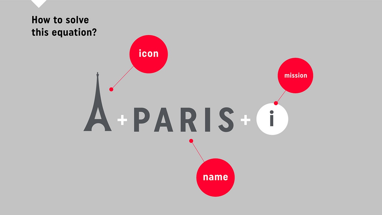
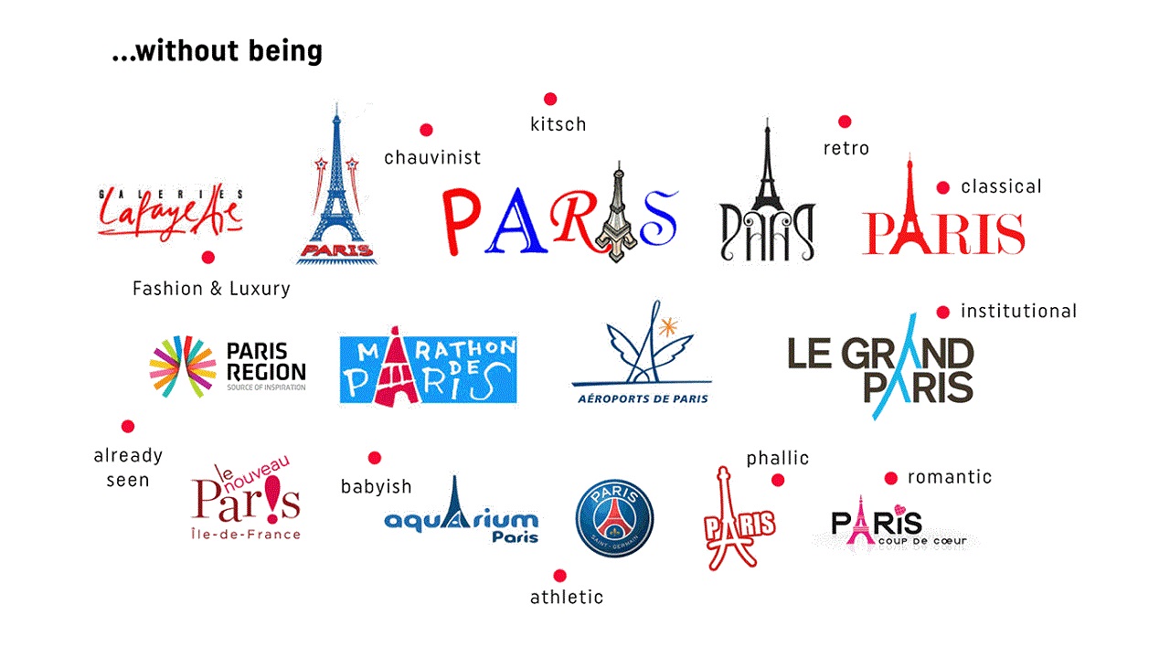
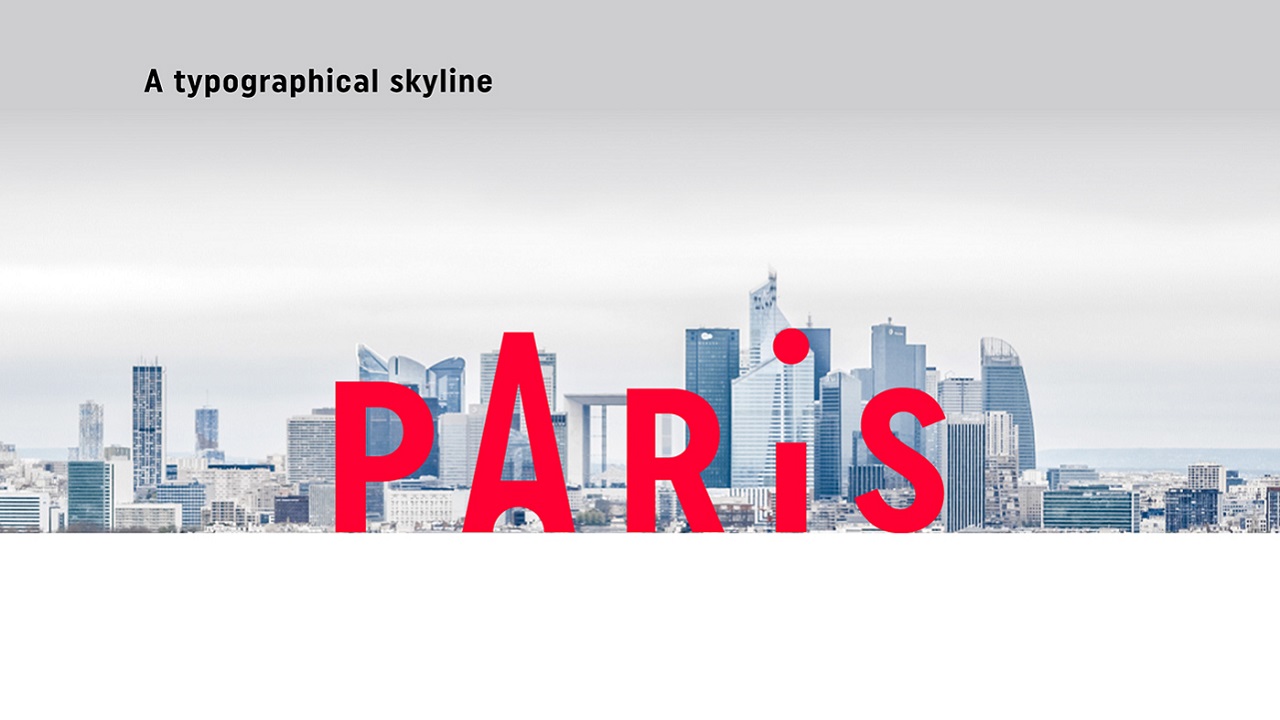
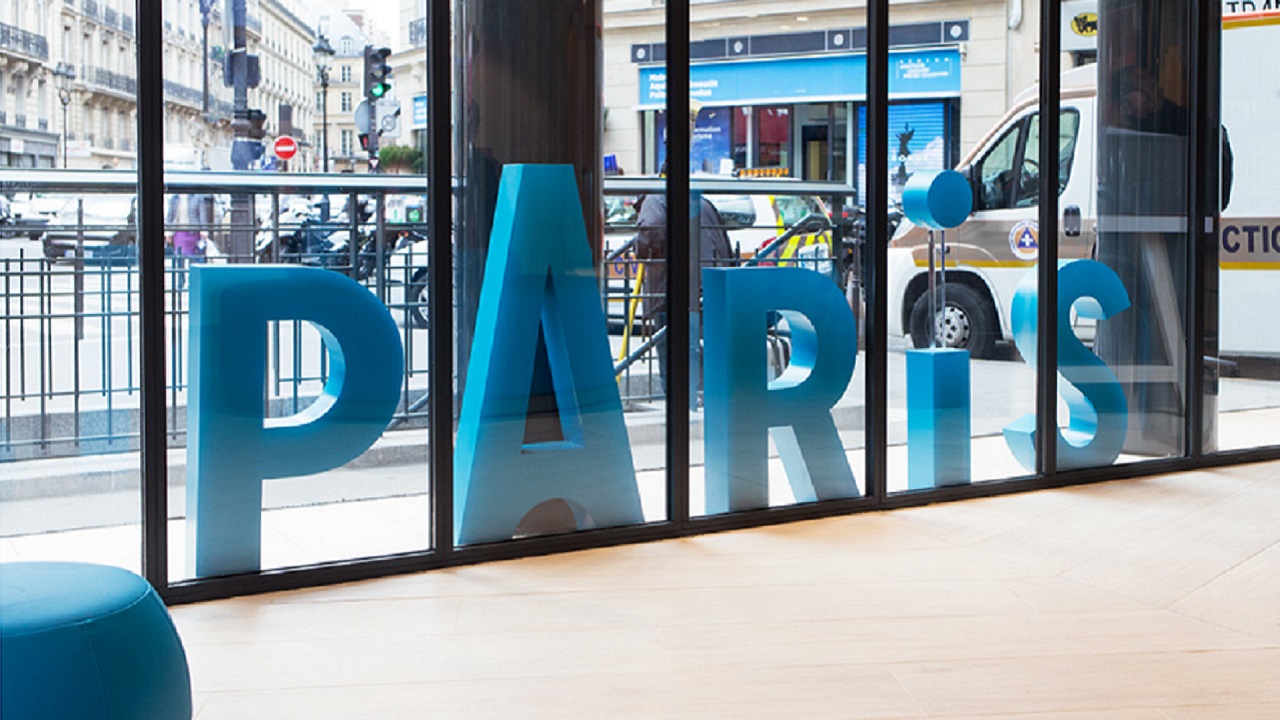
When you imagine a logo or any other graphic work portraying the capital of France, you, and probably a lot of other people, imagine it somehow containing the Eiffel Tower (and if you have a look below, you can actually see it being applied on many occasions – with good and bad results). But when the question to use the iconic ‘great lady’ arose at Graphéine, a French communication agency which treats visual identity with a healthy dose of creativity, they decided to opt for simplicity and concentrated on a typographic design that resembles a Parisian skyline. And the result is an appealing minimalistic typogram with the drawing of the “A” directly evoking the Eiffel Tower.
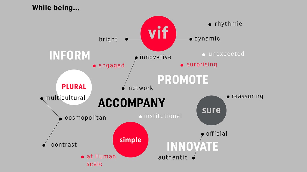
Although being aware that entering visual territory containing the landmark could be considered overused, and bordered on kitsch, the agency decided to communicate the ‘Paris’ destination to international audience with an insouciant aspect of Parisian life where the dot over the ‘i’ should represent a lovely wink, or even the Moon itself, just hanging above the metropolis. The new graphic design was created for the Paris Convention and Visitors Bureau, which is the official tourism organization and was established in 1971 at the joint initiative of the Paris City Council and the Paris Chamber of Commerce and Industry. The identity intends to carry out three specific missions: welcome and inform visitors, and promote the destination both domestically and abroad.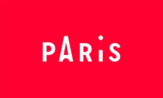
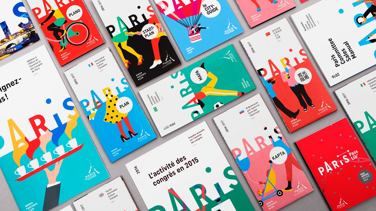
In this week’s edition of #ThrowAdThursday we can admire how the agency created various applications of the design, which was launched to revise the graphic designs of the Bureau’s editions of the official tourist pass, its information points, various colourful layouts and lastly the ever-needed multilingual map.
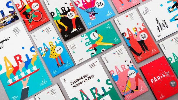
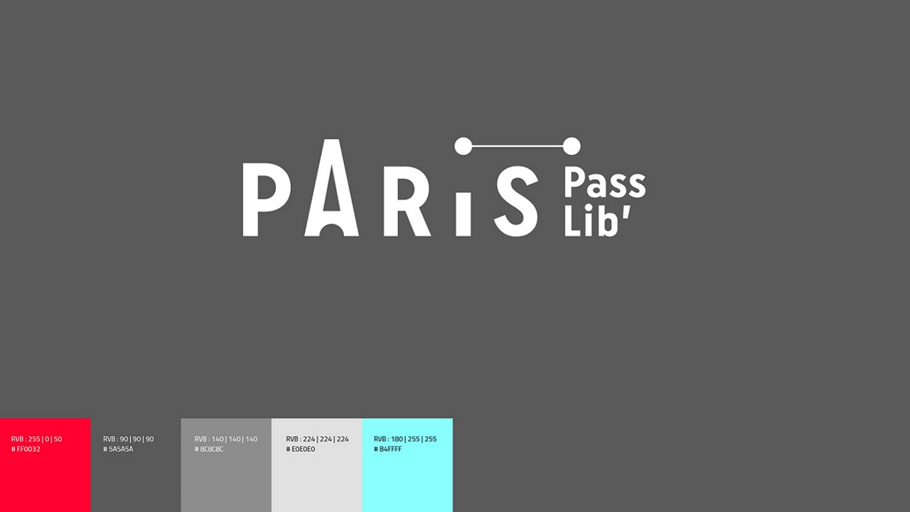
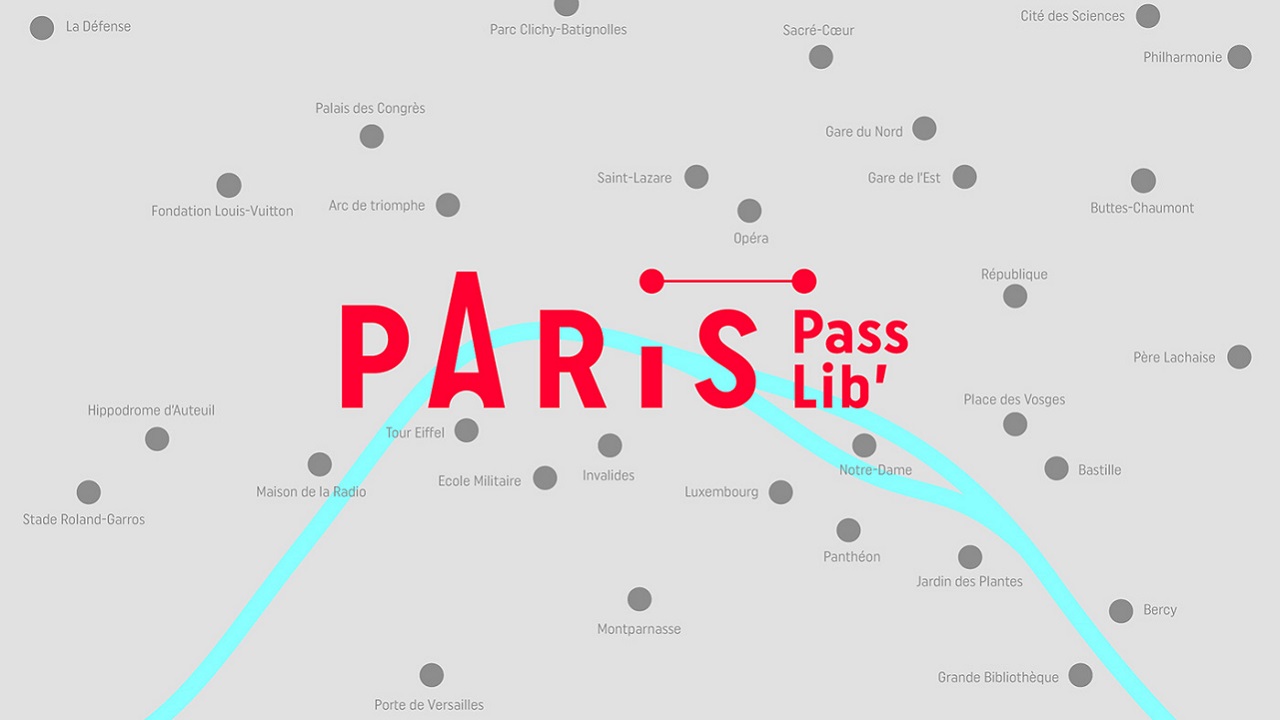
So, the first application of the new typogram was the “Paris Passlib” – the official tourist pass of the capital. This packaged brochure provides access to over 50 museums and monuments in Paris and Île-de-France, and allows visitors to travel freely with an unlimited ticket. It comes with a pocket book that contains all the useful information to know. This logo variation stands for the idea of traveling between several locations, from a key point to another. This sober and simple design allowed the agency to draw a tourist map of Paris.
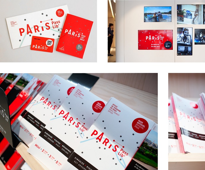
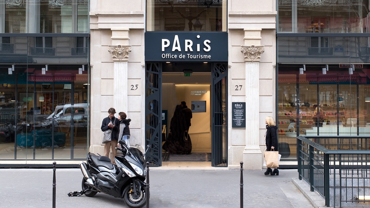
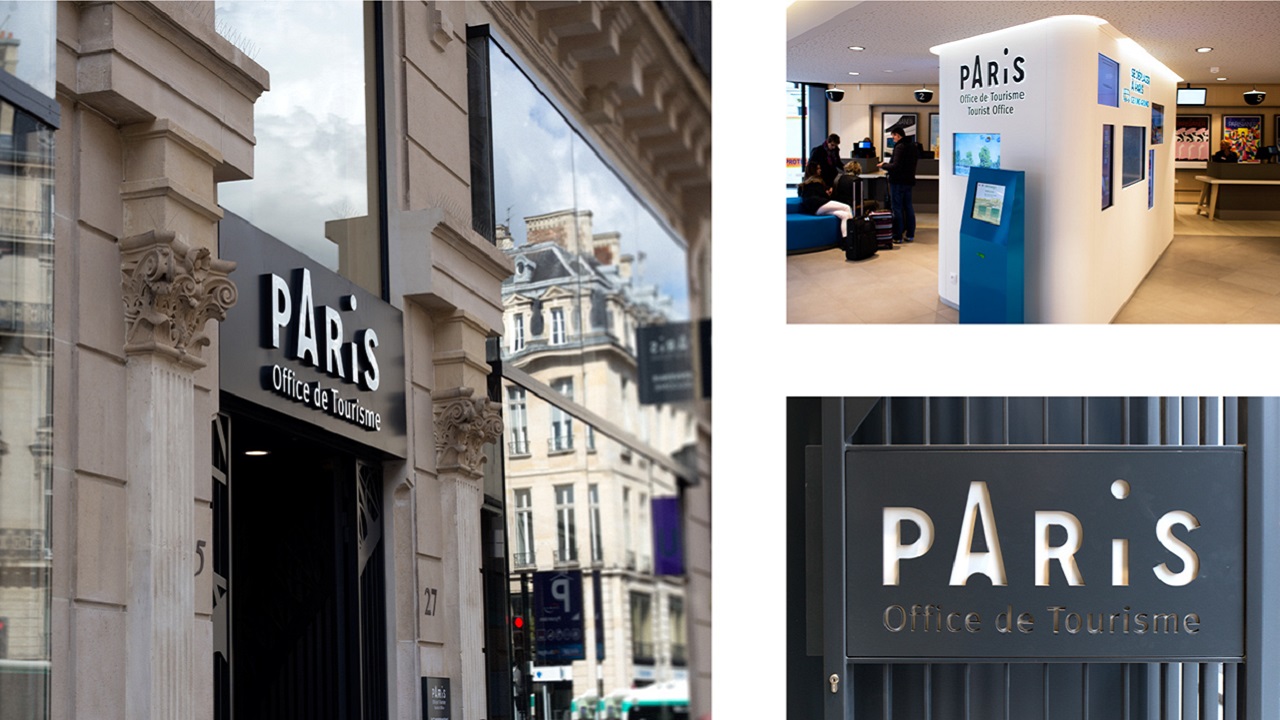
The Tourist Office has got five points of presenting information. The main office which is located at 25 rue des Pyramides, was completely renovated, and the new interior design was carried out by French agency Intangibles.
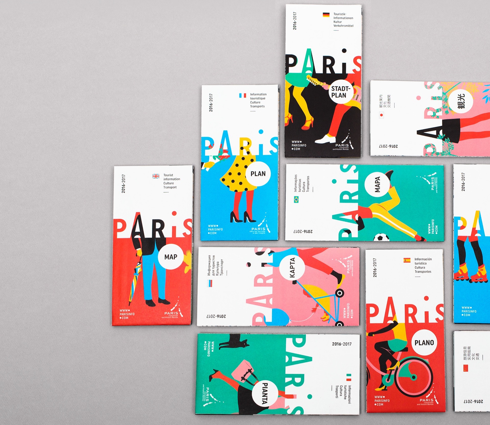
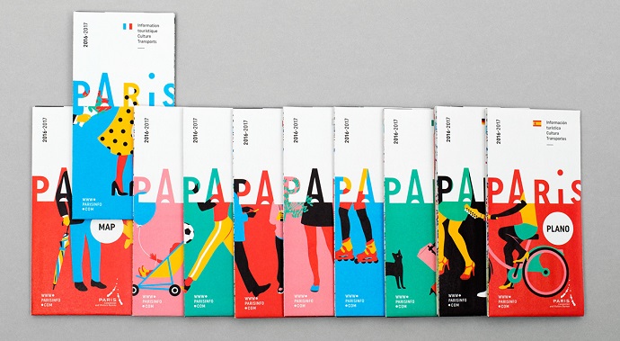
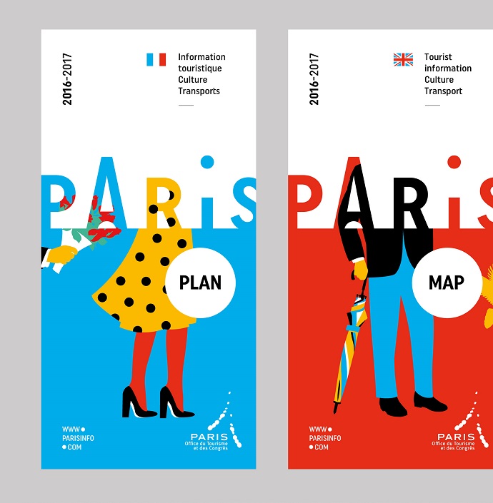
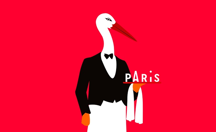
For their proposal, the Paris- and Lyon-based Graphéine selected the typogram is the central element. It contains the iconography and becomes a window to the city of Paris. The frame invites visitors’ eyes to travel between letters, titles and images, and thus creates curiosity. To work on iconography, the agency used this perfect opportunity to collaborate with Séverin Millet, a Lyon-based illustrator, whose simple and colourful work perfectly matches with the vision of the project. Valencia-born artist started his career in 2004 as an illustrator for French daily afternoon newspaper Le Monde for which he has designed, to date, about 700 drawings. As many other daily and weekly newspapers and magazines feature his work (including New Yorker), his work allowed the agency to step aside from the usual postcard pictures of Paris, and offer a fresh, colourful, and poetic look of the capital. You can visit Séverin Millet’s Facebook page to see a bit of his creative effervescence in form of notebooks, screen printings, and sculptures.

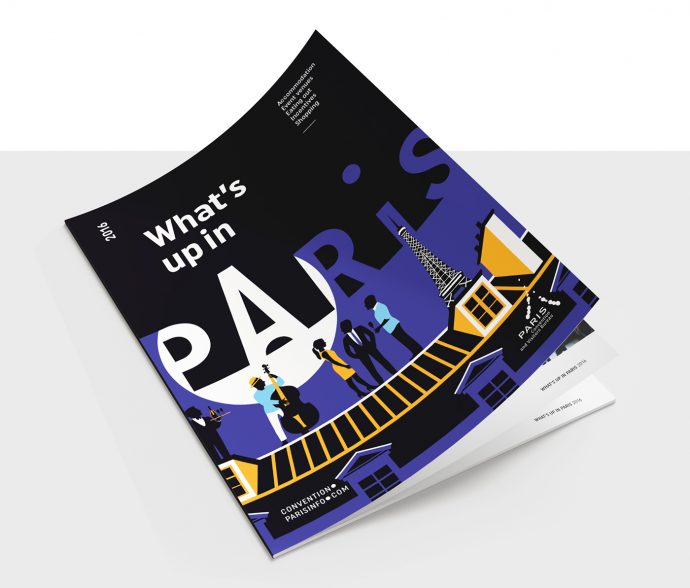
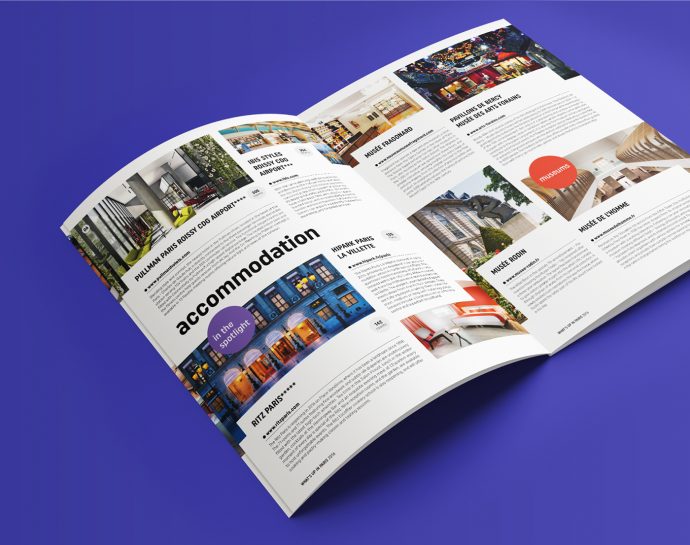
What’s Up in Paris is a trend magazine for events and stays in the capital. It presents through 32 pages the latest openings and renovations in terms of hotels, event venues, restaurants and shopping in Paris. The company chose a black cover to foster the image of a city that lives by night.
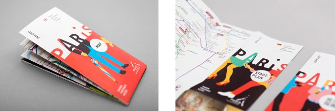
Lastly, with over 1.2 million printed copies, the map of the French capital is probably the main document offered to visitors for free. Moreover, it is available in 10 languages and Séverin Millet has created colourful and lively frieze-style booklets, where only the travellers’ legs are visible: a true invitation to stroll around the city!
