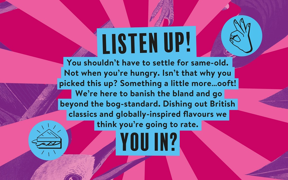
When it comes to product labels, the food-to-go category is quite dull. This sector is dominated by designs that look, sound, and offer the same thing. Tasked with creating a “brave new brand consumers won’t want to live without” by Urban Eat, strategic branding agency Robot Food saw this boring category as an opportunity to make it more appetizing with an energetic brand that would win the hearts of loyal fans.
Hoping to “implode” the sector, the Leeds-based agency has worked on Urban Eat’s branding, equipping the company with new vibrant designs that “push the limits and shatter the preconceptions of what ‘grab and go’ can be,” the agency explains. “The new Urban Eat is all about shaking up your routine while keeping things uncomplicated. It questions the previously unquestioned by providing exciting, always delicious options — whether you’re looking for something familiar or something new,” says Simon Forster, Founder and ECD, Robot Food.
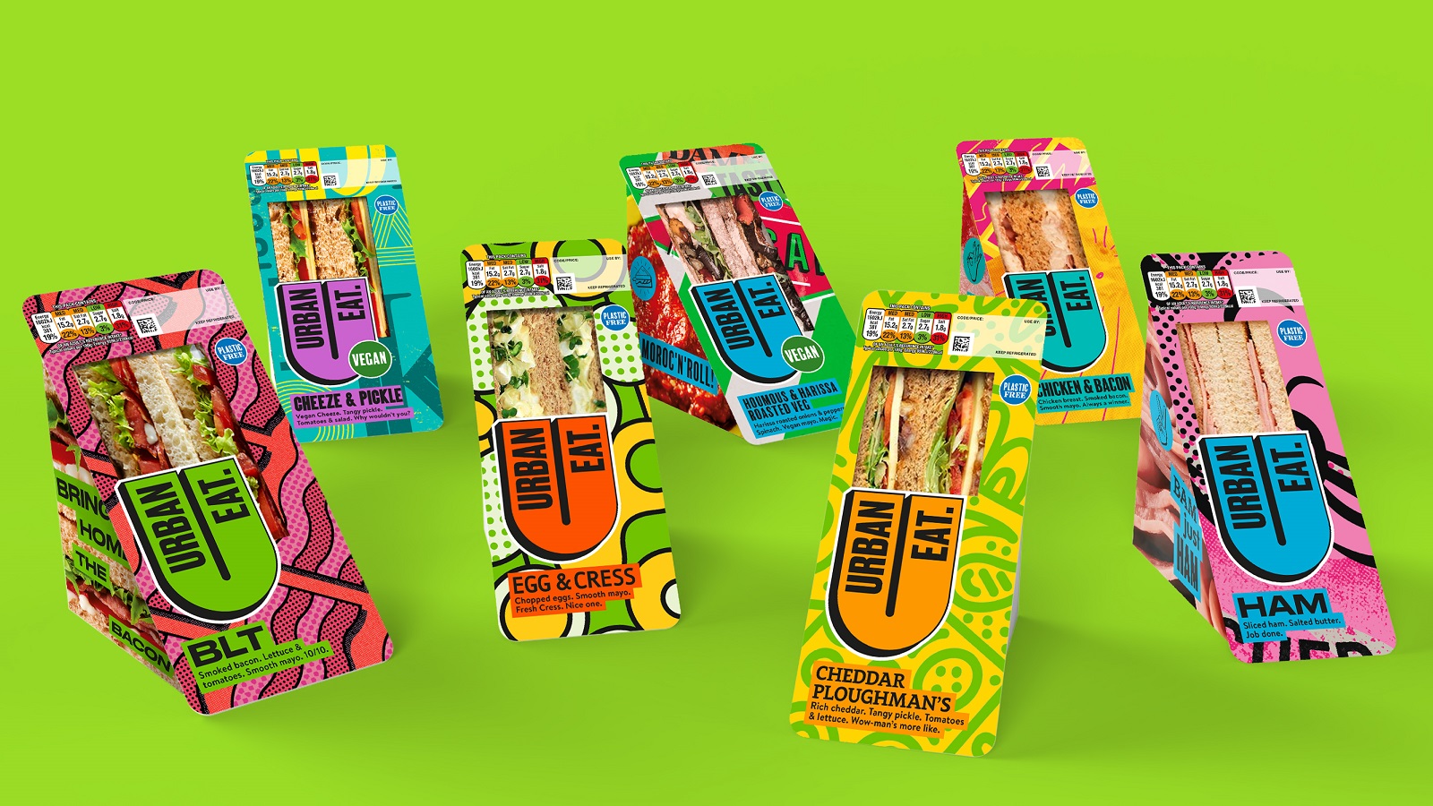
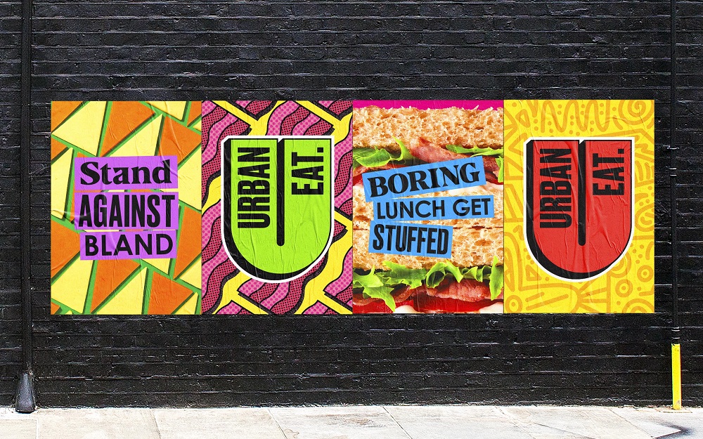
Robot Food inserted vibrant and aesthetically pleasing elements throughout the design, which will hopefully change people’s perceptions of what this sector can be. With joyous illustrative styles and vivid colors, the design is aimed at making the products stand out in the food-to-go aisle and boost consumers’ energy while serving their lunch. “Everything we did from the visuals and tone of voice is about breaking people out of lunchtime zombie mode and their regular habits,” continues Natalie Redford, Robot Food Creative Strategist.
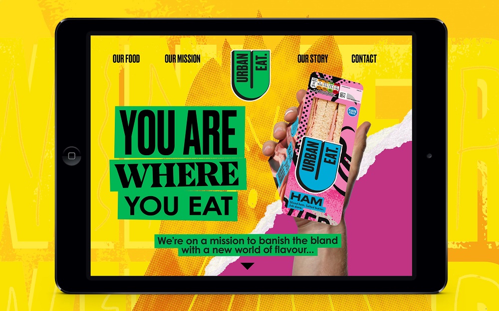
Establishing a more emotional connection with the company to bring the brand story — defined by the agency as “you are where you eat” — to life was crucial. The brand embodies urban life, and the new visual identity captures the city’s dynamism as well as the energy of the city dwellers. “The urban environment is about a rich mix of styles and colors, characters and cultures,” adds Forster. “We were visually and verbally trying to translate how eclectic people are in cities and harness that vibrancy to represent everyone who buys Urban Eat.”
The main design challenge was to highlight the vibrant colors, complex design patterns, and illustrative elements in a bold way but without estranging anyone. To sum things up, the design had to be “colorful and crazy but tasty and approachable,” says Chris Shuttleworth, Senior Director at Robot Food, in charge of all illustrations in-house. The illustrative styles are the essence of the Urban Eat brand, offering visual clues about the dynamic personality of the company’s product range.
Aside from evoking elements from across art history and pointing to the sandwich aisle as well, the illustrations also help consumers navigate through the range more easily by using the colors as visual tips for the flavor they want: Pink for ham, yellow for chicken, or blue for tuna.
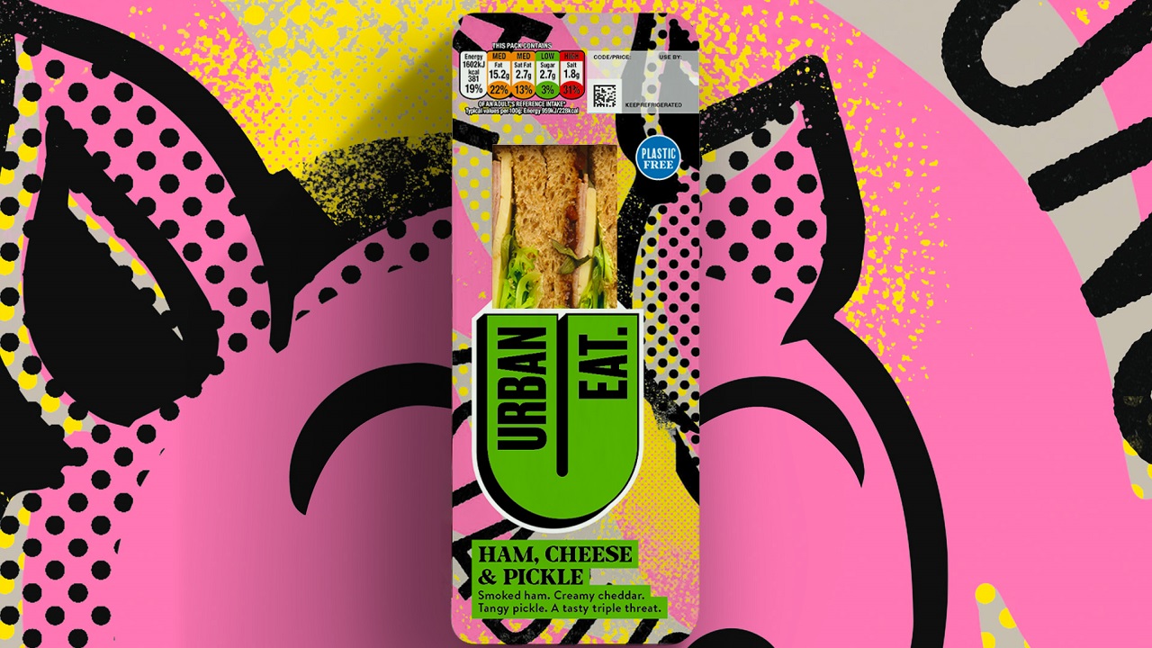
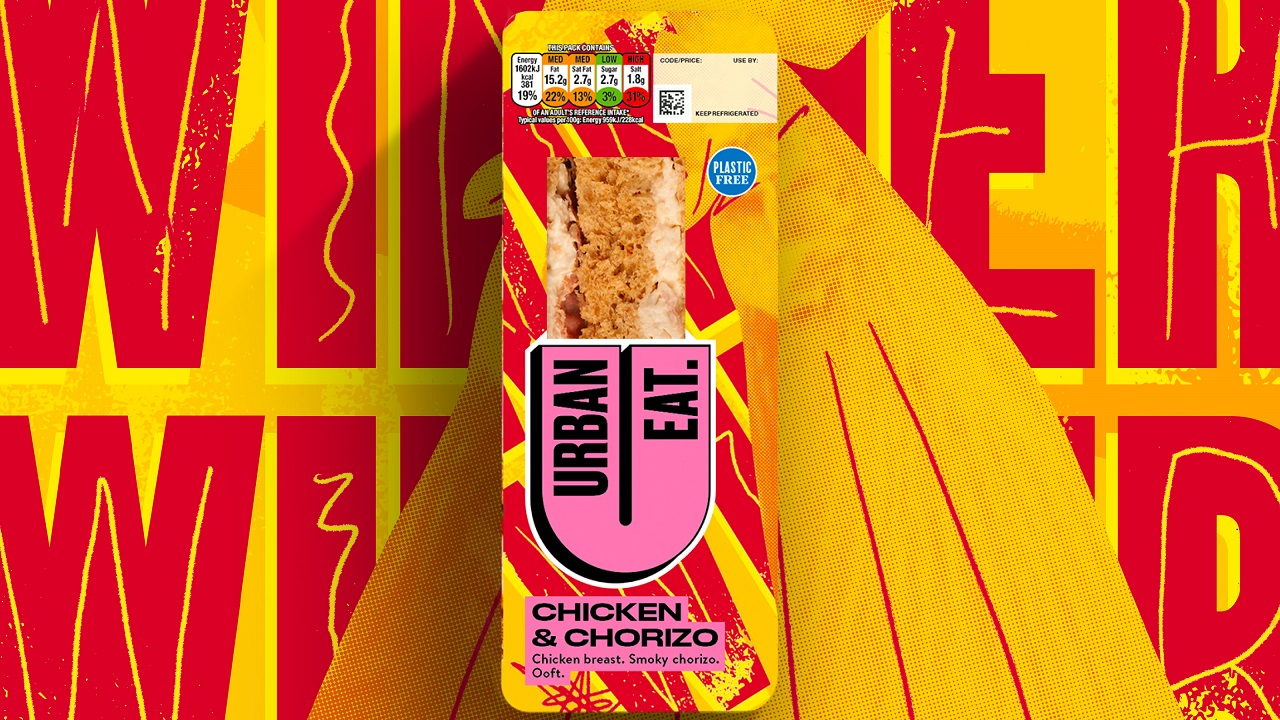
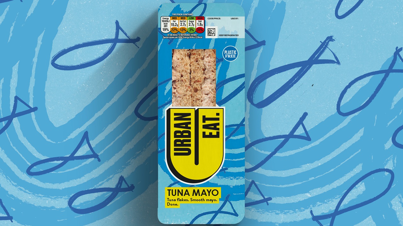
The illustration styles adopted by the agency range from “textured patterns to Memphis-like repeating shapes to Keith Haring-style line drawings, Matisse-esque cutout effects, color-washed photomontage, type-led graphics, and more,” according to the agency. Photography of key ingredients are adorning the side of the packs, complemented by punchy slogans just to “add a touch of the unexpected,” continues Forster.
“We treated the packs as individual works of art, giving each one its own unique illustration style inspired by the mix of people, flavors, sights, and sounds you’ll find in a big city. Working as a whole, the range is an eclectic expression of urban life, made cohesive with a bold brand mark that’s hard to ignore,” explains Shuttleworth.
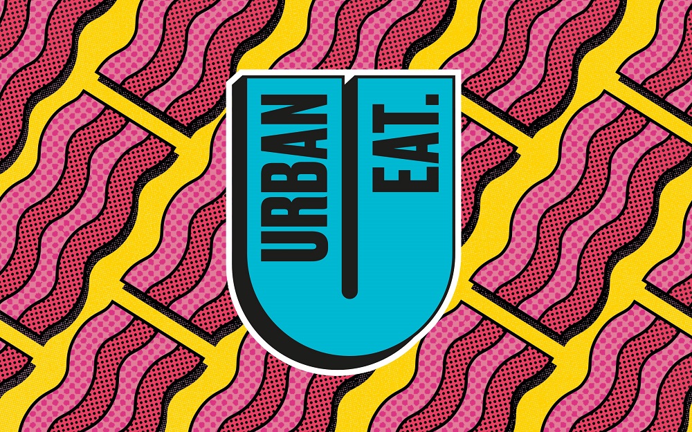
The creative team used a bright yellow tone to highlight the master logo, filling the silhouette of the secondary logos with other hues. Ten different fonts were chosen to further amplify the sense of eclecticism, which are also used in any combination across packaging and branding applications to allow easy navigation across the range as well as on-shelf standout.
Ali Johns, Head of Brand Development at Urban Eat owner Samworth Brothers, concludes: “This new chapter and identity will allow us to build brand awareness, grow into new listings, and inspire consumers looking for unique and exciting lunchtime offerings. It’s been a pleasure partnering with the Robot Food team and we’re so excited the vibrant new look has hit the shelves.”
Credits:
Client: Urban Eat
Agency: Robot Food