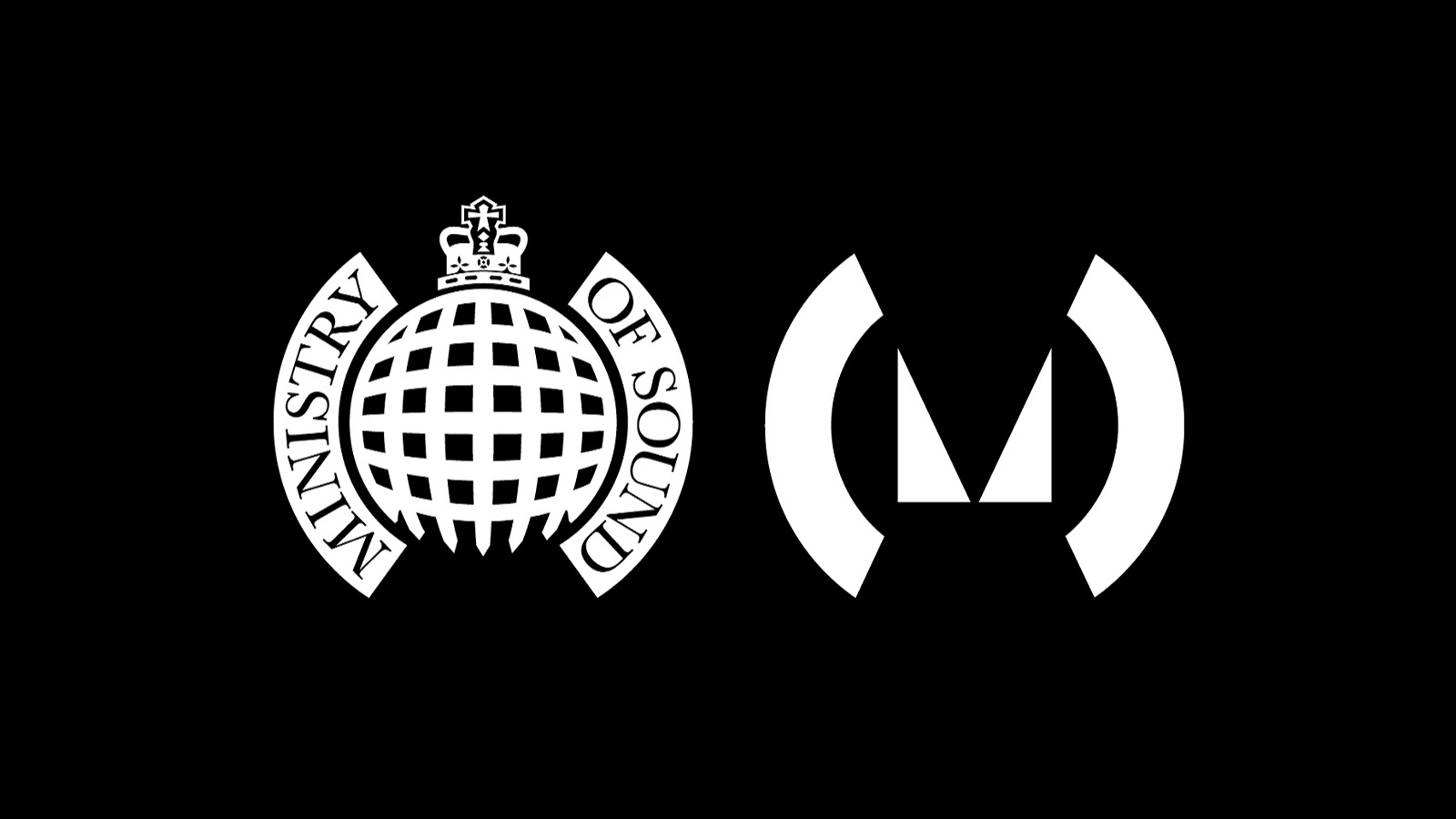
Ministry of Sound started in 1991 as a nightclub in London. After 25 years of building its legendary status, the club has evolved into a multimedia entertainment business – a club, magazine and a record label. The celebrate this anniversary, MoS collaborated with London studio Spin and created a whole new visual identity.

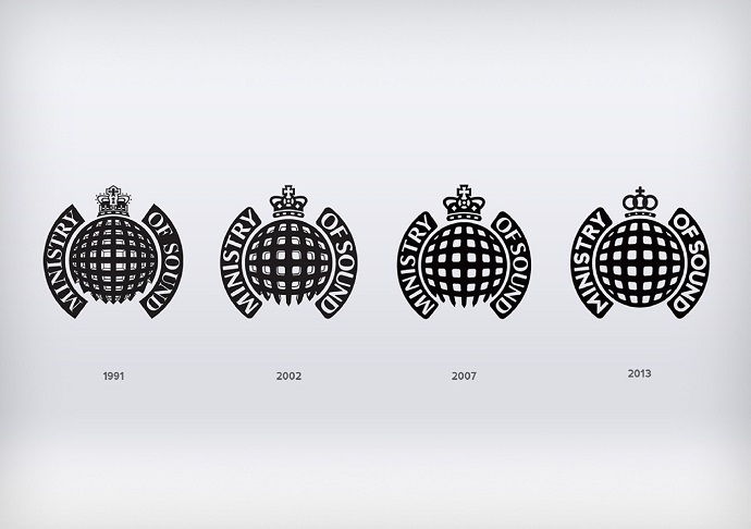
The original logo, which was intended as a twist on the House of Commons crest, was designed by artist Chemical X who describes it as “the last iconic logo designed without a computer using techniques that had been used for decades before.”
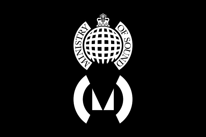
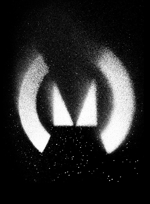
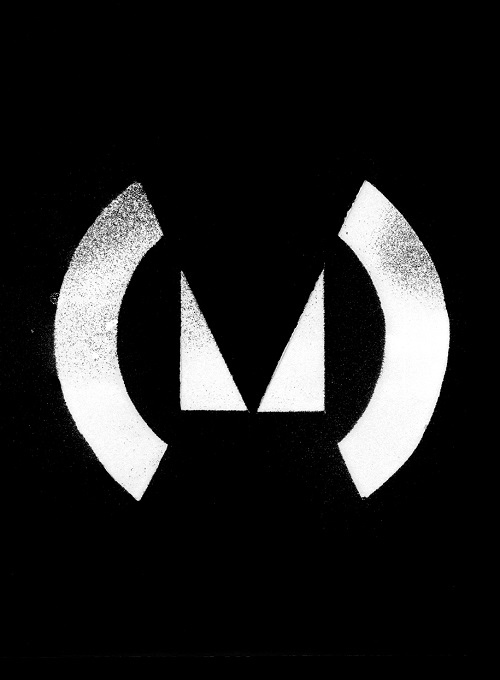
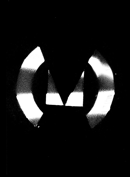
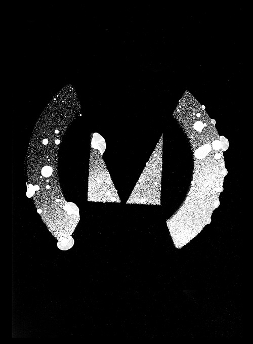


After a quarter of a decade, Spin decided to keep the rounded “brackets” of the original, but removed the spherical gate and signature crown. These were streamlined to a much simpler triangular “M” mark and rounded white blocks. The idea behind keeping these similarities to the old logo was to incorporate the club’s rich history with a futuristic approach and “spiky, irreverent qualities the club is famous for.”


Below you can see various versions of previous re-designs, with one of them being done by Spanish brand designer and art director, Jacinto Caetano, and also notice the huge change in Spin’s approach using much more minimalistic way.
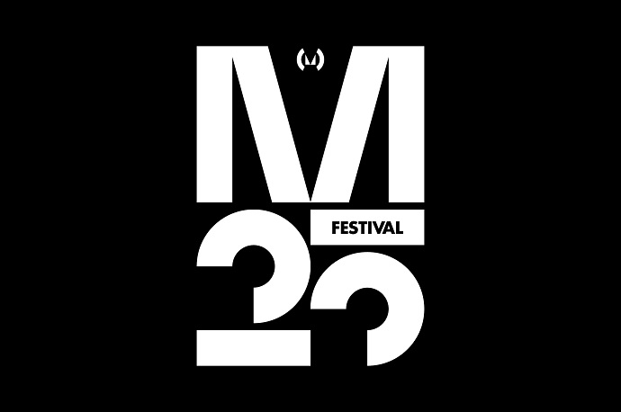
Do you not only like the new logo and identity, but also music by MoS? You can join the club brand in celebrating the 25-year anniversary at the M25 Festival which takes place at Trent Park, North London on 7th August with DJ Sneak and Erick Morillo headlining the line-up.
Credits:
Spin & Ministry of Sound
