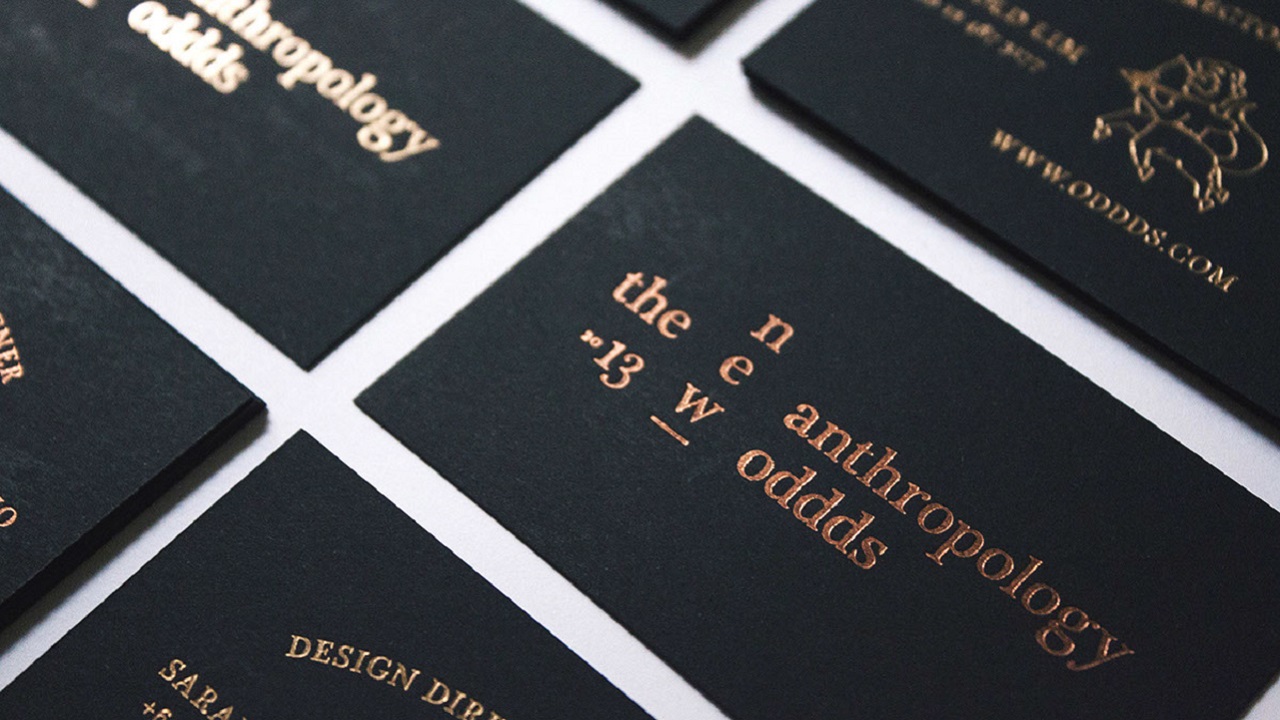
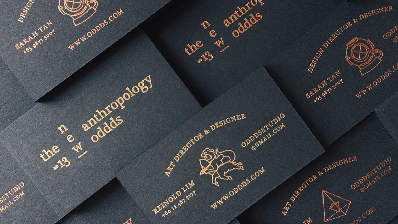
With the first article in our new column – Designer Showcase – we take a look at an unusual collaboration among two designers based in two different continents. In 2013, Reinold Lim, a brand interventionist and design doer from Penang, Malaysia currently working in Manchester, UK, and Sarah Tan, a designer born and based in Singapore, formed a design studio Oddds that reflects significantly on behaviour and futurism in design.
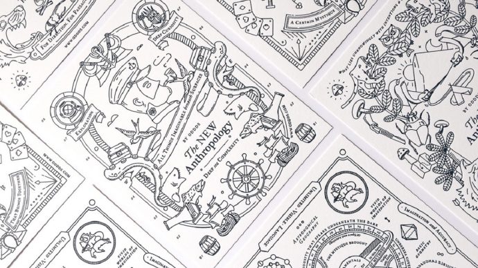
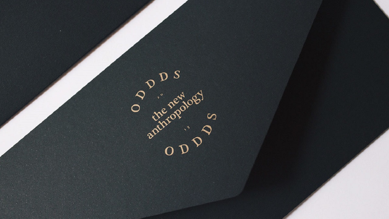
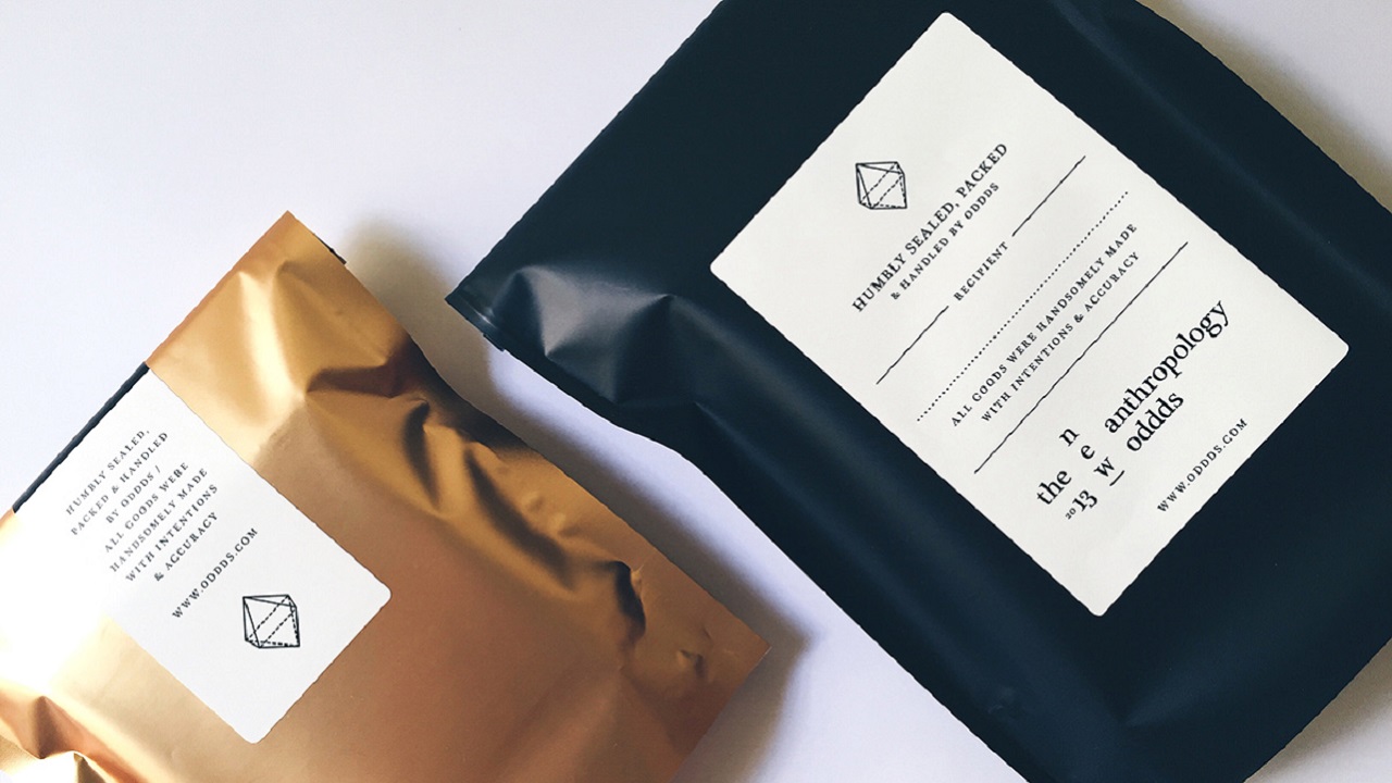
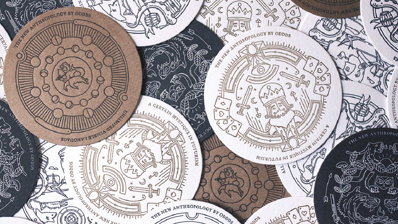
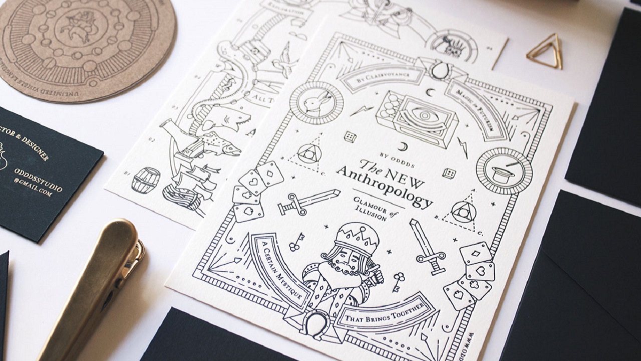
We will start with Oddds‘ own rebranding identity – labelled The New Anthropology – that presents the studio’s beliefs and values in four stages, or themes. The first stage, where all things imaginable can be created beneath surfaces and beyond edges, is called Deep Sea Complexity. The duo presents the second stage as Bravery in Hunting, during which what lies unknowingly can be brought to surface with intentions and experiments through art and design direction. The third stage, Glamour of Illusion, uses clairvoyance of futuristic forms to bring together a certain mystique feeling. The last stage, Science of Atmosphere, is where imagination and accuracy of methods shall bring about unlimited visible language. All in all, their rebranding identity aims to be an evolutionary set of systems that were progressively & intuitively placed together and drawn from inspiration of the duo’s fascination of human behaviour and cognitive curiosities.
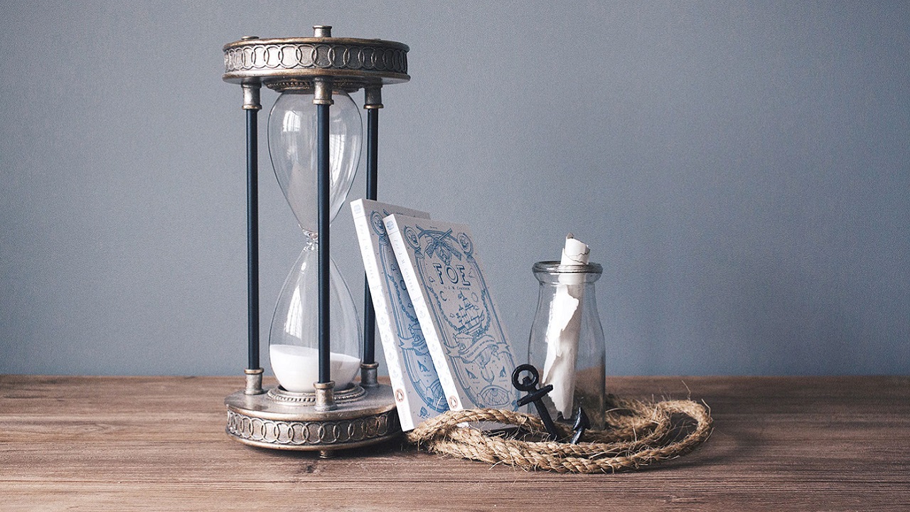
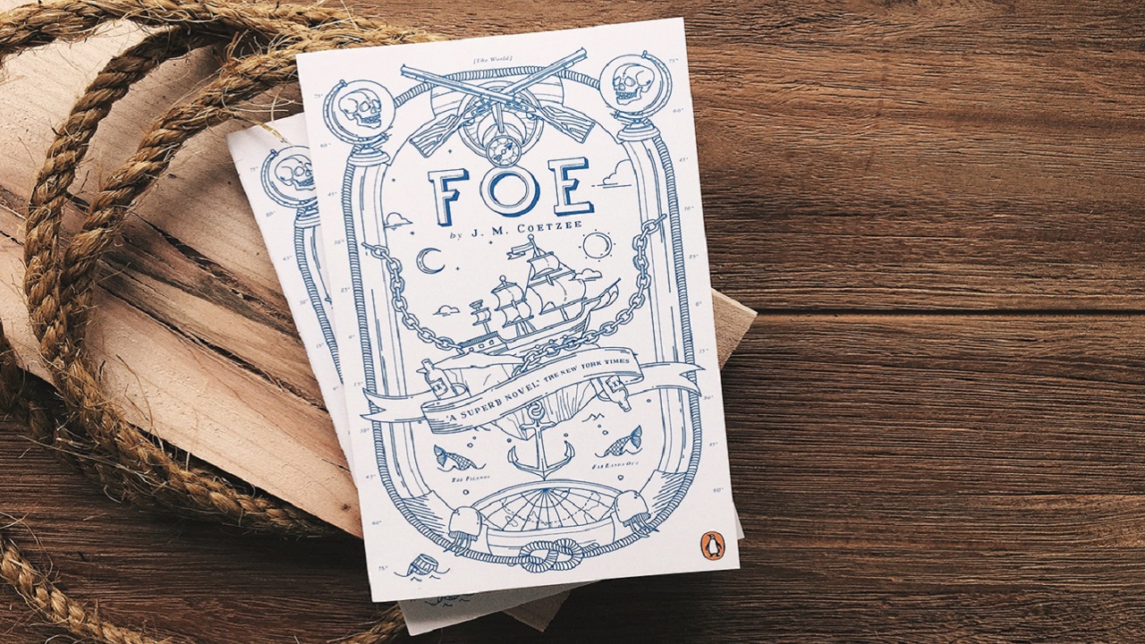
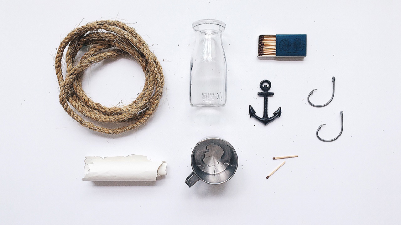
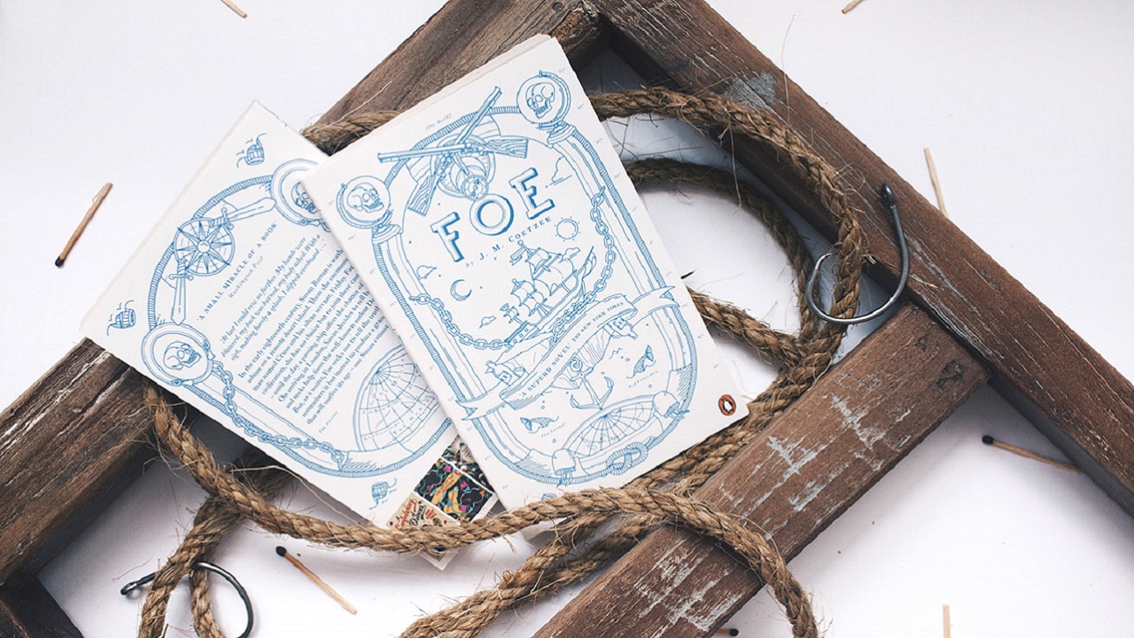
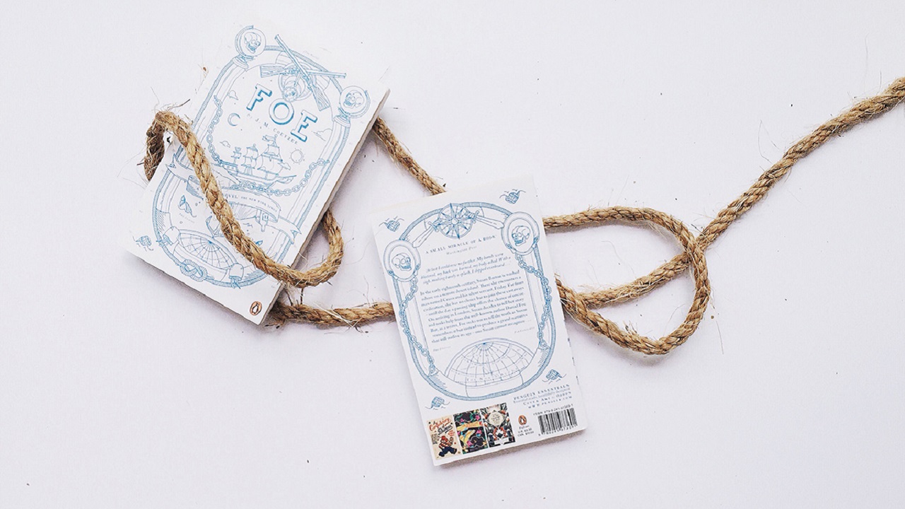
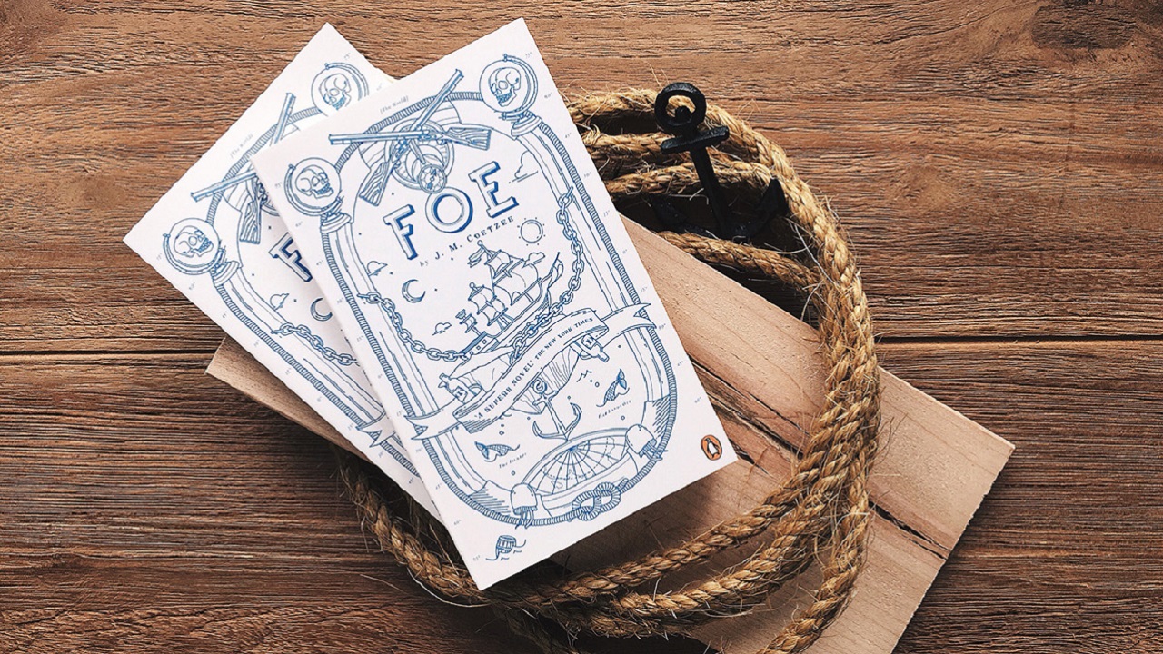
In August last year, the team was commissioned to design a cover of a Penguin Essential cult classic ‘Foe’ by J. M. Coetzee, that was published for the first time within the Essential edition. The design of the satirical reinvention of the story of Robinson Crusoe, inspired by mutiny, death and voyage, shows a contrast of both modern and traditional graphic elements, as well as blend of Eastern and Western cultures.
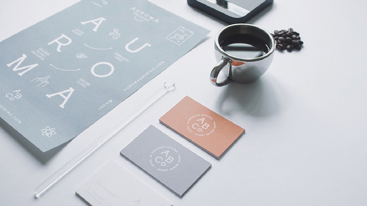
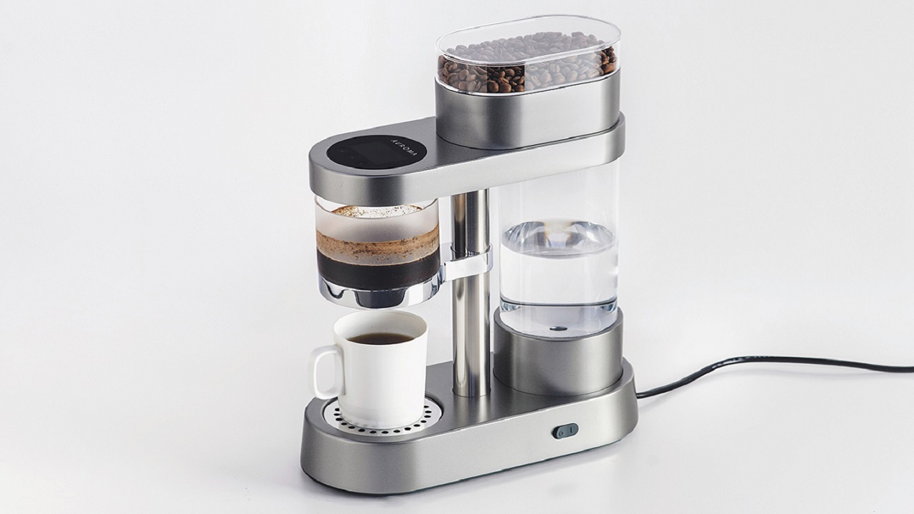
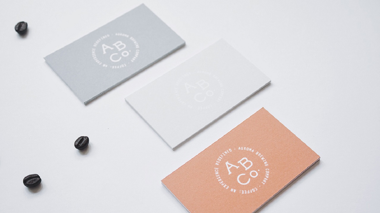
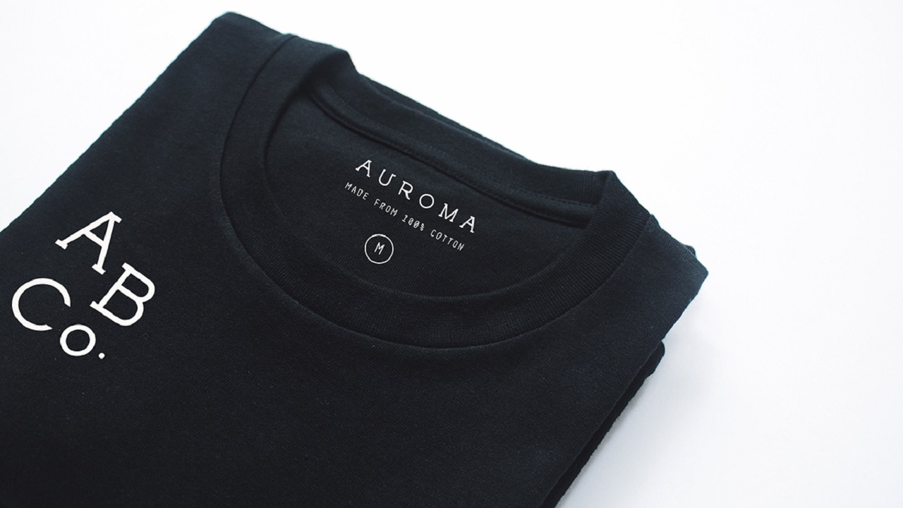
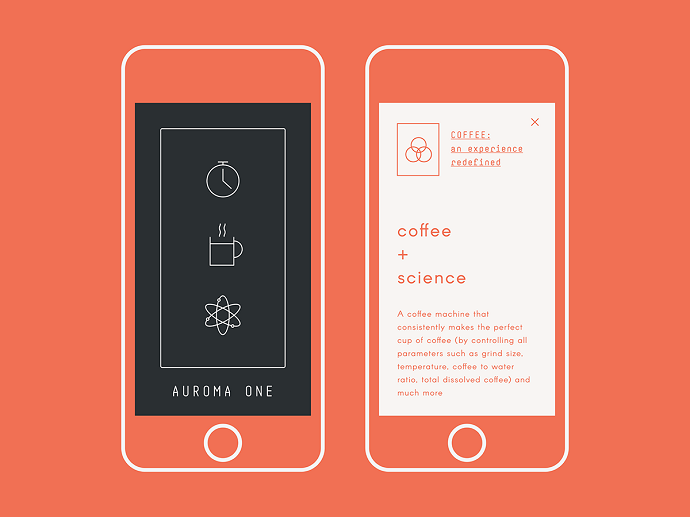
The latest design by the international design duo, from July this year, exudes simplicity and functionality together with processes and ration of brewing parameters of a unique product – Auroma One, a coffee science machine produced and launched on Kickstarter by Auroma Brewing Company (ABCo.) based in Vancouver, Canada. The design reflects the fact that Auroma is about a coffee experience redefined and formulated carefully with precision – Distinguished, yet experimental and bold just like a robust coffee bean. The logo and visual identity are bound together with a serif logo and logotype balanced with a monospace typeface created for various applications. Clean infographics show the basis of Auroma’s intelligence, capabilities & minimalism; thus identifying the brand’s aspects.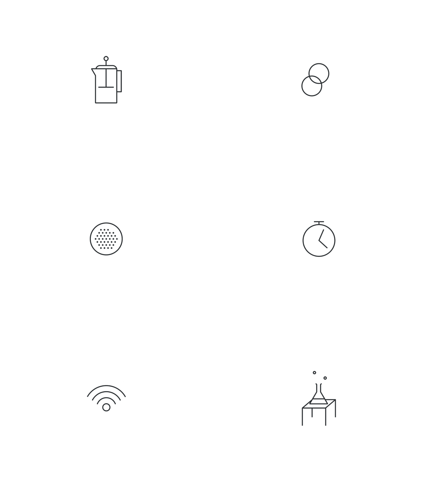
Credits:
