The restaurant industry is very competitive because the market is oversaturated with cafes, bars, and pubs, so most of these businesses struggle to find a way to stand out. Without good restaurant branding, it is hard to reach the consumers. Let’s think of tourists who want to have an espresso in a coffee shop while traveling. Will they go to a familiar restaurant like Starbucks, Hard Rock Cafe, or will they choose a local business? When choosing a place, consumers want to have a connection to the brand, and this makes restaurant branding so important.
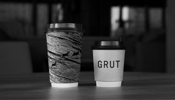
Founded in 2016, the Grut — a restaurant and brewery founded in southern Moscow — refreshed its identity, with the help of Russian-based agency Suprematika. The project won the agency 2 Gold awards at the 26th International Festival of Red Apple in the Packaging and Communication Design categories. Featuring an item that was already present in the local area, the designers gave a vivid look to the restaurant using a material provided by nature itself: wood.
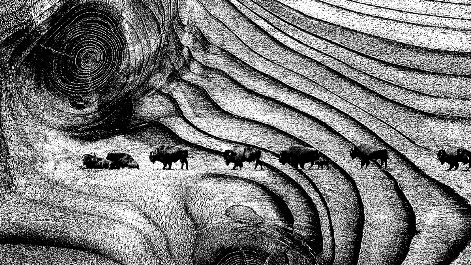
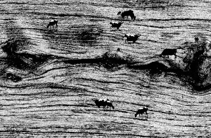
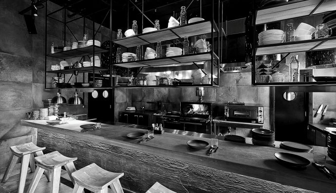
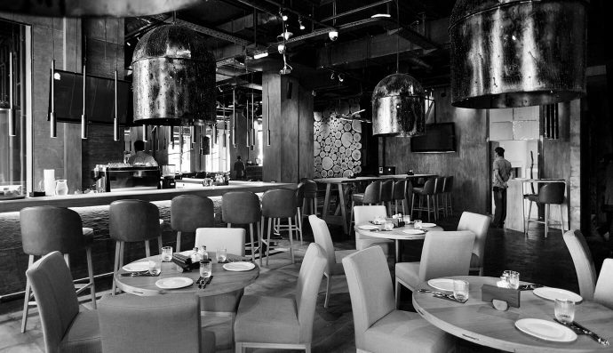
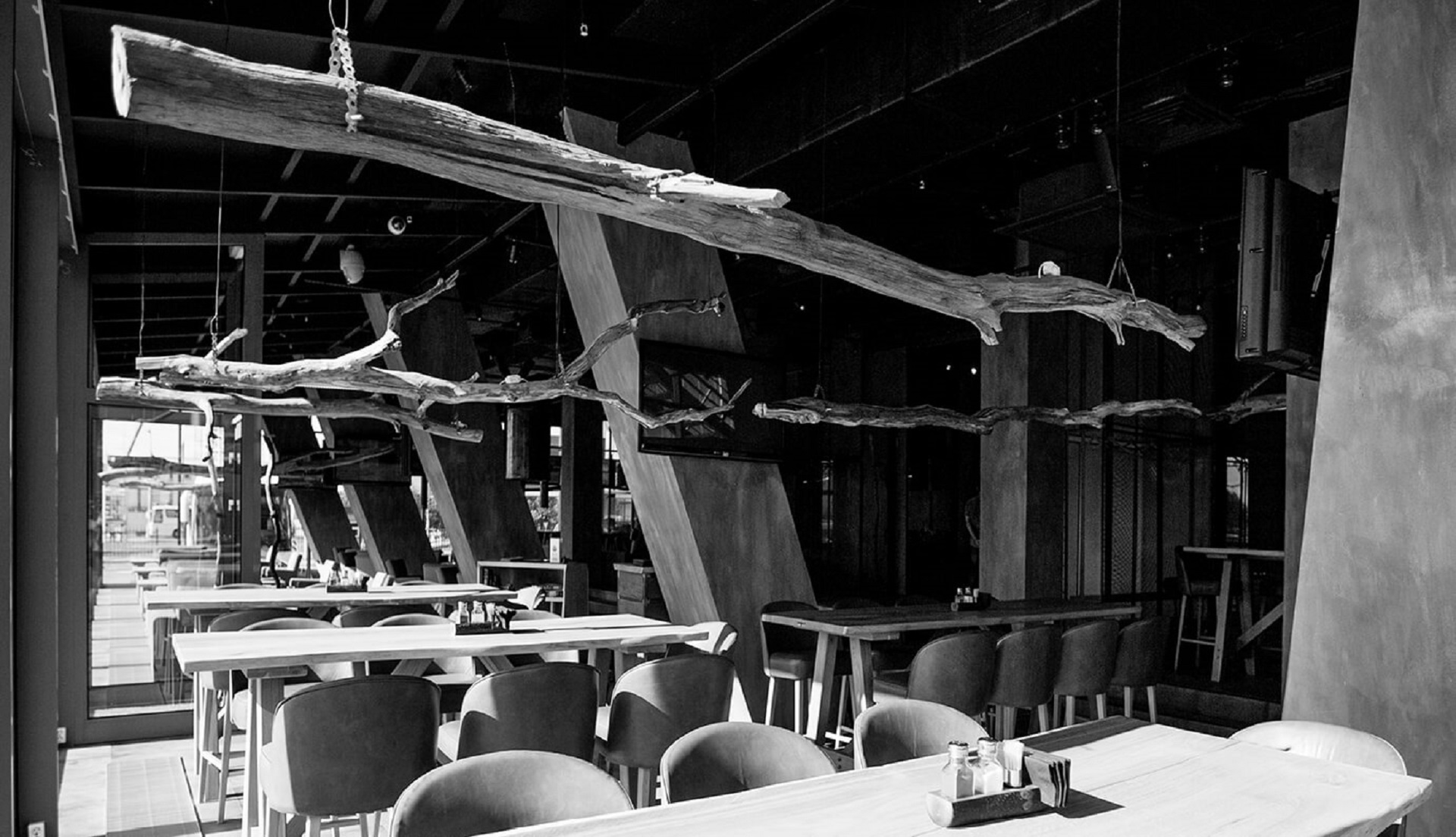
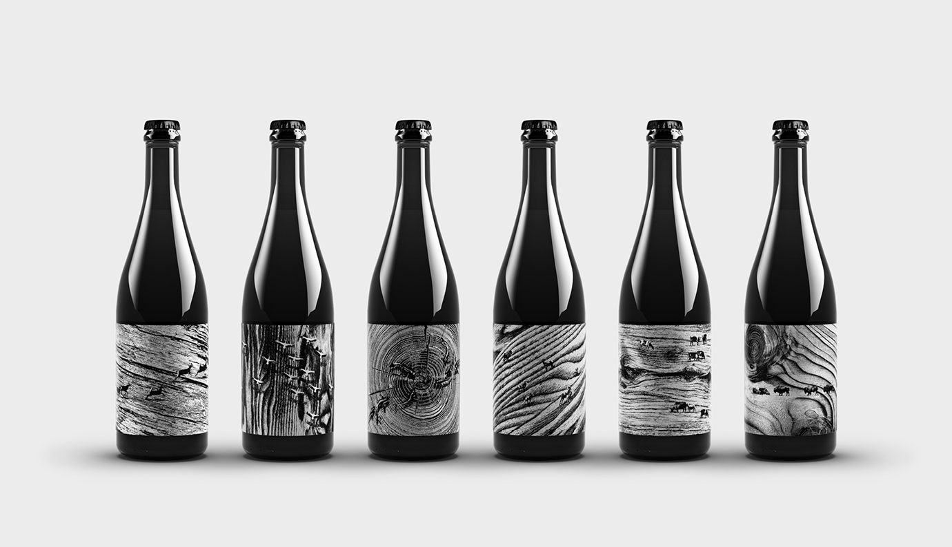
For the new design, the creative minds of the advertising agency drew inspiration from the rings of the wood, and turned them into visible patterns consumers discover the very first moment they pass through the brewery’s doors. Besides wood, other common materials were used for the restaurant’s interior, like metal structures, concrete, imperfectly finished and asymmetrical walls.
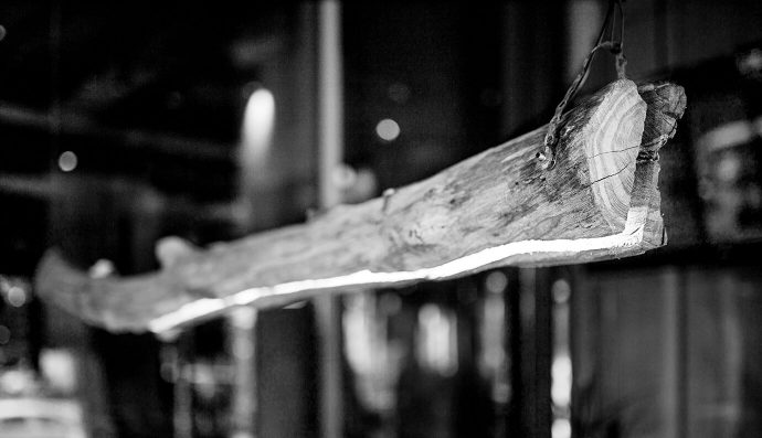
Natural colors, expressive textures, lines with strong features, and powerful prints — all of these aspects label wood as being an entity with a strong ornamental character.
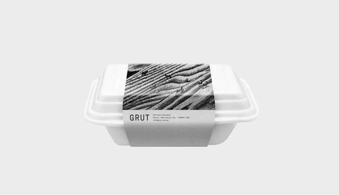
Inspired by the unique lines and shapes present on the surface of the wood, the Moscow-based agency transformed Grut’s personality, defining it as a complex visual system. Everything from menus to business cards, bags, food packaging, and bottle labels, outline the strong identity of the restaurant.
By transforming the natural wood look, it now seems that the restaurant incorporates unreal images and the consumers’ attention is captured by a gritty texture of the local beerhouse, whereas a series of black and white images provides them with a unique dining experience.
The developed minimalist logo dazzles the viewers’ eyes once again, because it shows pictures of cut trees, where the growth rings represent the background of some natural scenes and landscapes that always seem to evolve.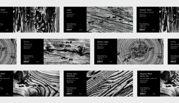
The restaurant’s name is inspired by the German word “Grut” — the Middle Age equivalent of beer — a beverage based on wormwood, ginger, yarrow, cumin, heather, and some other spices and herbs. Also, the branding agency designed the packaging for the eponymously named beer.
Credits:
Client: Grut Restaurant and Brewery
Agency: Suprematika