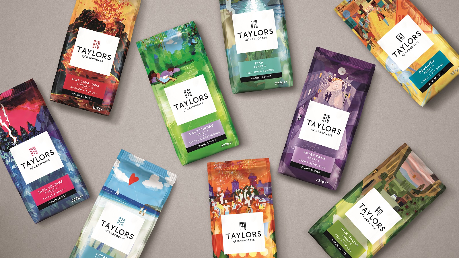
In case you haven’t noticed, we love tea. You could tell by our unique Branding Over Tea experience, as well as our recent article about the powers of tea ceremony being used in branding. The full rebrand for family-oriented business, Taylors of Harrogate, is no exception. New logo, packaging and brand proposition by Pearlfisher prove that quality craftsmanship and vibrant creativity have been pivotal in maintaining key elements of the Yorkshire-based brand since its foundation in 1886.
The family business based in the historic spa town of Harrogate, England has been devoted to the craft of outstanding tea- and coffee-making since the time when Charles Taylor sold his first pack of tea. The famous tea brand has always managed to avoid shortcuts by “showing care and respect to everyone along the way – from the people who grow it to the people who drink it.” And the new identity by Pearlfisher shows just that.
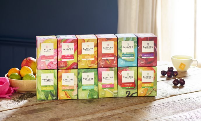
The rebrand sees Taylors’ wide range of tea and coffee joined together as one unified ‘extraordinary flavour’ for the first time while bringing a new logo to play a more prominent role on all products with an iconic lockup of letters T and H forming a window. This should evoke the idea of opening a world of flavour or give customers a chance to peer into a home of revered expertise. Moreover, the new design takes its inspiration in brand’s rich history and was inspired by the fact that back in the 1930s, Taylors was originally based in a large terraced house where products were literally shipped out of the front window.

The evolved logo and vibrant new packaging designs across Taylors’ three core tea and coffee ranges reflect the brand’s position on real ‘craftsmanship’. It focuses on the makery and innovation, and Pearlfisher’s decision to boost the packaging for each range with extraordinary, hand-drawn illustrations by three artists from different corners of the world definitely proves to be a great idea, as it brings a unique aesthetic to the packaging expression.
Just listen to Jonathan Ford, Founding Partner and CEO of Pearlfisher, uncover the story behind the beautiful work: “We’ve worked in partnership with Taylors of Harrogate for almost a decade and we’re genuinely excited to have helped define the future direction for such an iconic British brand. By revising the brand’s focus from ‘craft’ – which has become a jaded concept in almost every category – to ‘craftsmanship’, we’ve brought the Taylors story of artistry, ‘makery’ and innovation to the fore with clarity and confidence.”
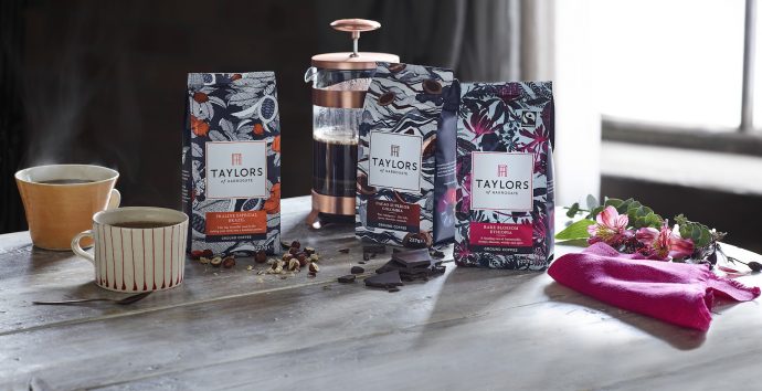
And although the design was delivered by artists from America and Asia, it shows a certain feeling of unity, and Jonathan Ford further explains: “We commissioned artists from far-flung corners of the world to create the beautiful illustrations upon which the new aesthetics for each range are based, and couldn’t be happier with the final designs – considered yet contemporary, traditional yet progressive, just like Taylors of Harrogate itself.”
All this could be seen at Pearlfisher’s official launch, which added a nice touch to the real craftsmanship by supporting the designs with a combination of tea & coffee tasting with matching food and appropriate musical accompaniment for each design.
.@pearlfisherlive just launched new identity for @Taylors & it shows a real multi-sensory piece of craftsmanship by 3 international artists pic.twitter.com/TFI1UMv6v6
— Branding.news (@brandnewsfeed) 3. srpna 2017
Marketing Director at Taylors of Harrogate, Dom Dwight, said: “We’re incredibly proud to share the new Taylors brand proposition. We’ve always been committed to crafting extraordinary flavour so we’re excited to bring this to the forefront of the brand through a unified redesign and some truly unique new blends and flavours. The tea and coffee market is fast moving and ever changing – it’s more important than ever for us to be bolder and brighter, demonstrating our creativity and craftsmanship through new taste experiences and beautiful, eye-catching packaging.”
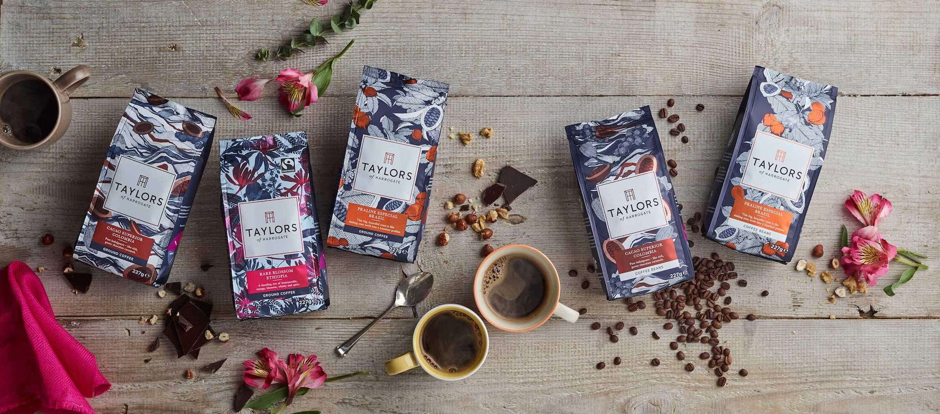
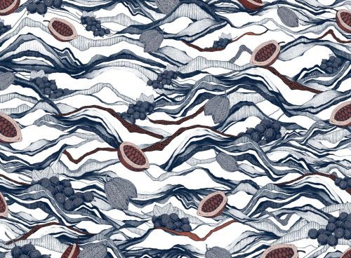
The three artists took into account specific features of each blend and crafted a really mouth-watering experience. Bangkok-based illustrator and artist, Suthipa Kamyam, took charge of redesigning Taylors’ premium single origin. His insanely detailed, and illustrious illustrations “hero the specialness of an element of flavour specific to the region where the coffee is grown”. See for yourselves!
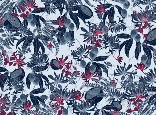
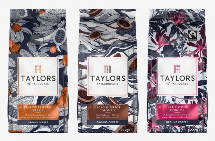
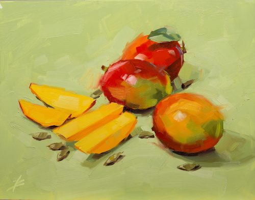
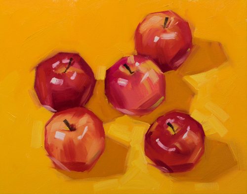
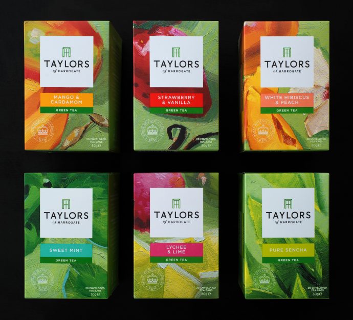
Colorado-based illustrator David Bates was assigned with the task of reinvigorating Taylors’ range of green teas and fruit and herbal infusions that was created in partnership with the botanical experts at Royal Botanic Gardens, Kew. His bold on-pack illustrations aim to raise to life the extraordinary flavours within each blend. A combination of bright colours, hand-drawn brushstrokes, heavy detailing and artistic flair points to the real process of craftsmanship which was used in creating the blends hidden inside each box: An on-trend Mandarin and Ginger infusion, and three new green teas blended with Lychee and Lime, White Hibiscus and Peach, and Mango and Cardamom.
Thirdly, Tokyo-based artist Izutsu Hiroyuki took care of the most iconic range, Taylors’ lifestyle roast and ground coffees. Hiroyuki managed to refresh these coffees, which were originally launched 21 years ago with the idea that “linking coffee to a moment in time, emotion or feeling, rather than an origin or roast, would make the world of coffee easier to navigate.” And as Taylors celebrates its 7th year as the number one brand in filter/cafetiere in retail this year, it is not brooding in the past – these new illustrative designs aim to bring coffee mood and flavour together.

A final and neat touch — simple, new flavour wheel infographic — should help consumers understand the flavour profiles of each coffee, while rich colours differentiate the variants and aid navigation against a tonal blue palette that runs across the whole range for unification.
Don’t you already feel like having a cup of tea? Or coffee? Let us know in the comments!
Credits:
Agency: Pearlfisher
Client: Taylors of Harrogate
Photos: Pearlfisher, Taylors of Harrogate Instagram, David Bates, Suthipa Kamyam
