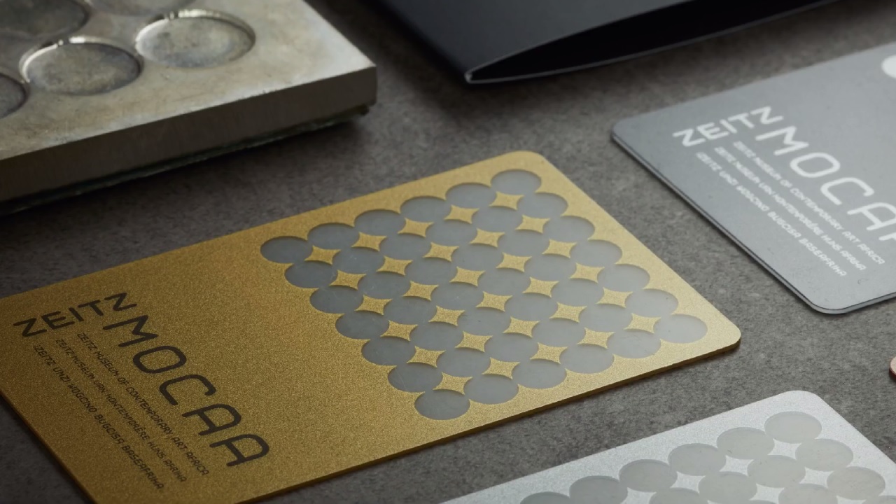
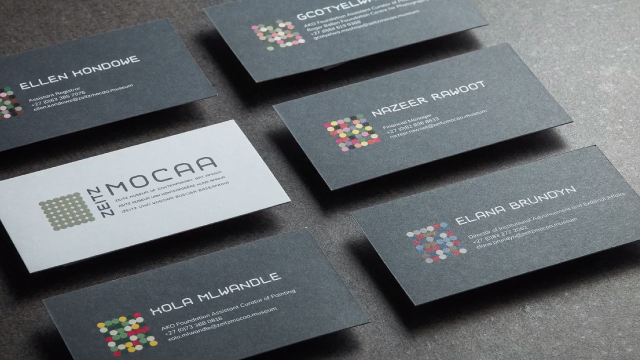
Africa’s largest contemporary art museum, the Zeitz Museum of Contemporary Art Africa (Zeitz MOCAA), opened its doors to the public on 22 September. The museum was inaugurated in the famous V&A Waterfront complex in Cape Town. Its architectural frame takes its roots in the Grain Silo, the tallest structure in the city at the time of its construction, in 1921.
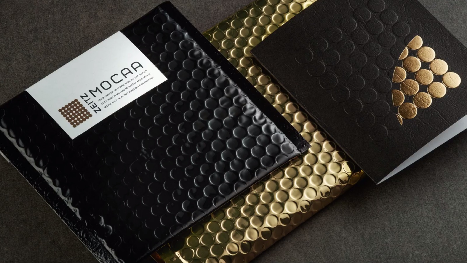
South Africa’s most-visited destination carries a great historical heritage, so the museum’s branding needed to be spun around the same motif. Whilst the architects managed to boost the building’s look by transforming the old structure into a contemporary, almost Tate-Modern-like one, M&C Saatchi Abel was assigned with the task of portraying the institution’s visual statement, outlining its spirit through new logo and brand identity.
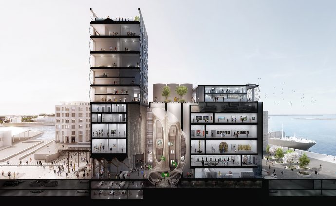
The cultural ‘cathedral’ now welcomes hundreds of art collections while its brand identity carefully preserves the city’s cultural legacy. It also reflects the desired iconic status and symbolic importance of the museum, both for the continental and international areas.
Contoured using the complex’s ruins, the famous British architect Thomas Heatherwick of Heatherwick Studio crafted the museum’s silhouette out of the 42 unused cylinder silos, which now host over one hundred galleries spread over 9 floors. The former agricultural space provides unique premises where one can admire the creative work of artists both from Africa and its diaspora.
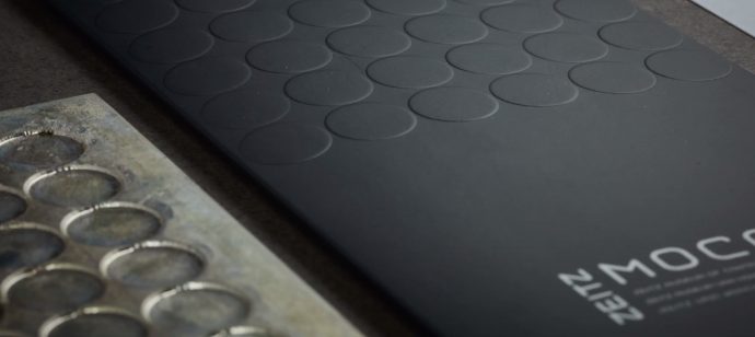
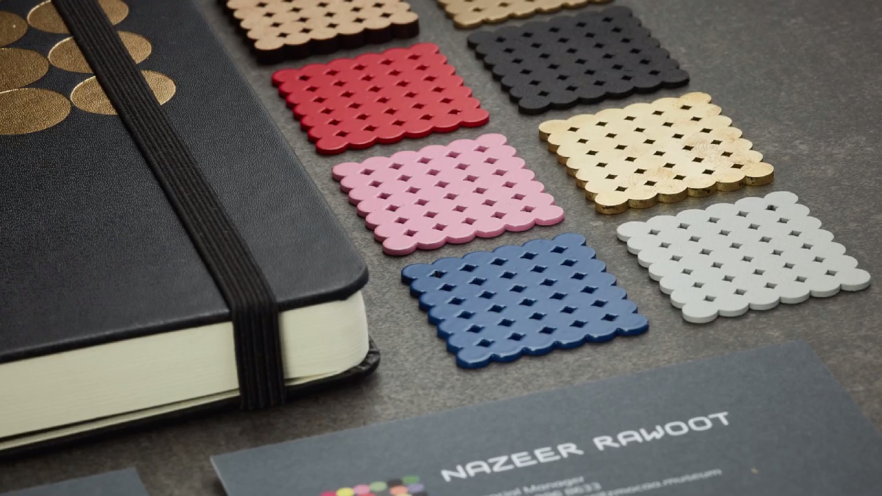
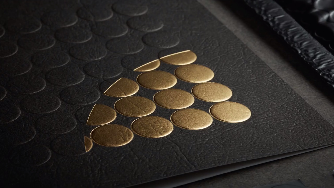
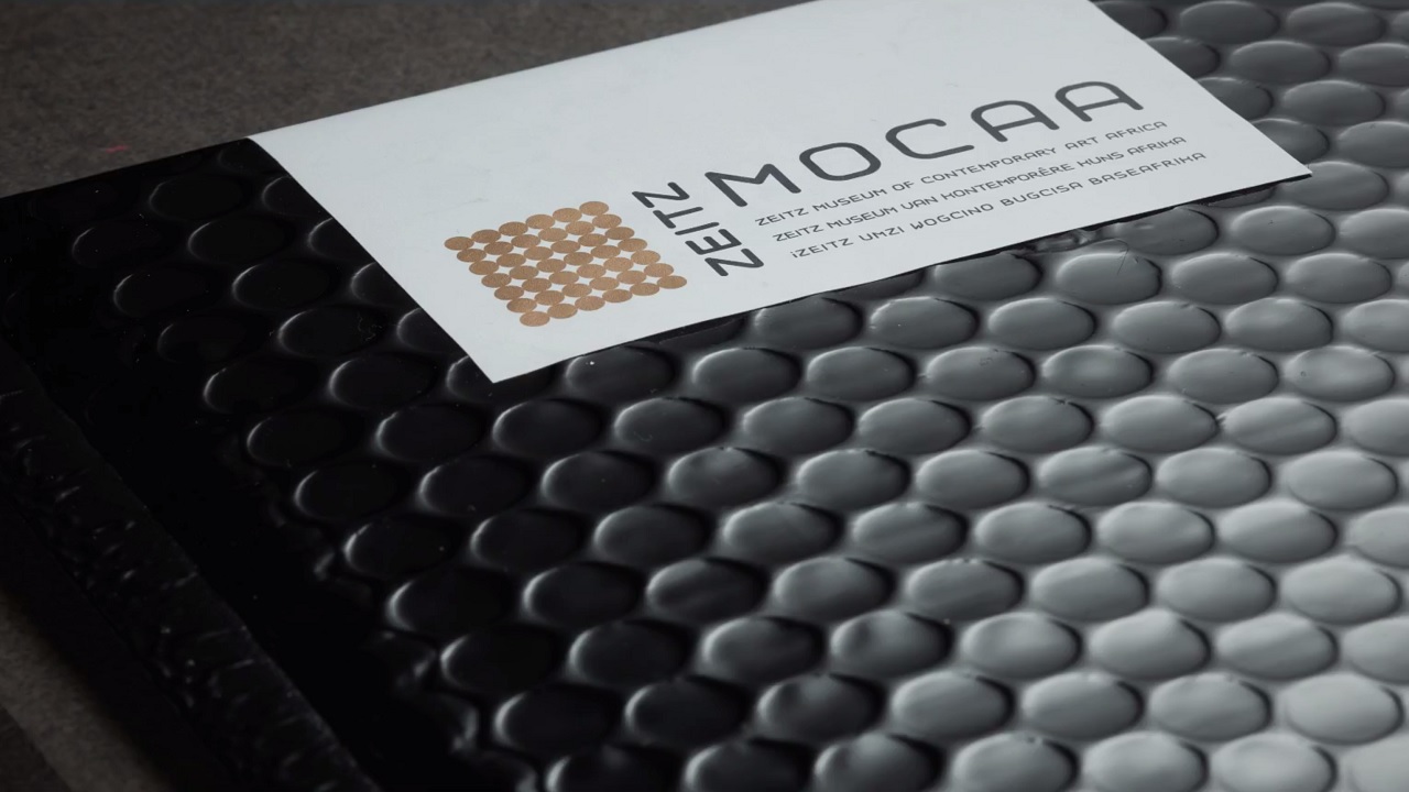
Seen from above, the massive concrete tubes form a simple grid; an image that awakened the Cape Town-based agency‘s interest to adapt it to a twenty-first-century style and use it as an exclusive visual representation for the museum. The artists processed the emblematic image of the silos and added a slight touch of creativeness to get an eye-catching logo worthy of admiration.
For the visual language to be even more delicate, and as close as possible to the original concept, the agency played with colors, textures, and patterns to soothe the connection between visitors and African art. The image stands as the museum’s authentic signature that mirrors the spirit of the historic building and the variety of art pieces that embellish the building’s walls.
As for the typeface, the artists improvised and sketched a new font from the scratch. Influenced by the simple layout of the silo tubes, the creatives united these circles with simple lines and wrote letter after letter, carefully created by hand and then digitized, delivering a particular design. The Forty-Two font reflects the building’s industrial style and will be used to signpost every room in the museum, from toilets to the restaurant.
Besides being named as the institution’s pro bono advertising agency, M&C Saatchi displayed a permanent photo exhibition inside the museum. This yet again proves the agency’s great passion for art that dates back to opening its eponymous gallery in London in 1985.
Although Mark Coetzee, Zeitz-MOCAA’s Executive Director says the museum is “geographically situated in Cape Town but has a dialogue with all 54 African states,” the decision to build the museum in the city and not elsewhere gave birth to a lot of controversies.
The museum encourages cultural education by offering free tickets for a few hours a week to African citizens. Yet, given that it is built far from the poorer communities, Africa’s newest icon might still be seen as an elitist destination which is impossible to be reached by a large number of people in need…
Credits:
Client: Zeitz Museum of Contemporary Art Africa
Agency: M&C Saatchi Abel, Cape Town, South Africa
Founding Partner, Chief Executive: Mike Abel
Founding Partner, Head of Strategy: Robert Grace
Founding Partner, Executive Creative Director: Gordon Ray
Creative Director, Design: Ashraf Majiet
Copywriter: Marguerite Nel
Art Director: Kirsten Collins
Business Director: Ille Potgieter
Account Director: Sam L’Etang
Account Executive: Luke De Kock
Video Editor: Nic Manshon, Daniël Ferreira
Producer: Ronwin Bailey, Juliet Esquire
