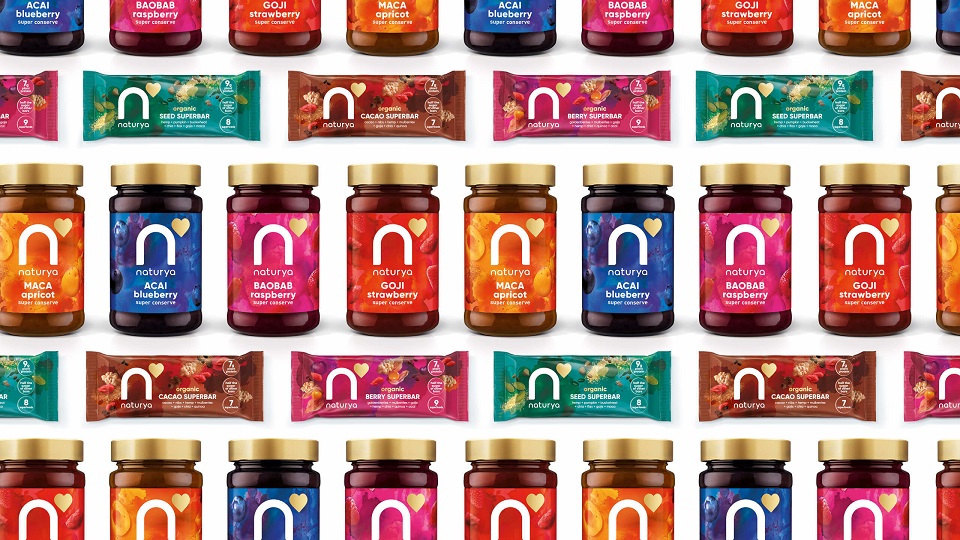
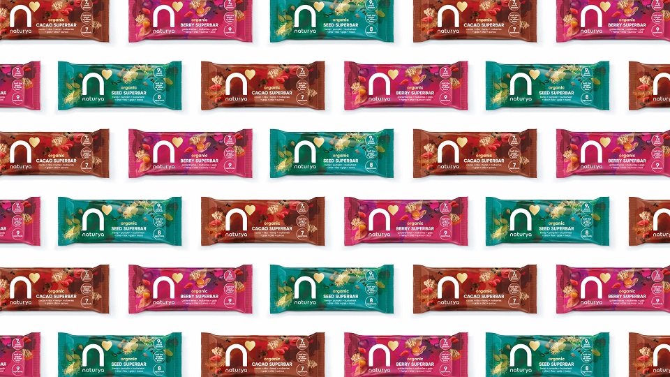
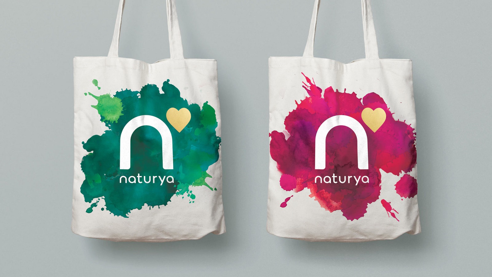
The food brand Naturya defines itself as a key player in the health food market across the UK and Europe. The company quickly grew into a premium food brand, delivering high-quality products to its customers. With a history of almost a decade, the company relaunched with a new visual identity and concept for its product portfolio, following a partnership with the FutureBrand design studio.
Each product of the Southstoke-based company is nature-inspired and proudly wears the manufacturer’s wish for people to adopt a healthier lifestyle. Positioned as a niche brand, the new visual signature extends the company’s presence into the market, aiming to target as many health-conscious consumers as possible.
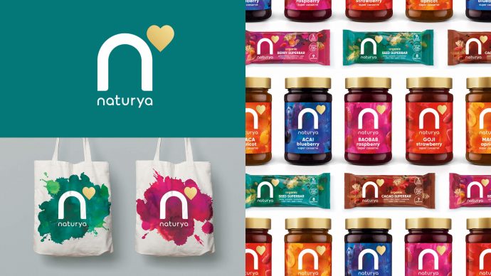
The rebranding project’s concept focuses on the products’ nutritional benefits, a value that was carefully analyzed and adapted to a visual notion that embellishes the brand’s fresh identity.
Driven by the strategic idea “Whatever you do, do it for real,” the brand aims to highlight the positive impact that its products can have upon one’s well-being. “Naturya makes you feel alive, bursting with energy – we wanted to ensure this positivity and abundance through the design language,” said Marie-Therese Cassidy, FutureBrand’s ECD.
First, the artists got inspired by the brand’s vibrant color palette and added a few vivacious illustrations to craft the packaging’s dynamic appearance. The new labels deliver an energic mood, while the gold lines, drawn on a matte background, showcase the products’ premium quality.
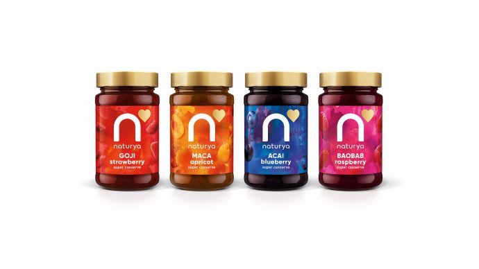
Spinning around a tranquil emotion, Naturya’s new image completes the company’s superior standards. The artists embedded Mother Nature’s best goods within the new personality and outlined them through a modern font, original logo, and suggestive illustrations. The design chosen to express the company’s spirit sums up the products’ wonderful benefits for one’s body and mind: nutritious, tasty, and aesthetically pleasing.
In addition, the logo, which was hidden somewhere in the back before the agency was invited to craft its new look, supports the brand’s new identity even more. Its simplicity encourages a more intense connection with customers while highlighting a nutrient-rich experience.
The fresh design concept emphasizes the brand’s commitment to offering premium products. It also mirrors the company’s attention for a healthy lifestyle and marks the brand’s attitude towards quality.
“When you are building a new brand to meet new consumer demand, it takes very special foresight from others to visualize the opportunity in the same way that FutureBrand do. We met with dozens of agencies, a few grasped it, but only FutureBrand absolutely got why we do what we do. Their vision, creativity, passion, and culture are inspiring. Their work on Naturya reflects all of it and more,” proclaimed the company’s CEO, Ben Purcell.
Inspired by unique flavors, but also by the natural and vibrant features of the company’s delightful products, the artists created a visual language that simply bursts with energy and engages consumers to start a healthier life.
