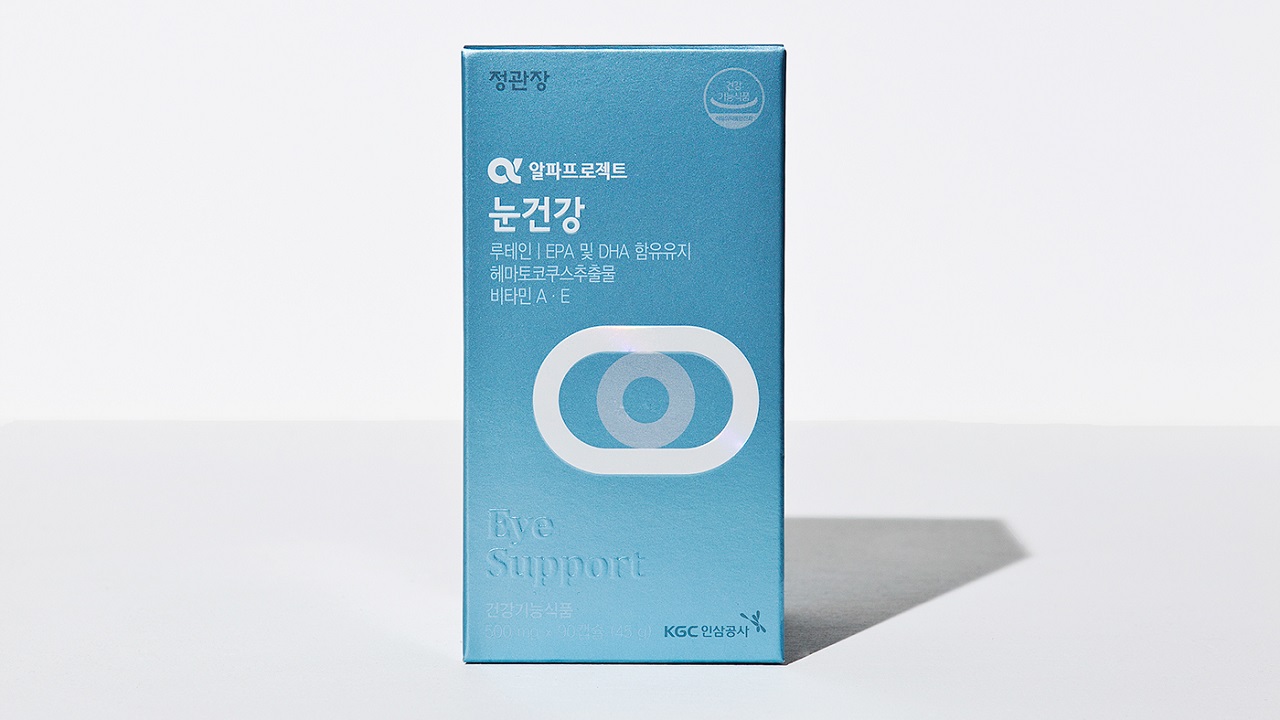
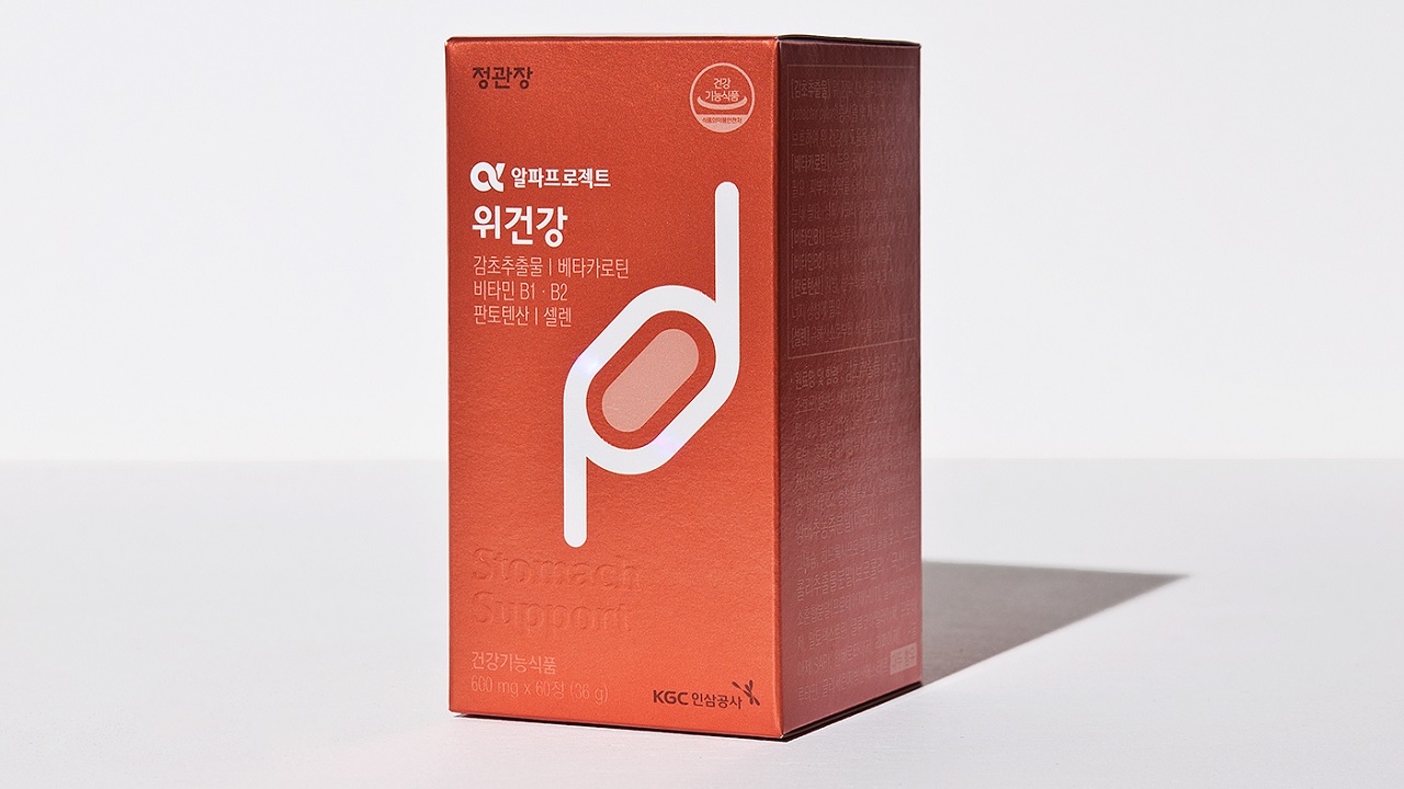
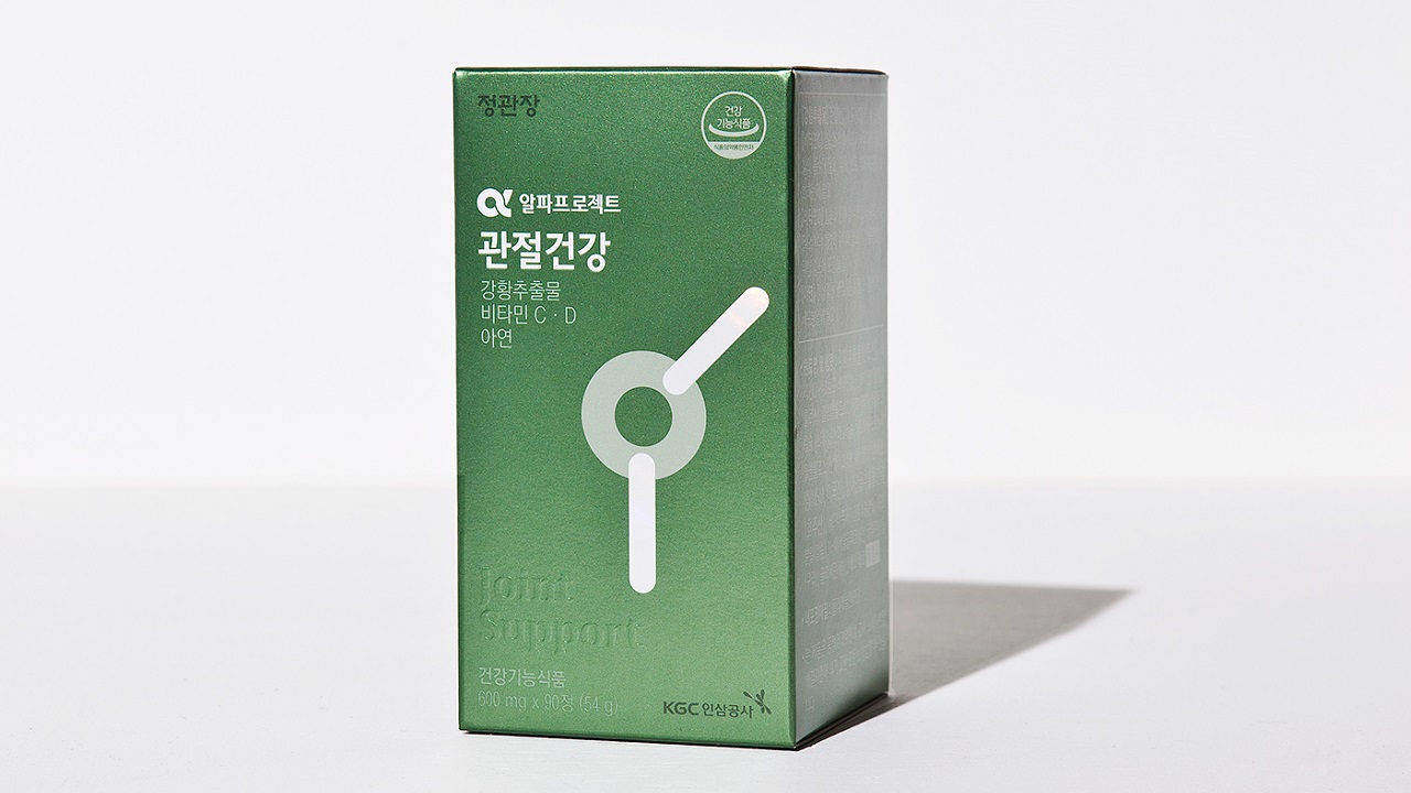
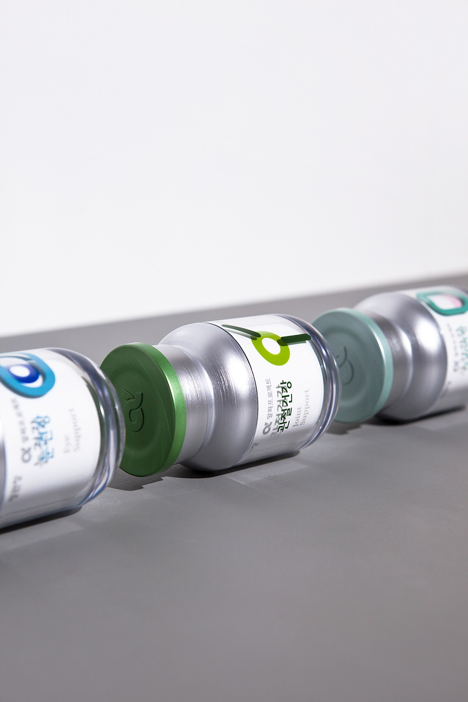
CheongKwanJang Corp (KGC) is a brand that produces innovative health supplements based on ginseng. To bring extra value to its customers’ healthy lifestyle, Asia’s most trusted and reliable ginseng product has introduced a new product line, Alpha Project. The recently developed special dietary supplements range from Liver Support, Stomach Support to Oral Support and Blood Circulation Support (and more), all of which represent products that have a strong foundation of vitamins and a fresh combination of minerals and herbal extracts.
To boost the sales of the new products, the company had to go great lengths in search of experienced artists who can develop the best imagery for these unique supplements. In order to visually represent their natural benefits, the brand contacted Content Form Context (CFC) studio, having just a single request in mind. To develop a packaging design inspired by human organs.
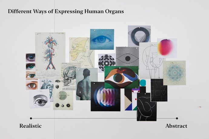
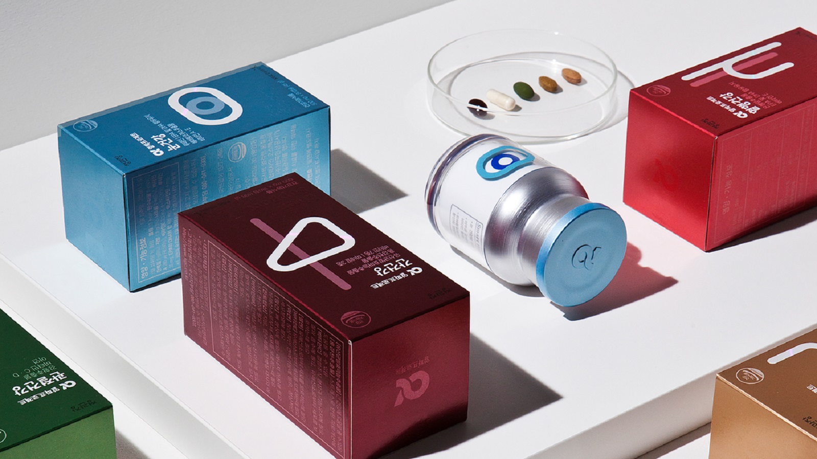
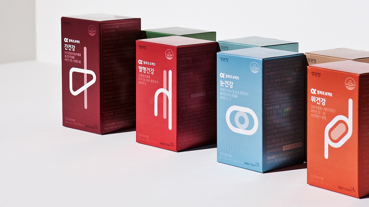
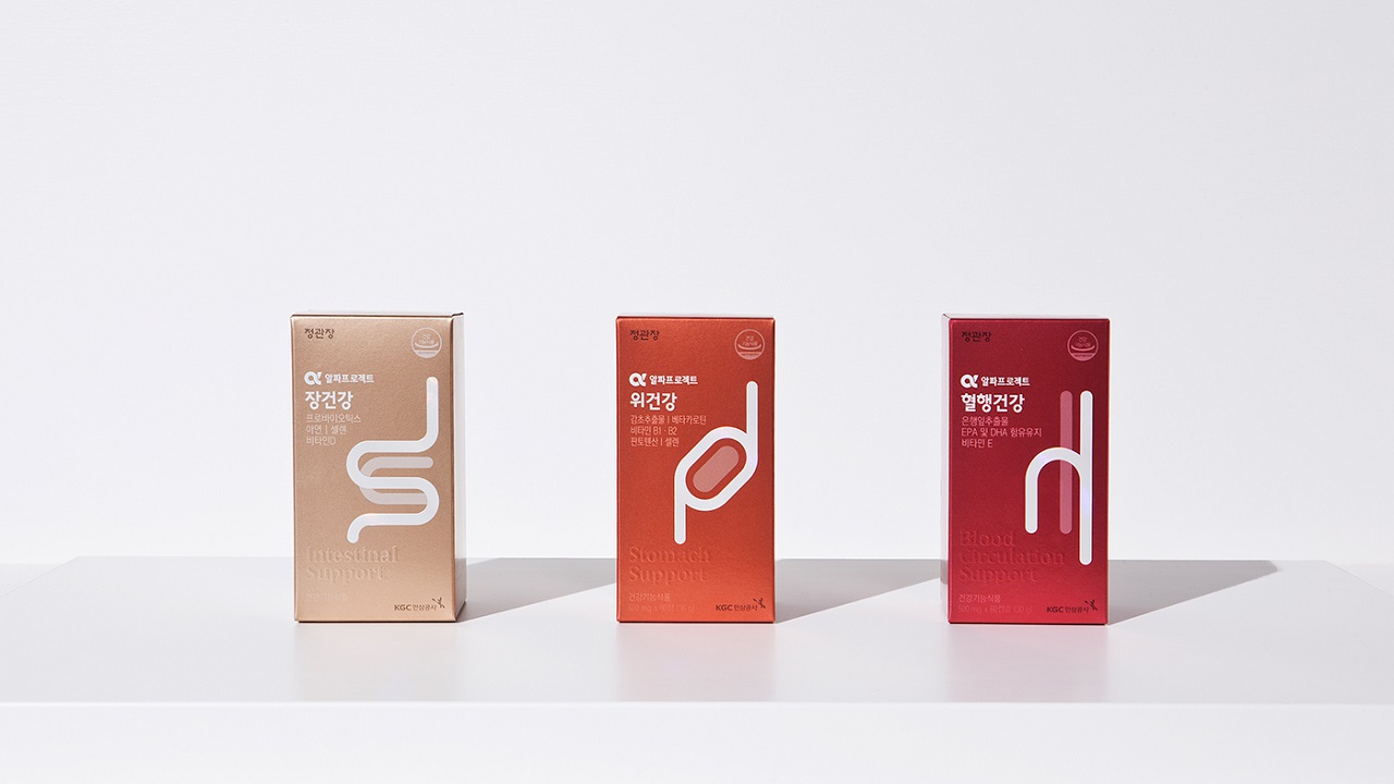
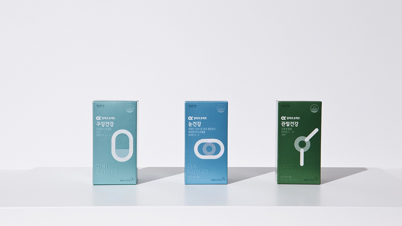
By getting to the heart of the matter, the creators had analyzed different ways to visually express the human organism, from super-realistic to abstract. Their brainchild is a simple, yet minimalist sketch, dominated by geometric shapes and contrasting colors.
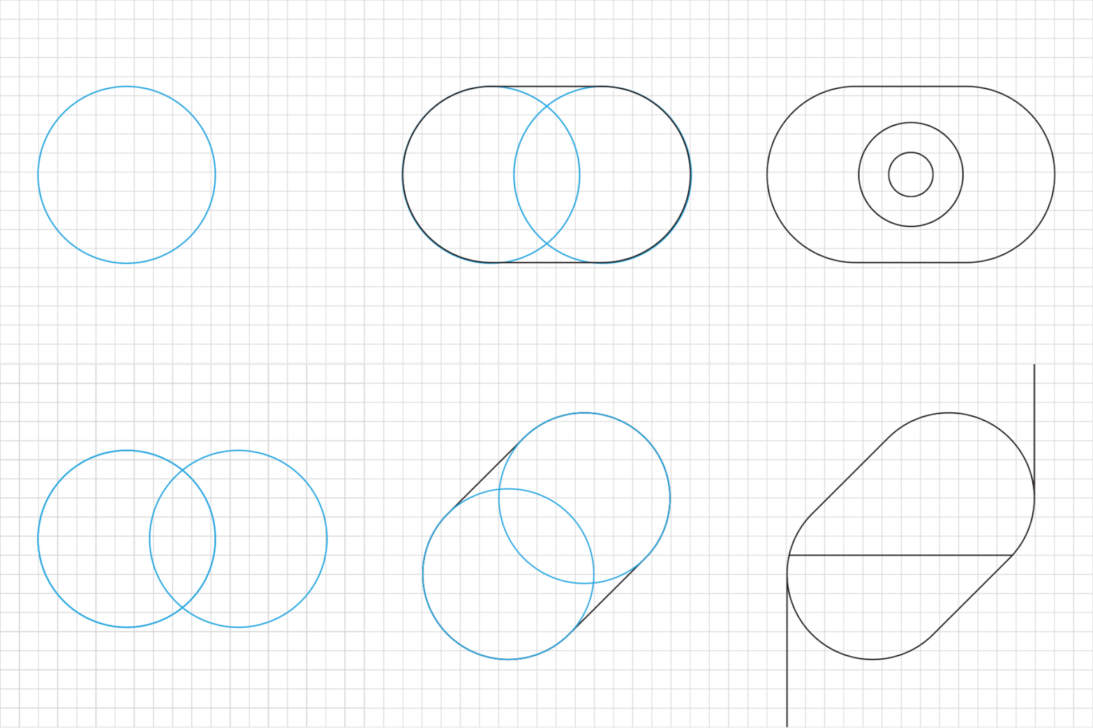
Each product’s logotype follows an individual graphic treatment. And although the visual concepts are executed abstractly, the final results reflect the anatomical reality of the human body in every detail.
All six newly-implemented visual identities make the brand stand out from other companies. The modern signature gives KGC a good visibility among consumers, whilst the idea of reflecting parts of the human body on the packaging strengthens the relationship between the brand and clients and raises it to a maximum level of confidence.
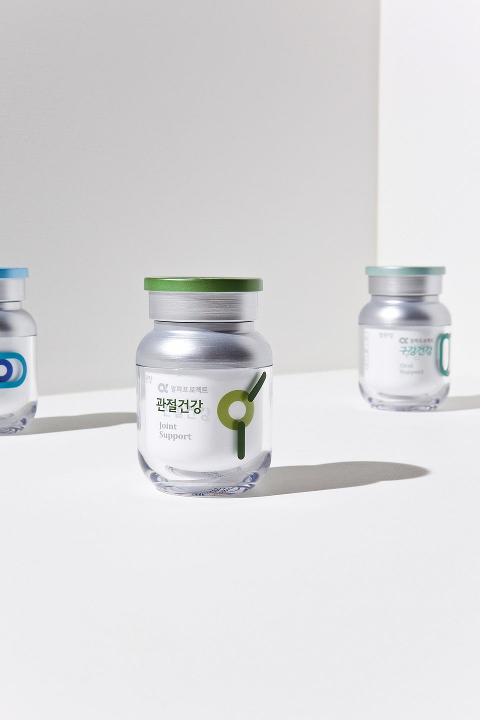
Human body is an ensemble made up of small mechanisms that complement each other. Together, they have the ability to maintain life. Interestingly, the artists draw inspiration from this and reflected it on the flasks’ labels.


The bottles include multiple layers, each one being composed of two different symbols. The first one, placed on a white paper band that contains info about the product, embellishes the vessel’s first glass zone. The second symbol sits on the bottle’s exterior glass layer, completing the background image with other minimalist lines. Standing together, the duo unveils a whole entity, similar to one of a human ‘temple.’
While the packaging expressing human organs delivers a high level of confidence, the chromatic detail, added to the bottles’ neck, expresses the company’s effort in producing premium products that can help anyone enjoy life to the fullest.
