Through its television channels, magazines, books, travel experiences, and expeditions, National Geographic aims to inspire everyone to take a better care of our planet. The company targets science enthusiasts and those committed to exploring the world in search of its best-kept secrets. In other words, the topics and the sensory experiences promoted by the magazine tickle the intellect of the most inquisitive minds around the globe – and at no time of life is curiosity stronger than in childhood.
Nat Geo Kids nurtures children’s curiosity and cares for their intellectual development. These are the moments when children seek knowledge by exploration and when the young minds wonder about what surrounds them. Nat Geo fosters their curiosity and feeds their desire to explore the unknown by stimulating their learning process with a new and pleasant visual experience.
With the help of Plenty studio, the Nat Geo’s children’s media department changed its visual identity into a more playful one, with an image that strengthens the brand’s connection to kids and reflects its core values.
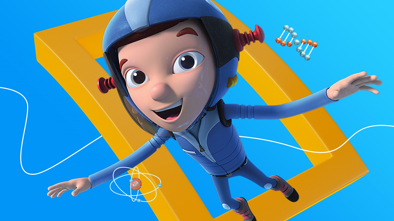
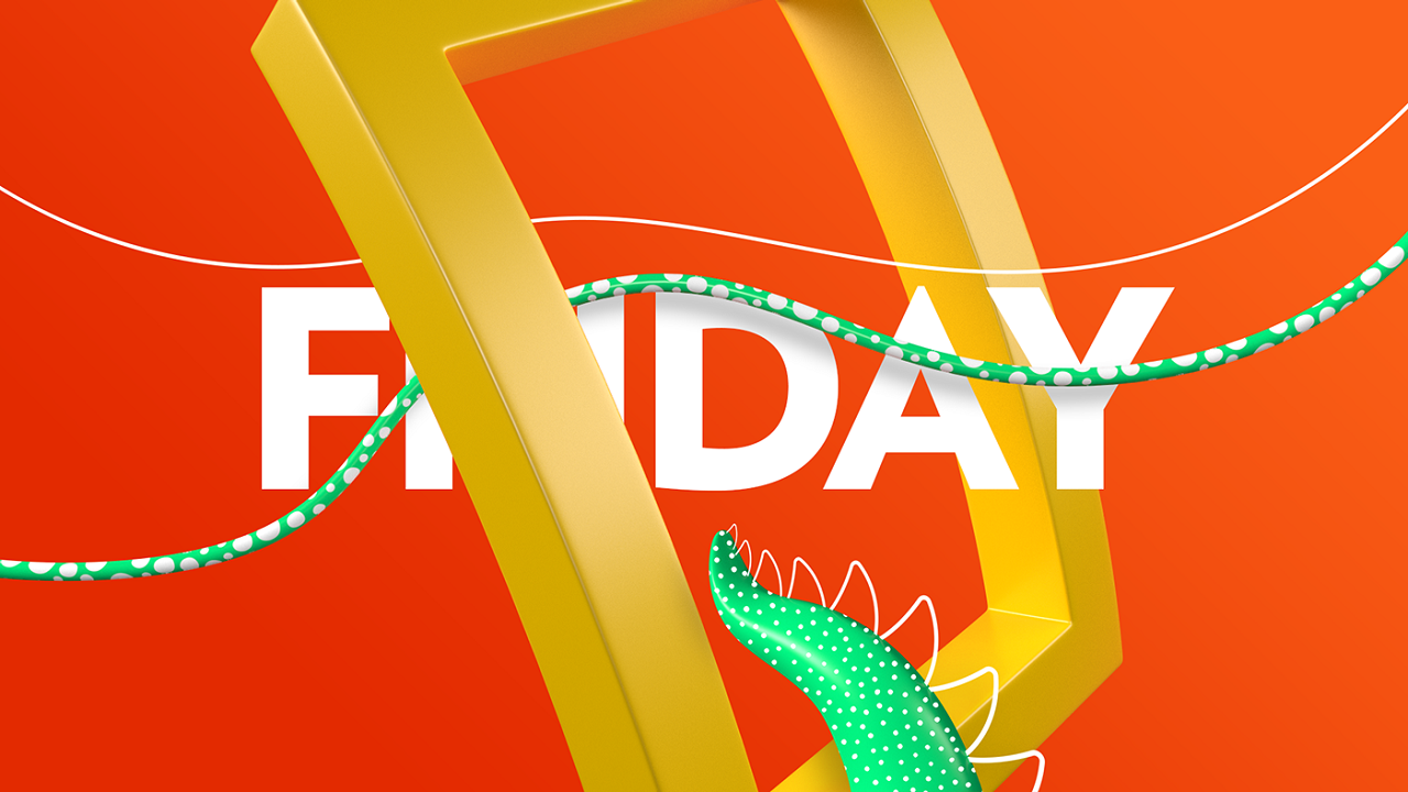
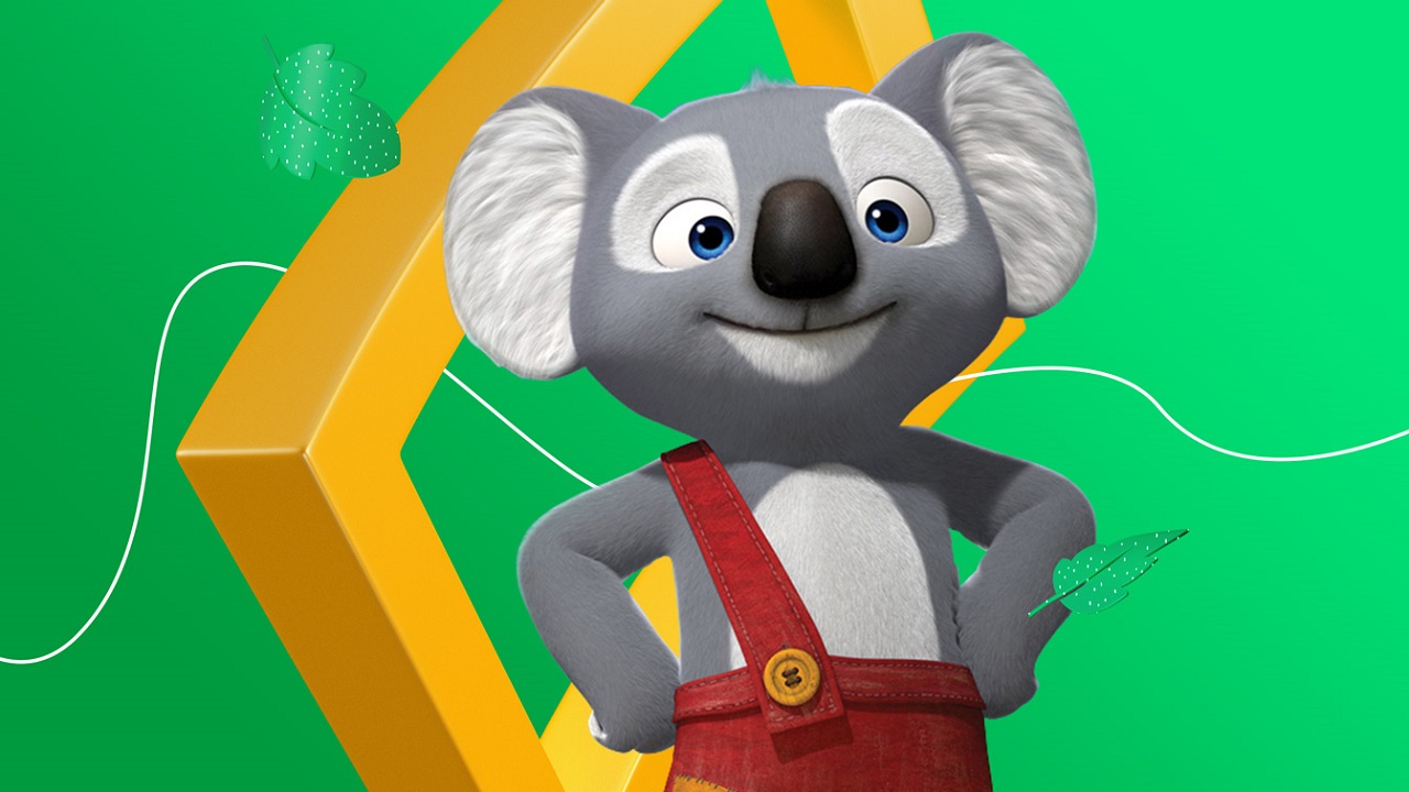
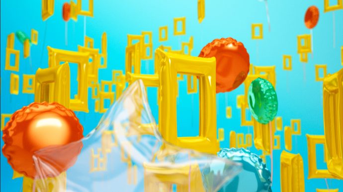
Inspired by the company’s world-famous logo, the emblematic yellow frame, the artists crafted a new visual identity driven by the premise “Because we know you are curious.” The creatives transformed the simple logo to a more relevant symbol for kids. In the hands of the designers, the notorious frame metamorphosed into a fictional portal that inspires children to cross beyond its imaginary gates and explore nature’s scientific treasures.

The protagonist of the creative system, the yellow frame, becomes a flexible element stylized with fluid elements. It unveils the dynamic universe the brand wants to explore through a series of featured documentaries for children. The energetic logo is as active as the kids can get and unfolds before their eyes as a bouncy visual experience that captivates their attention.

“It was very important that the branding reflects the channel’s connection with the core brand. National Geographic’s unquestionable value as a synonym of quality, and prestige had to be present,” says Mariano Barreiro, VP Branding at Nat Geo.
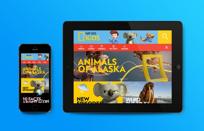
The artists applied the same visual treatment for Nat Geo’s main content sections: Science & Sea, Nature, Animals, and Space. For each theme, the designers created different graphic packs that precisely reflect the topics approached by the science network
The key elements of the packs are highlighted by predominant colors, a 3D object gallery, and a set of patterns that stand as the skeleton of the resulting images. “The mix between 2D and 3D generates a connection with the kids. It feels as if they can intervene the elements and play with them on and off the screen,” claims the Buenos Aires-based agency.
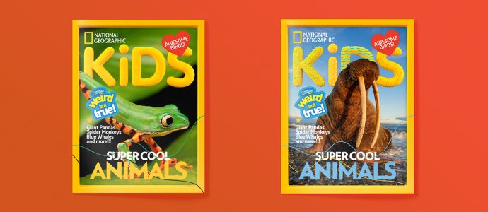
The new identity supports the company’s scientific values, while its looks were specially created to reach a younger audience. The newly introduced jolly personality can be found across TV promos, idents, print, and online. Wouldn’t you just love these as a kid? We certainly would…

Credits:
Client: Nat Geo Kids
Agency: Plenty
