There is something true about the fact that many of people are faithful to a certain brand, but because humans are emotional beings, we instinctively react with positiveness at the sight of a colorful, aesthetically pleasing packaging that wraps up a product that we need to buy. So, we might quite easily ‘betray’ a brand for another that knows how to creatively sell its goods or service. And packaging is such a specific thing that it influences consumer’s shopping experience. It plays an important role in a brand’s image and, most importantly, it represents the most precious tool for communication. This is where a brand can get as creative as it wants to express the quality of their products.
In this ‘ocean full of fish’, which boasts plenty of outstanding packaging designs that combine different styles to satisfy everyone’s taste, finding a product that pleases your sight and lifts your appetite just by looking at it seems almost impossible. Or is it?
Join LOCO Studio and their ‘fish’ swimming in their ‘ocean.’ Within their waters, or portfolio, you’ll be able to find many sea creatures, or projects, sliding along creative ideas to finally burst in endless creativity.
Just recently, the warm “Creativity Stream” that fuels the studio’s imagination mixed its waters with Nord Stream,” a current that has brought an eponymous product line of preserved foods. The waters just washed off at the agency’s shores in Nizhny Novgorod, Russia, leaving five different types of seafood on the creatives’ desks. They needed a bold visual identity that would describe both their exquisite taste but also their premium quality.
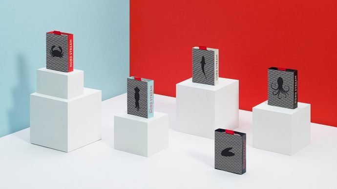
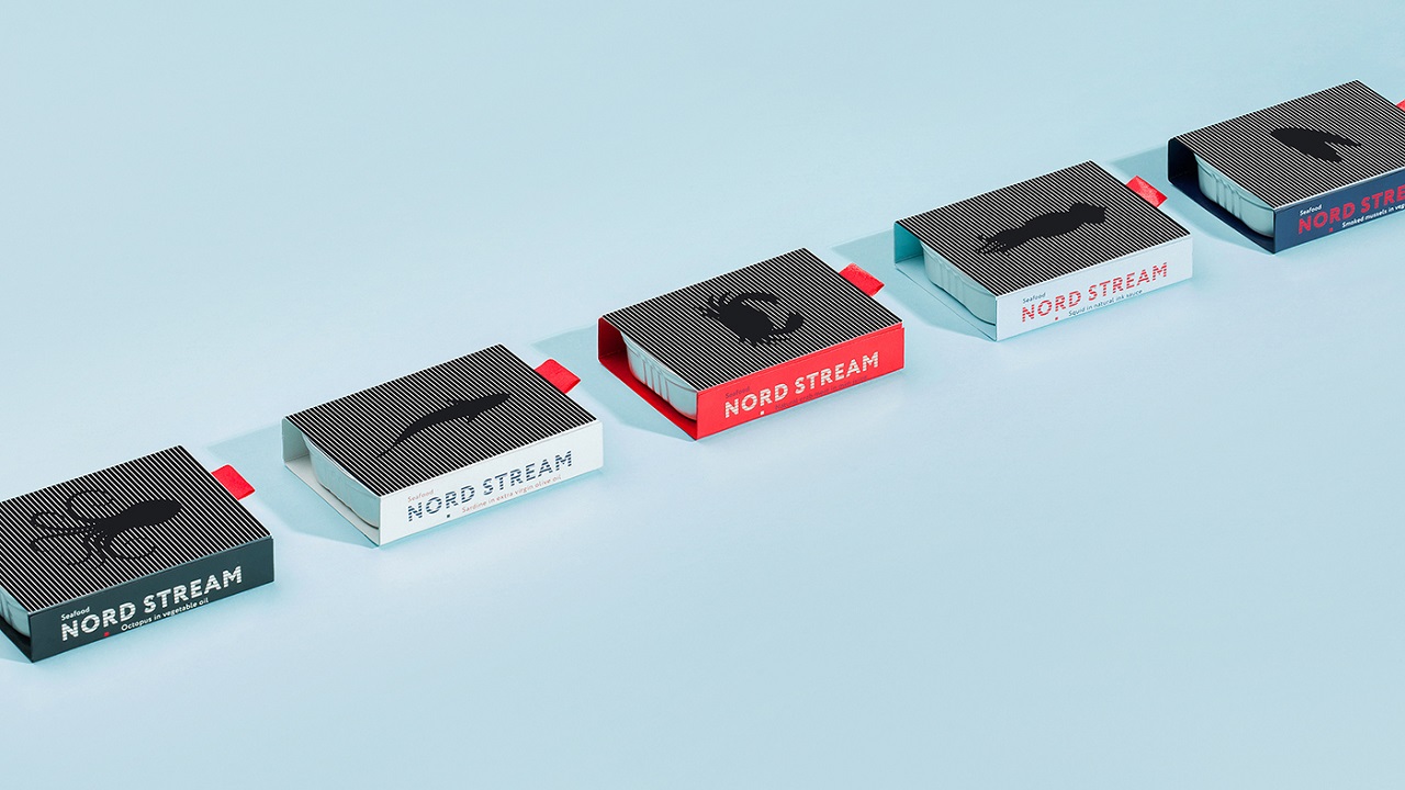
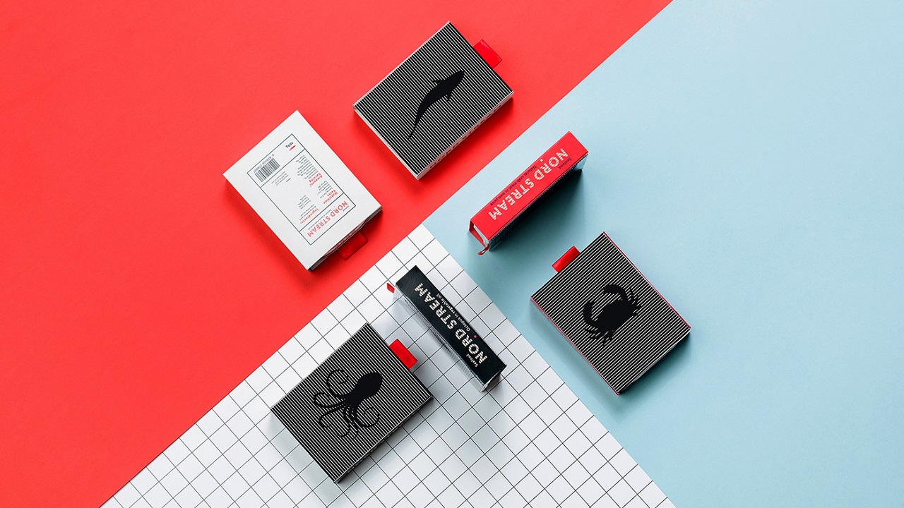
These marine animals were sardines, smoked mussels, crabs, octopuses, and squids, each of them carrying a high percentage of vitamins and minerals within their nutrient-rich DNA to help you keep a healthy, strong, and happy lifestyle.
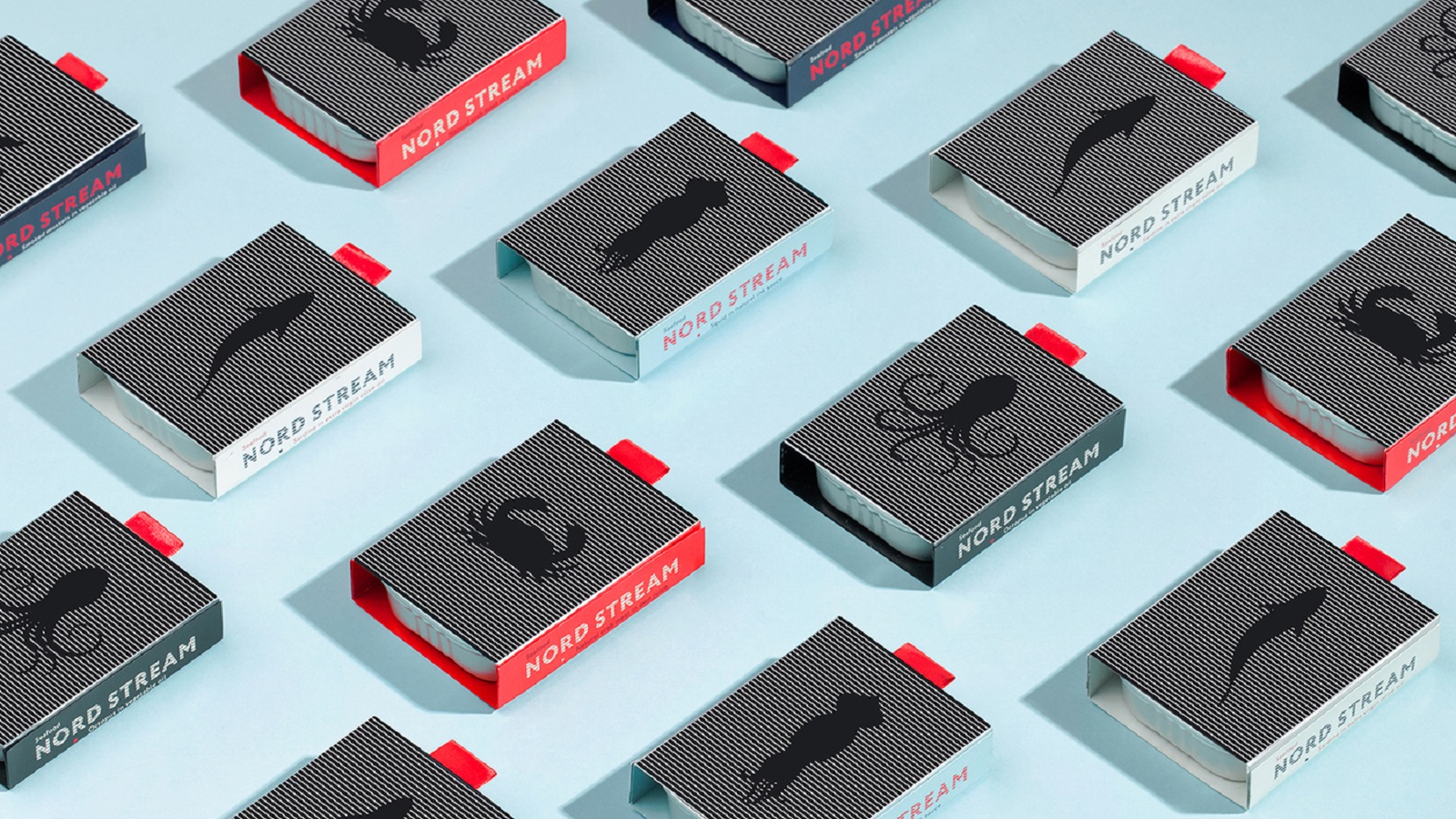
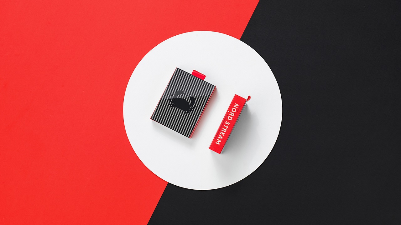
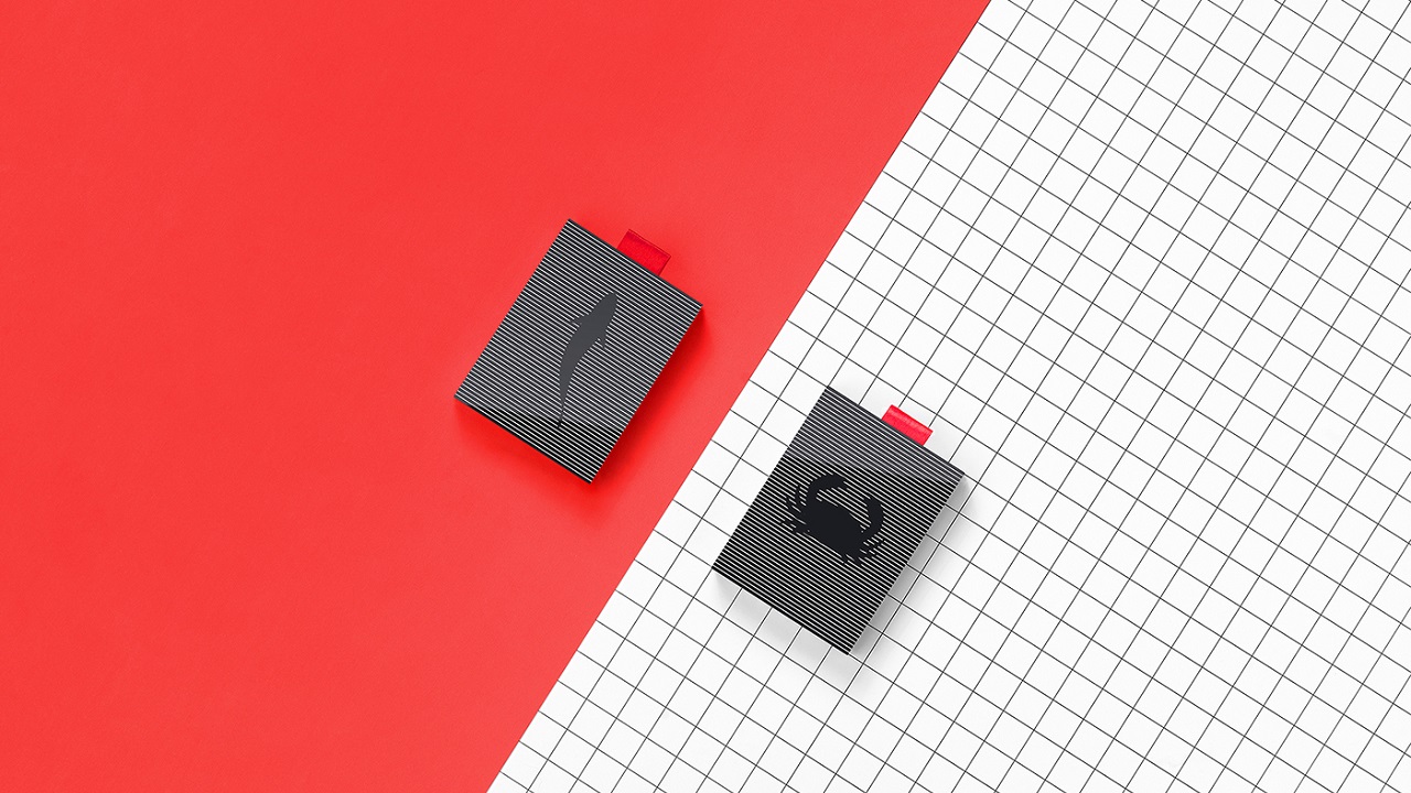
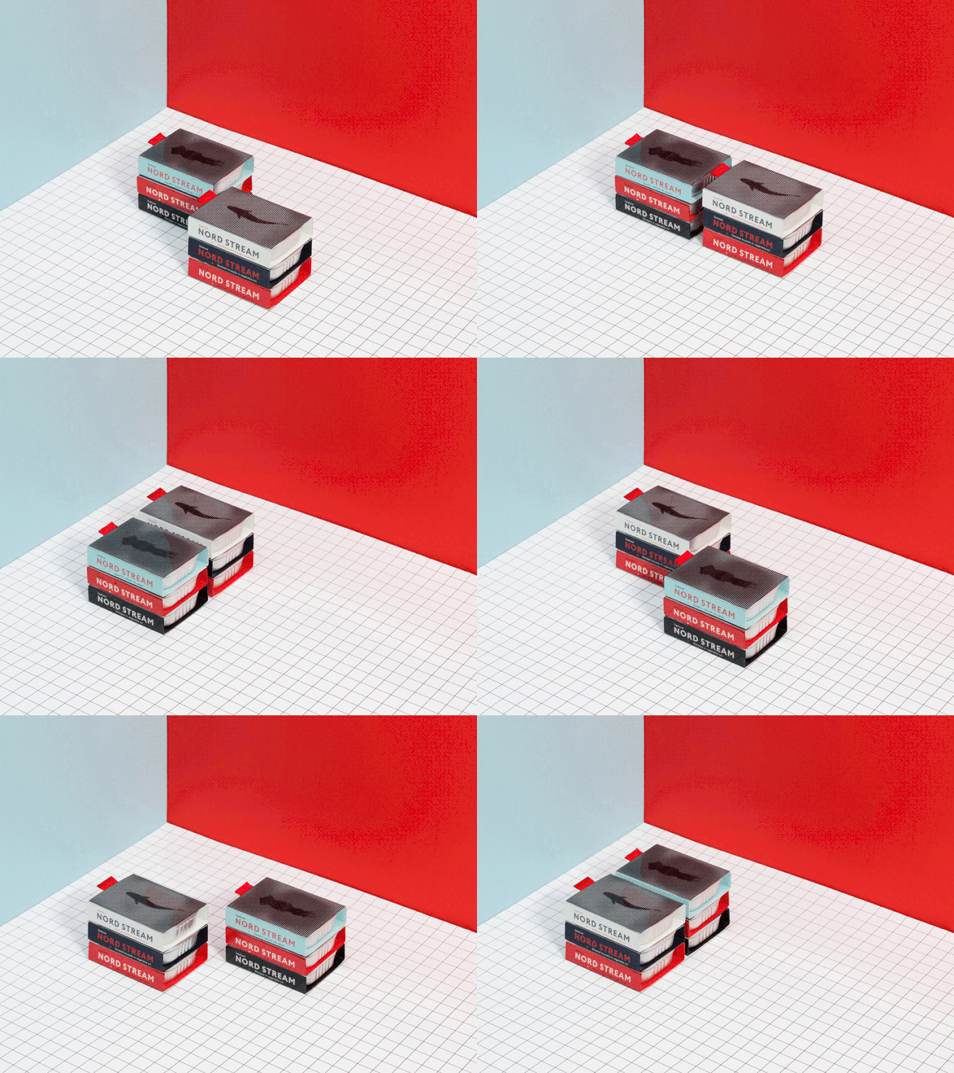
To complement these benefits, the studio found an ingenious way to spice up the products with a packaging design that visually balances your diet. Each flavor has been attributed to a visual identity that communicates with potential customers through a hidden animation.
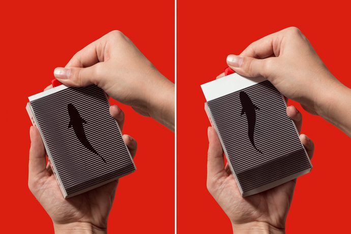
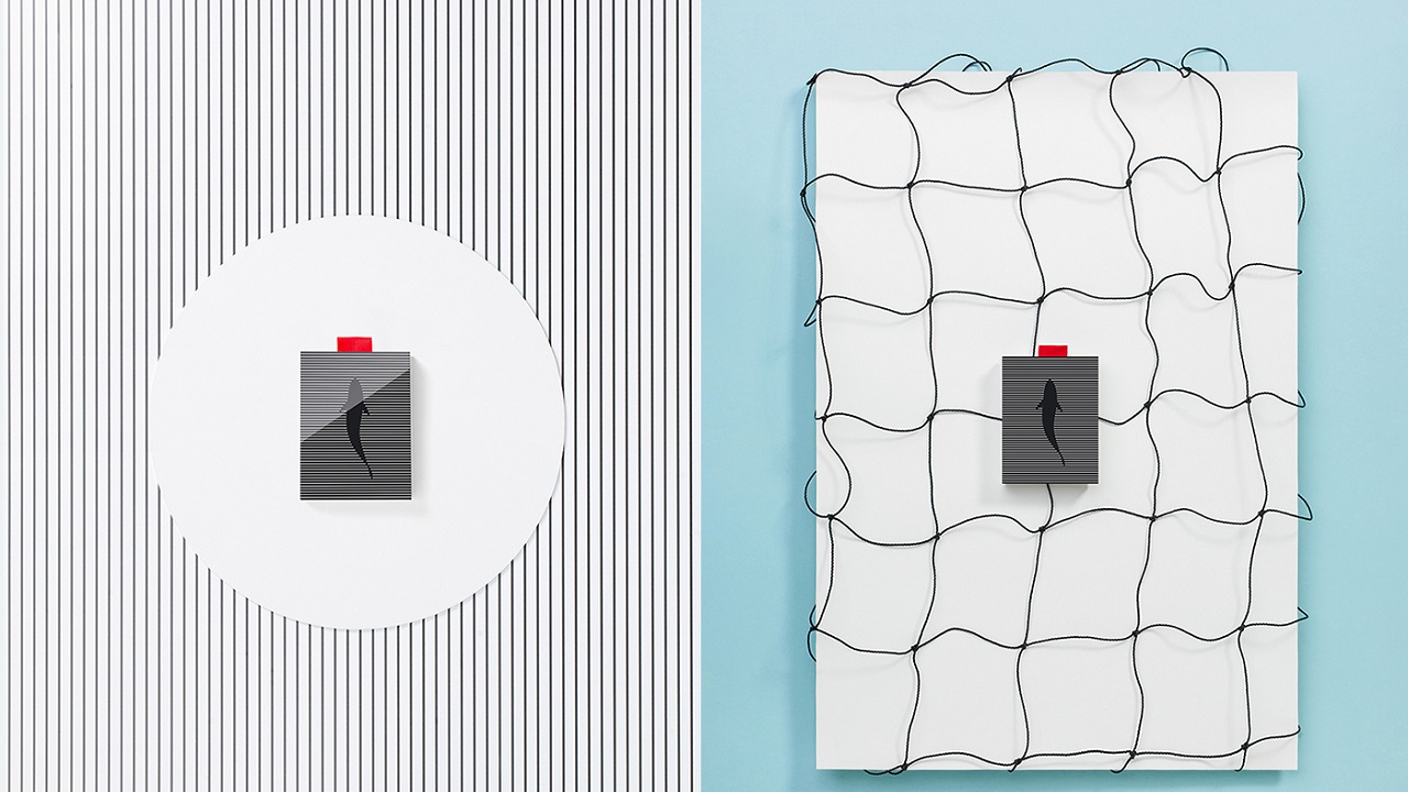
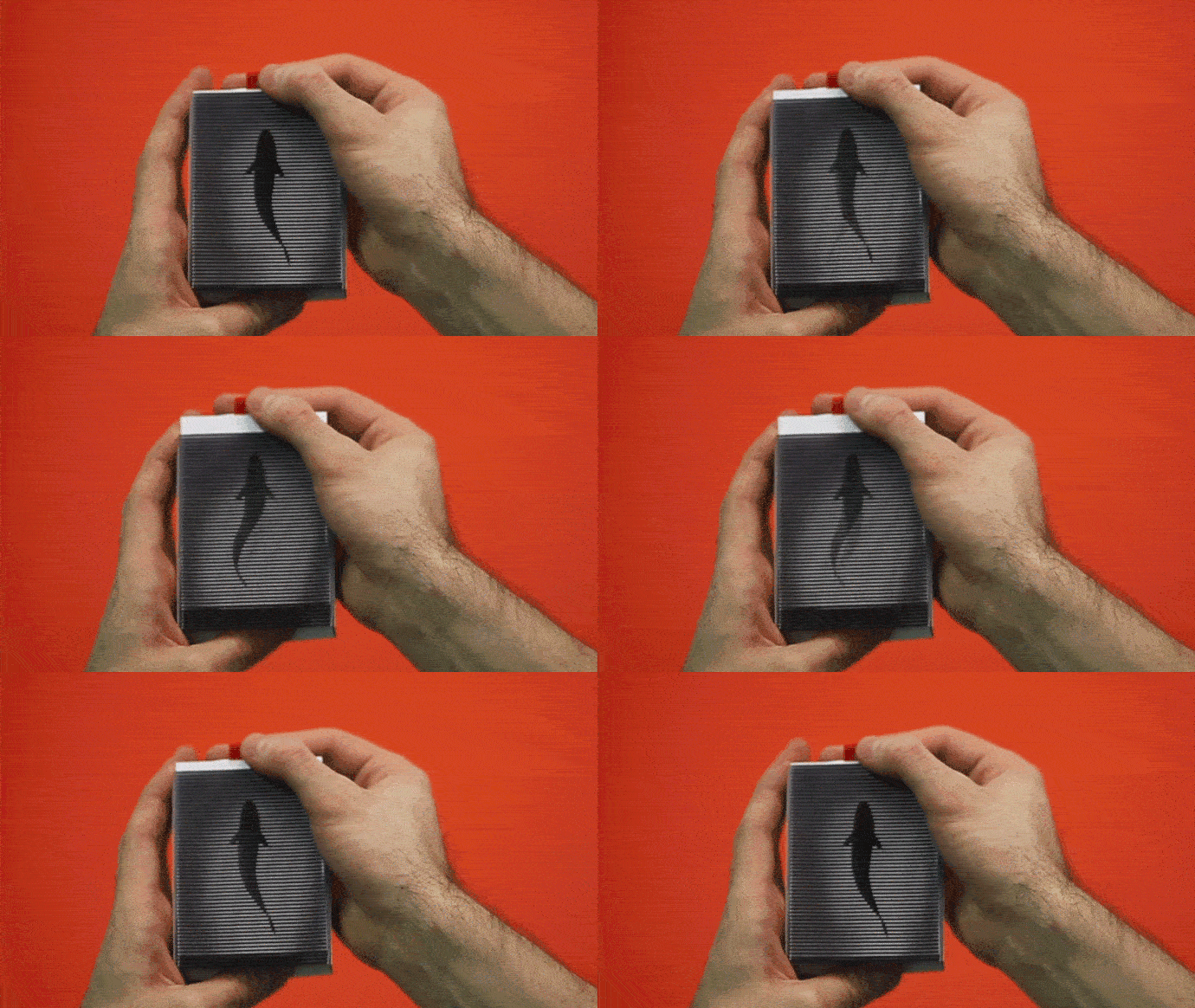
Although the pictures seem static, there’s a pulse that runs through the veins of all of them. Each image shows its movability once the consumers find out how to activate it. To trigger the whole action, the clients need to use a special key that lies at the top of the packaging.
The key, which actually bears the shape of a red strip, starts the whole graphical show with an artificial animation that faithfully reflects the natural movements followed by these sea creatures in their own familiar environment.
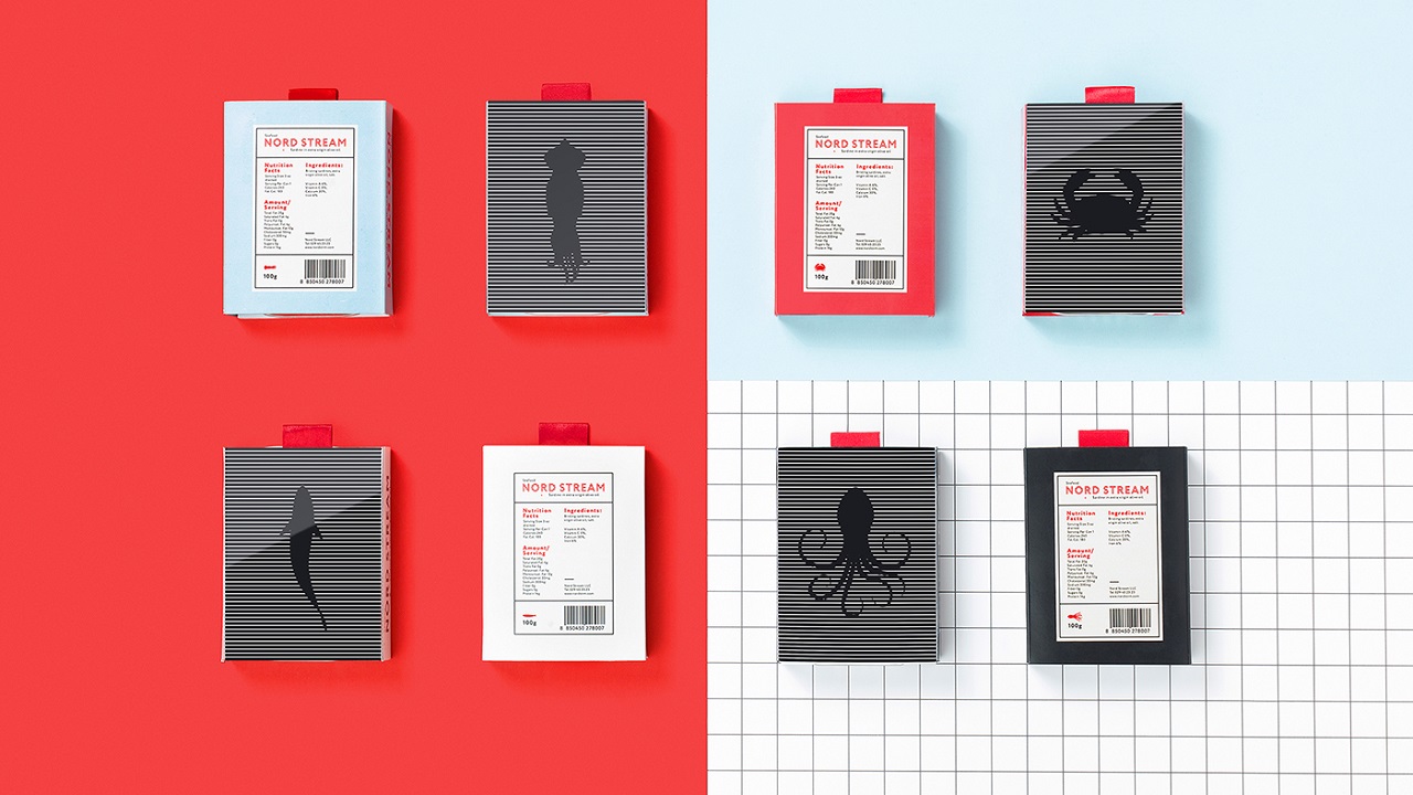
While the main side of the package is dedicated entirely to the animation, the back side brings room for information about the ingredients and the nutritional values.
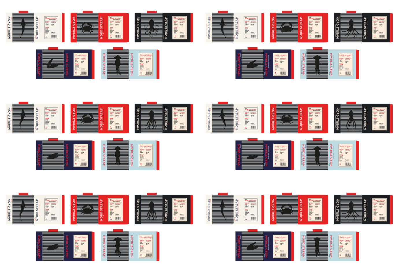
The packaging’s lateral sides were reserved for the brand’s name written with a strong typeface. But the bold font is interrupted by parallel horizontal lines, a sign that the company’s name was created using the same striped design in mind, embracing the pattern that contoured the animated illustrations.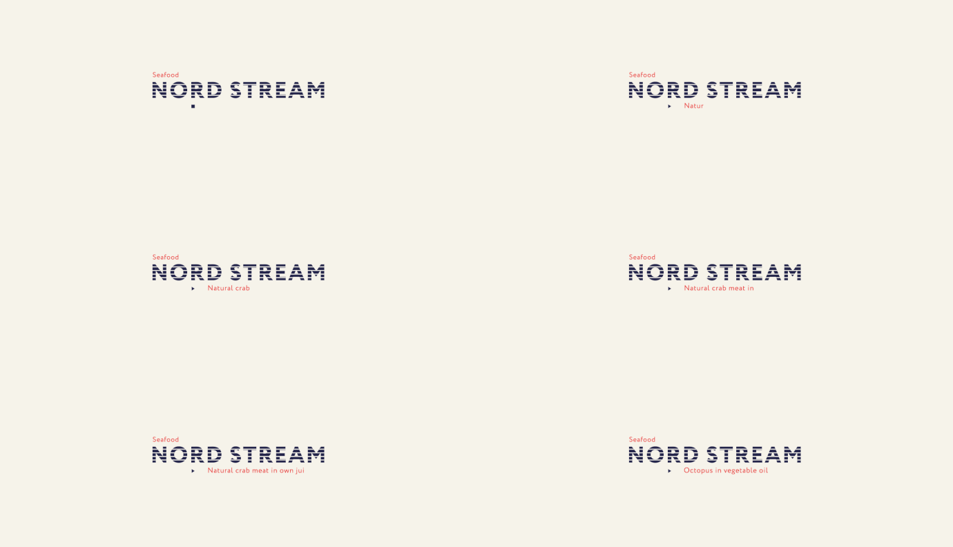
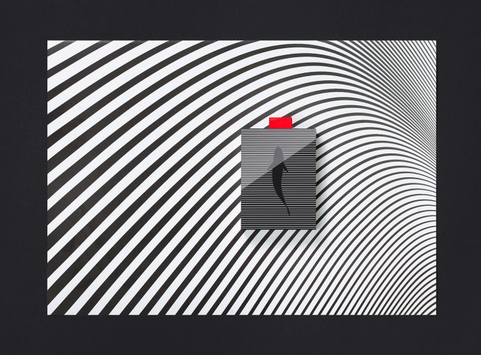
“While creating the concept, we came up with the idea that communication of the product with its potential customer should be done with the help of the hidden animation, which is based on the work of the moiré pattern. The picture which is on the top of the package starts moving when you open the package. It impresses and involves a customer in the process of communication with the product,” claims the agency.
The simpler the illustrations seem, the more sophisticated they are. By giving an energetic flow to an image that lacks in movement, the creatives succeeded in transforming a routine shopping experience into a fun and memorable one. The agency claims that the brand is available for purchase. So, what are you waiting for? Ready, set, SHOP!
