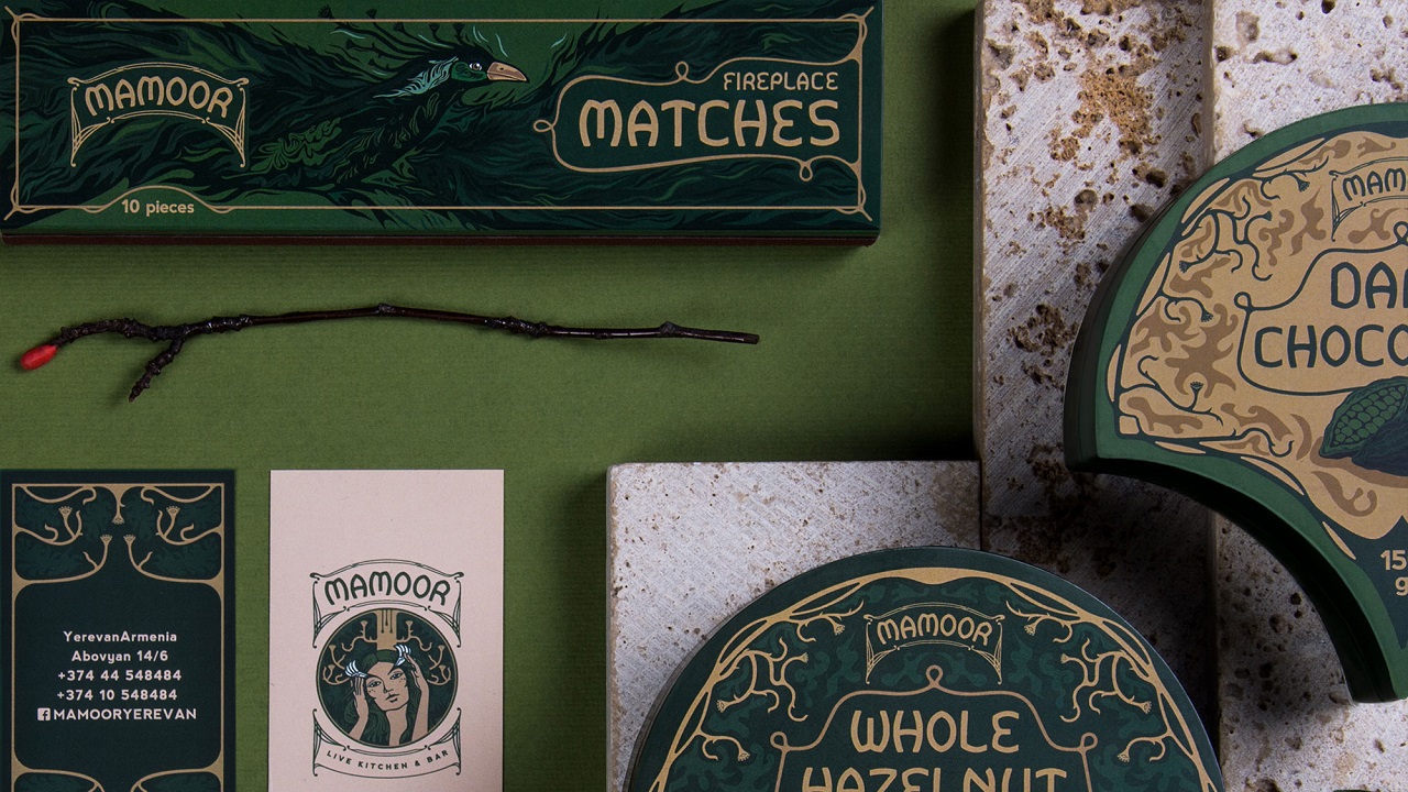
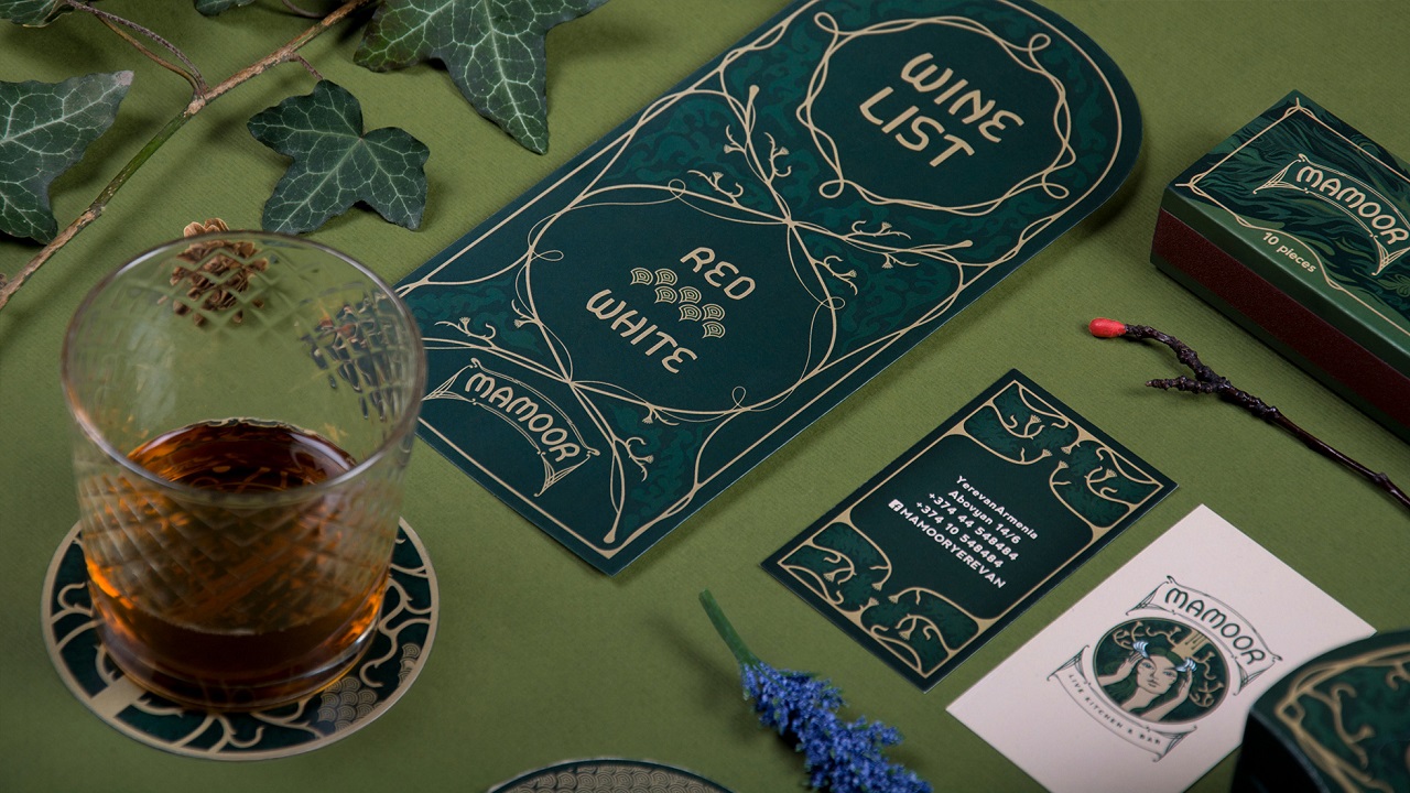
In folklore, a forest is a symbol of mystery and is usually inhabited by mystical creatures such as witches, fairies, and various monsters. The personality of each of these supernatural entities has already been outlined, so it’s quite difficult for present-day authors and writers to create content that will fascinate readers just like the original tales do. Still, there are artists who prove that new ‘folktales’ can be as captivating as the original ones.
Whoever said that great fairy tales are dead hadn’t stumbled upon MAROG creative agency‘s amazing story “Mamoor.” Long story short, the modern folktale is about a dense and virgin forest ruled by a fairy who has sweet and special treats for anyone who decides to wander through her enchanted woodland.
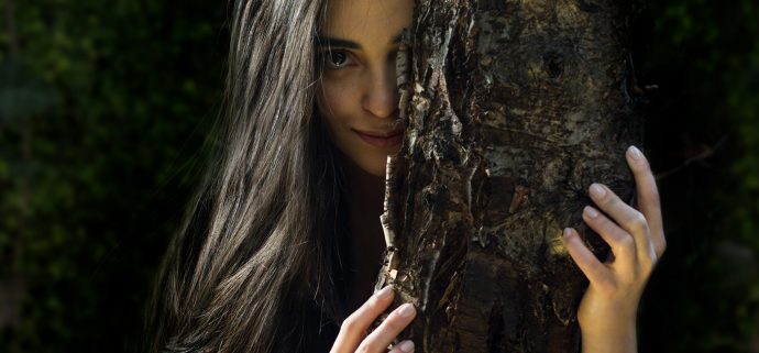
Mamoor isn’t just an ordinary folktale. Actually, it represents just a metaphor the authors chose to visually express the friendly—yet mystic—spirit of Mamoor, a restaurant located in Yerevan, Armenia. Being opened quite recently, the restaurant welcomes its guests with a cozy ambiance and allows people find everything they need to feel more connected to nature.
The chosen colors, the interior design, and even the name (which in Armenian means “moss”) got perfectly mixed, tricking your mind into thinking that your dining experience unfolds in the middle of a forest, where fairies enchant you with their perfectly-soft voices and trees become the best companions to keep you entertained.
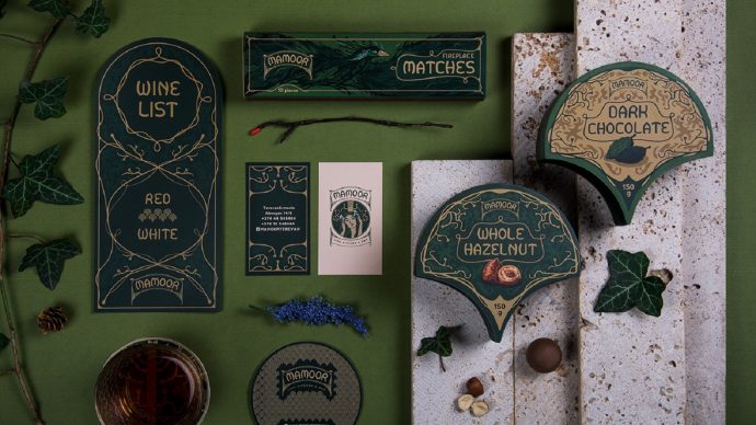
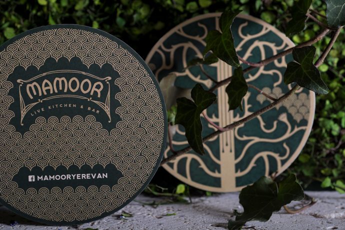
To convey this feeling, the Yerevan-based agency defined the restaurant’s visual identity by creating graphic elements that combine a series of good treats delivered by nature itself with a well-known motif frequently present in fairy tales.
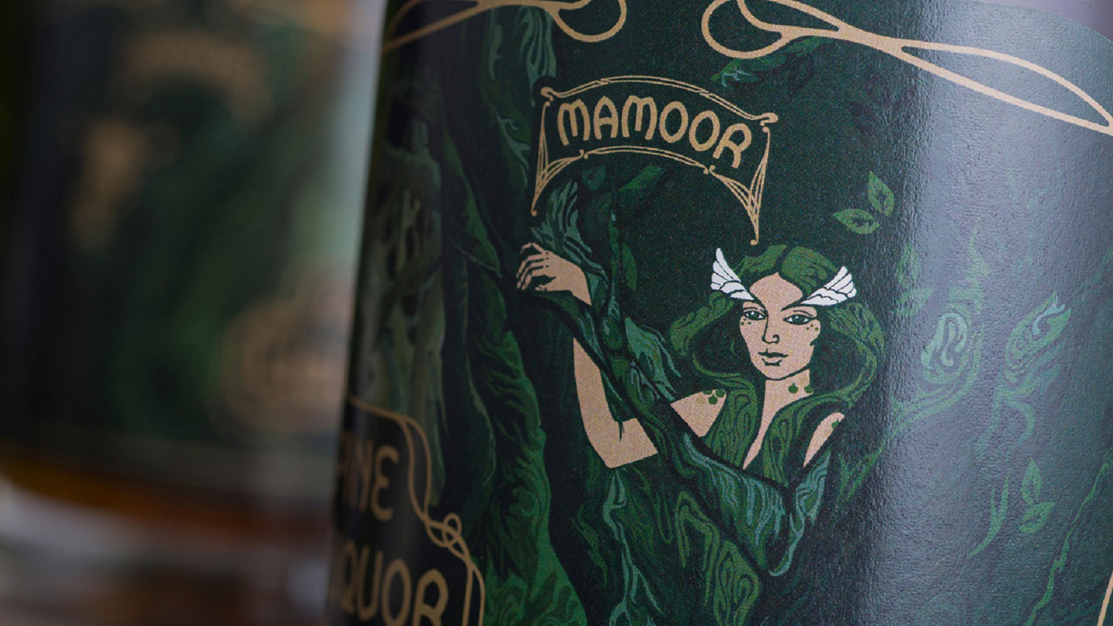
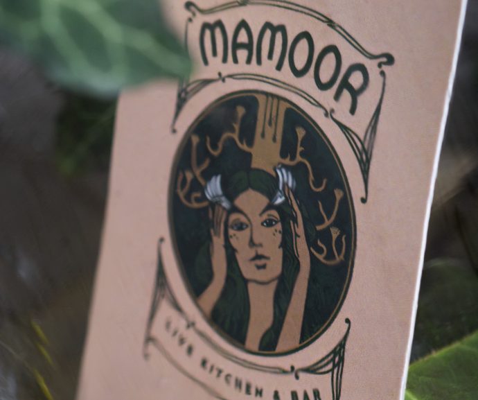
For example, these figures can be admired on the logo, which features a charming fairy. Her face is beautifully complemented by a stylized tree that stretches its branches towards the back of her head. When admired as a whole, the branches seem to form a halo that perfectly harmonizes with the mysterious girl.
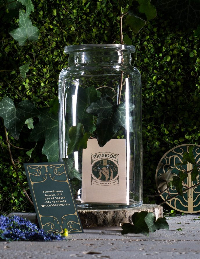
The fairy, accompanied by other special characters, put a spell on a series of brand items, specially created to “liven up the entire visual identity” of the magical restaurant.
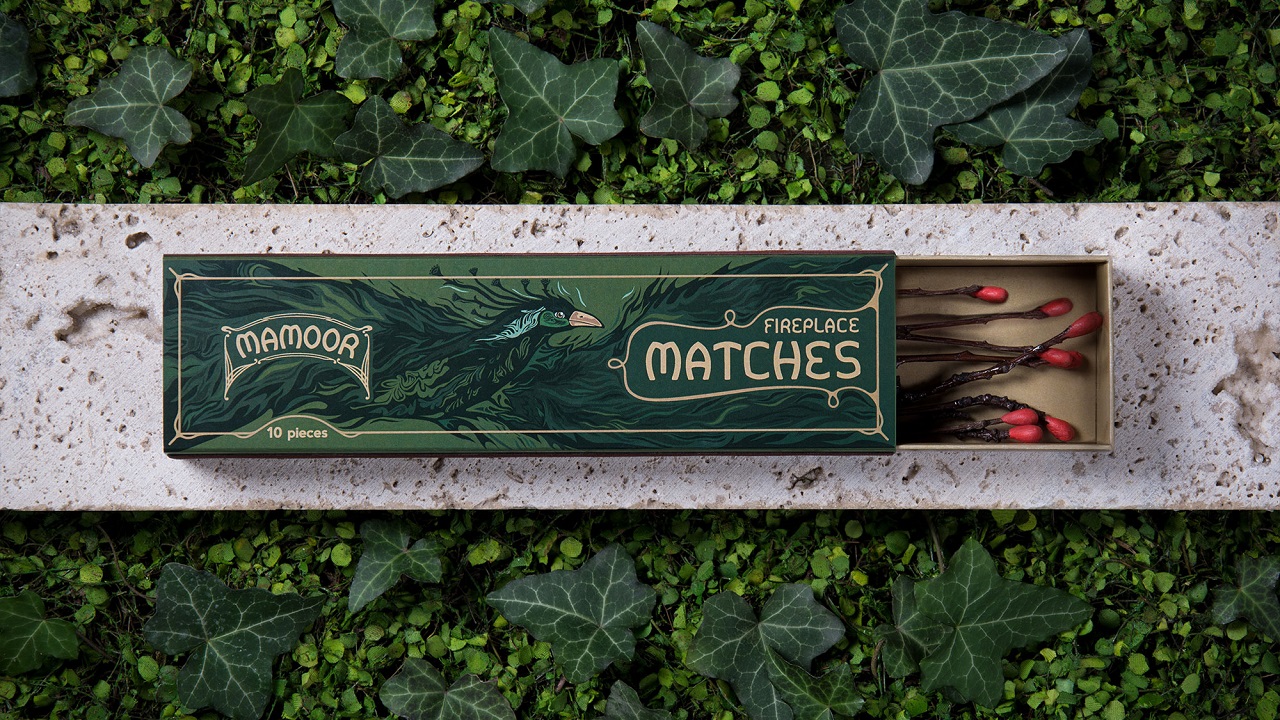
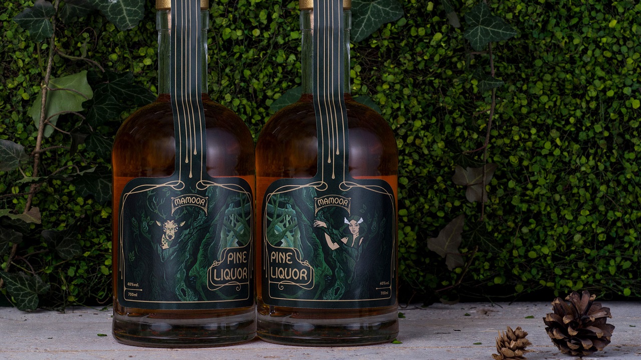
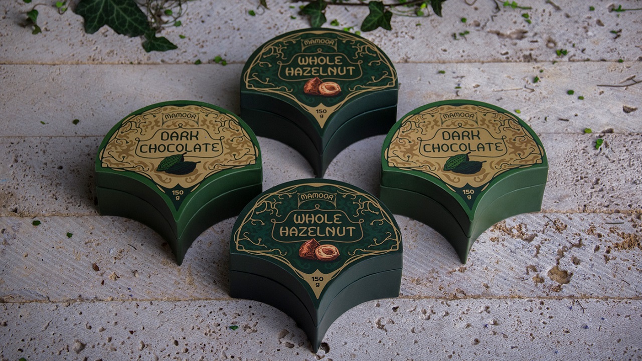
These items include a series of chocolate boxes inspired by the wood texture of a tree, а label of pine liqueur bottle that includes illustrations of the pretty girl and a deer, and an original matchbox with matches made from actual tree branches. “Each match is a thin branch of a tree, one end of which is coated with phosphorus and potassium chlorate mixture that can be ignited,” claims the agency.
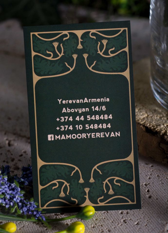
The aesthetic lines of all these original brand items were defined using the Art Nouveau style, and can be admired across the typography, logo, packaging, menu, and business cards.
“Art Nouveau style is the main visual inspiration for the creation of the visual brand identity. The logo features a mysterious girl, that embodies the spirit of the virgin deep forest. Other visual brand elements are a stylized tree and its branches which also convey the desired mood,” says the creative team. Get ready to be enchanted!
Credits:
Client: Mamoor
Agency: MAROG
