Students of all ages, there’s something you haven’t thought you’d ever hear from anyone else other than your math teacher: Math is fun! And if you don’t believe us, then maybe RA Voskhod‘s amazing work for Corpus IT school will convince you.
Commissioned to design the school’s visual identity, the Ekaterinburg-based studio didn’t use catchy visual elements such as illustrations, iconography, typography, or animation to outline the engineering spirit of the school. Instead, the creatives put themselves in the programmers’ shoes and borrowed one of their greatest tools from them: math. Utilizing it, the designers didn’t just manually craft the aesthetic lines of the new identity. They programmed the visuals to generate themselves.
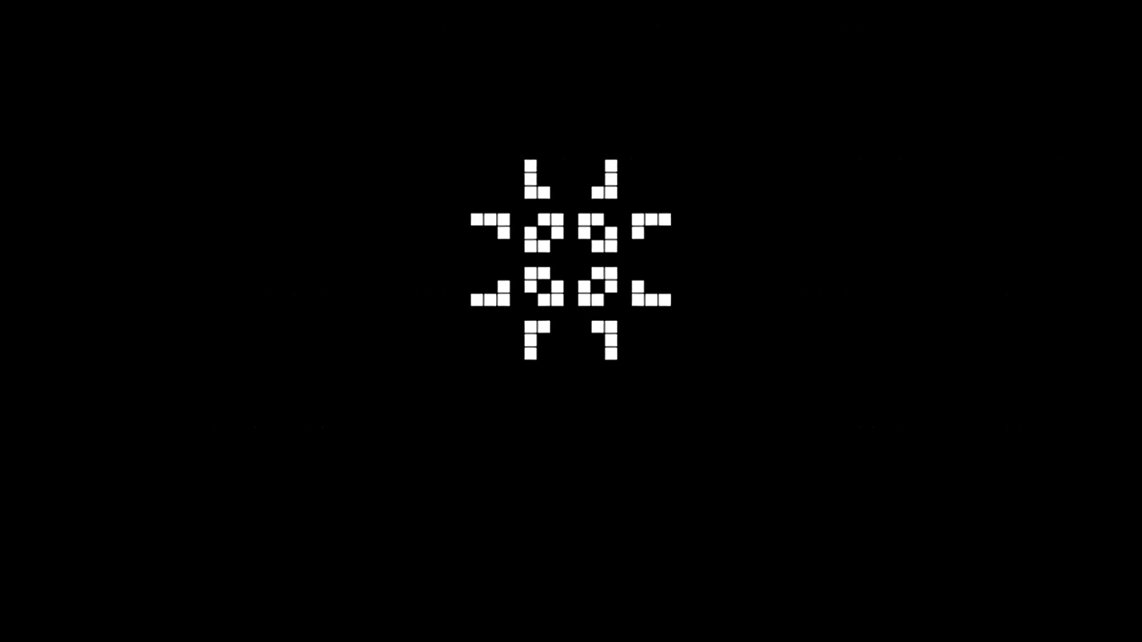
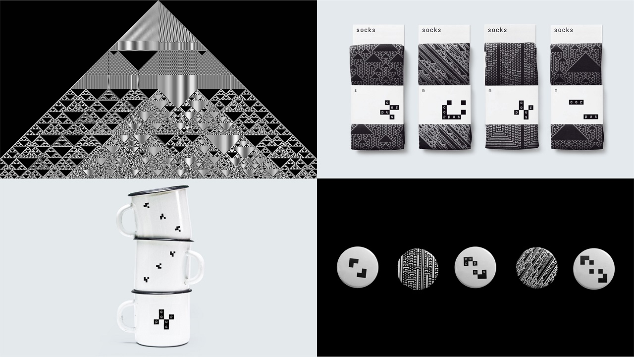
To do so, RA Voskhod drew inspiration from math’s most beautiful visual expression, cellular automaton (CA), a language known by every programmer. These tiny cells are described as a constantly evolving algorithm, in which each cell’s life depends on its environment. Based on this principle, pixels can find themselves in two possible states, namely dead or alive. If the cells find the perfect conditions nearby, they evolve into a series of labyrinthine networks.
In order to evolve into complex doodle patterns, a user only needs to determine the initial state of the structure. Then, without requiring any other input, the cellular automata can develop by themselves, creating patterns with different shapes and distinctive properties.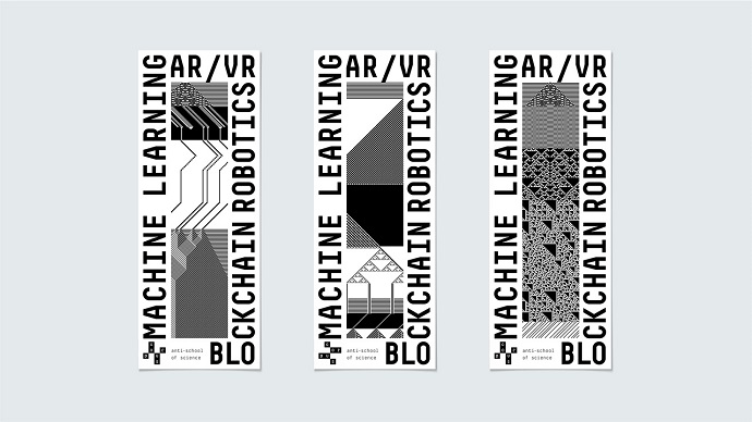
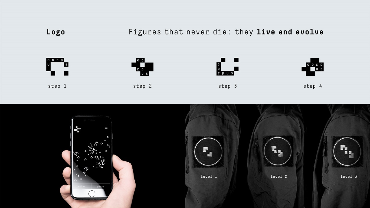
The source of inspiration to contour Corpus IT’s visual signature was British mathematician John Horton Conway‘s Game of Life. But unlike the game, in which the whole pattern blooms out of a combination of a few pixels, the designers’ models emerge only when a player types words in the generator box of an app the agency developed for this project.
Once the artists set up the initial state of the CA, they watched as the cells morphed into a series of spectacular images, generation by generation. As a result, the school now has a ‘multiple’ personality, which modifies whenever the input undergoes changes. “The rules of spelling influence the cellular automata’s state, and the identity gets unlimited development possibilities,” claims the agency. Therefore, any text introduced in the system transforms into a unique code “that switches the rules of the cellular automaton.”
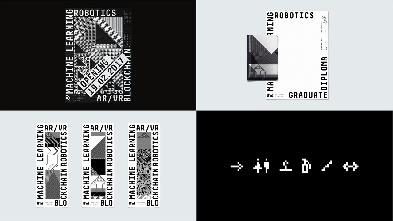
And just like that, RA Voskhod effortlessly created something that would attract even those who don’t have a huge passion for math. So, we can all admire this perfect “symbiosis between programming and design” on business cards, notebooks, shirts, mugs, bags, and even socks.
“Corpus IT provides not just a set of knowledge, it creates a new community of innovative professionals with innovative ideas. Therefore, it needs a recognizable, corporate yet bold identity, one that young students will be proud of,” the creatives added.
Do you still think that mathematics is ugly? Rediscover the joy of learning maths by watching the two-minute-long video RA Voskhod prepared to support the school’s visual identity. Enjoy!
Credits:
Client: Corpus
Agency: RA Voskhod
