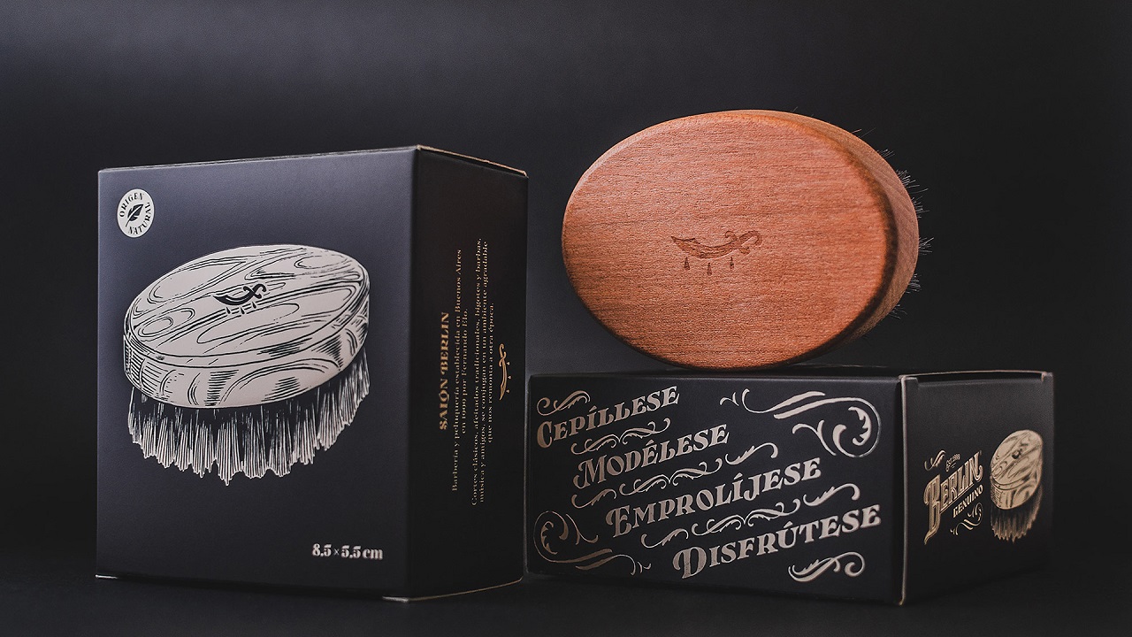
Developing a manly packaging for a highly-masculine product can be a hard task for any creative team. But somehow, Yani & Guille—two graphic designers from Buenos Aires, who work together in projects related to typography, calligraphy, and illustration—managed to nail it. After being contacted by Salon Berlin, a barbershop in the Palermo neighborhood of Buenos Aires, the two artists were commissioned to create a whole new visual communication of the hairdresser salon.
After long hours of testing, creating strategies, errors, and investigations, the creatives successfully brought to life the look of “Berlin Genuino,” a line of natural items created and tested by real barbers. The product rage includes a conditioner, an oil, and a beard brush.
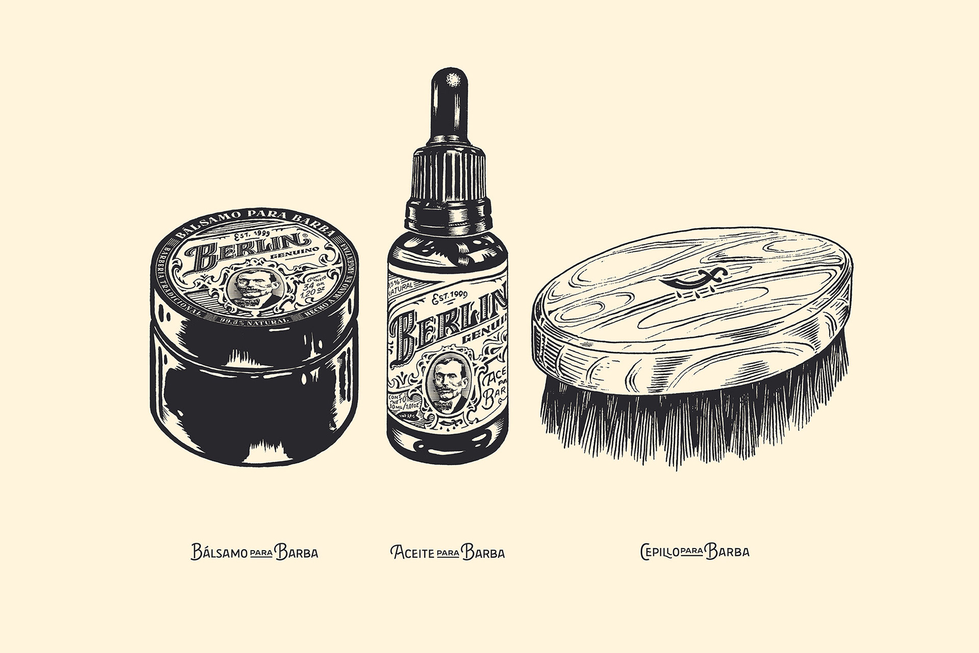
Each and every item waited on the shop’s shelves for a visual identity. As expected, the products were treated individually and received their own visual look which complements the aesthetics of the previous barber tools.
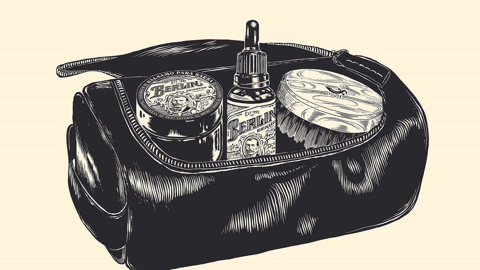
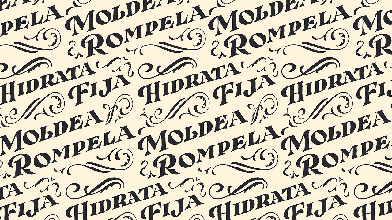
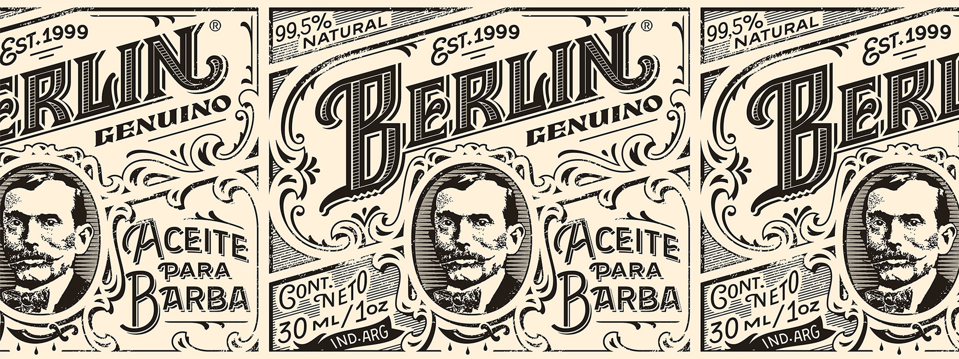
“To go with Berlin Genuino’s spirit, we developed a strong visual identity, but still sustained by a firm handmade personality. We included as well a set of illustrations and rough letterings for the labels, packaging and their whole communication,” claim the creatives behind the design project.
Analyzed separately, each product has its own visual charm that presents its magic when the products are assembled together. The tools for grooming beards come with a series of illustrations and letterings that aim to boost every man’s inner ego and self-esteem.
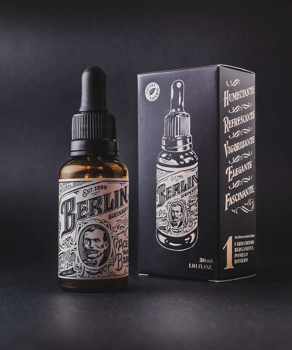
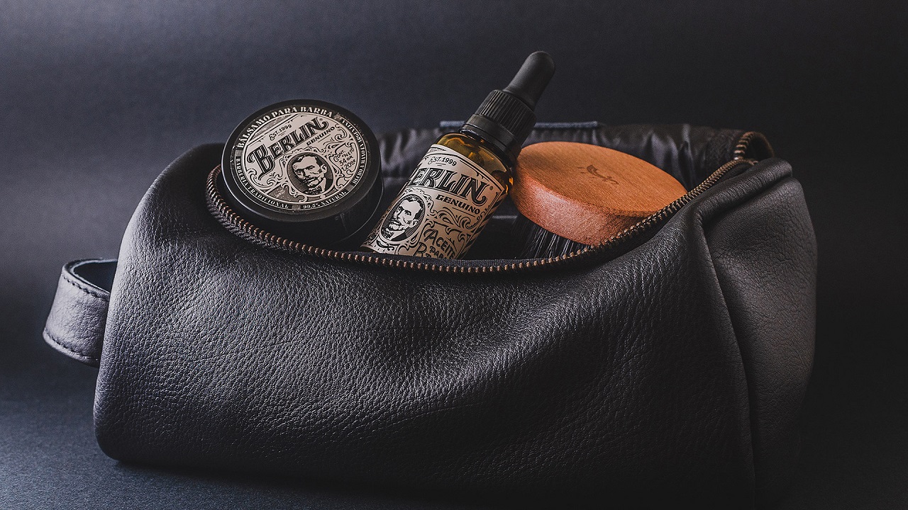
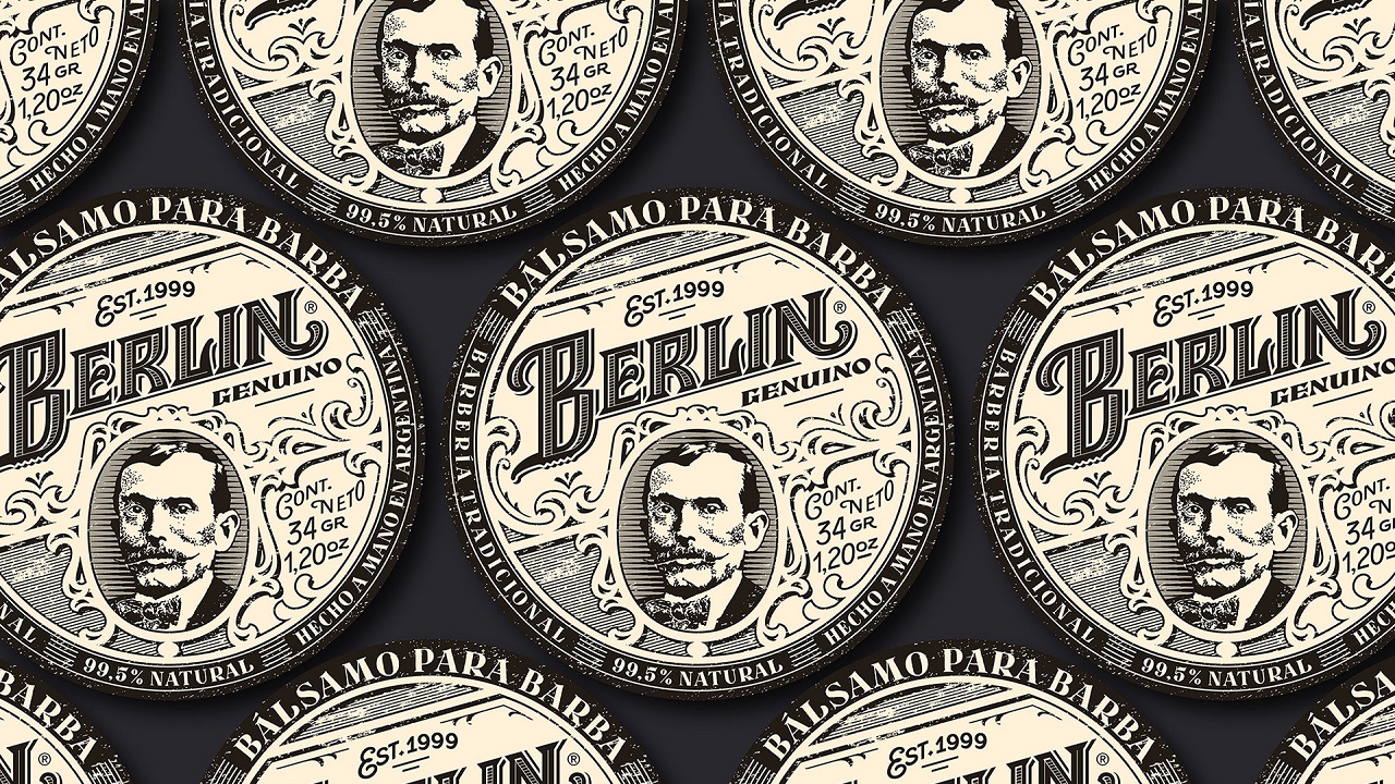
The cosmetic products look like there is a vintage story behind each of them. For example, the beard balm’s container is covered in bright black, and there is a label on its top that carries the image of an elderly man who seems to just have walked out of a barber shop. The man’s face is surrounded by a round frame, at the edge of which are placed words written with a font that looks like being as old as the man depicted in the illustration himself.
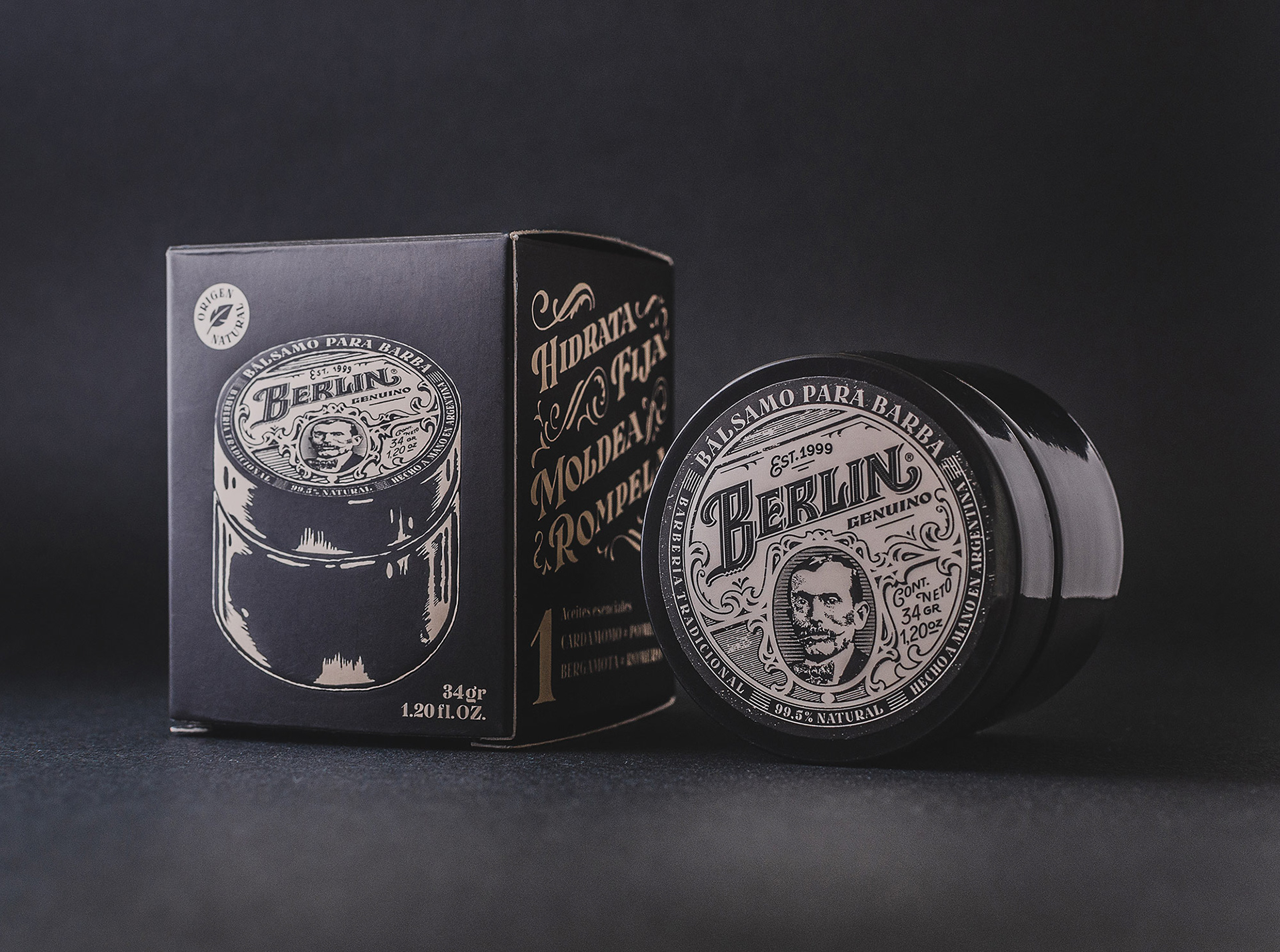
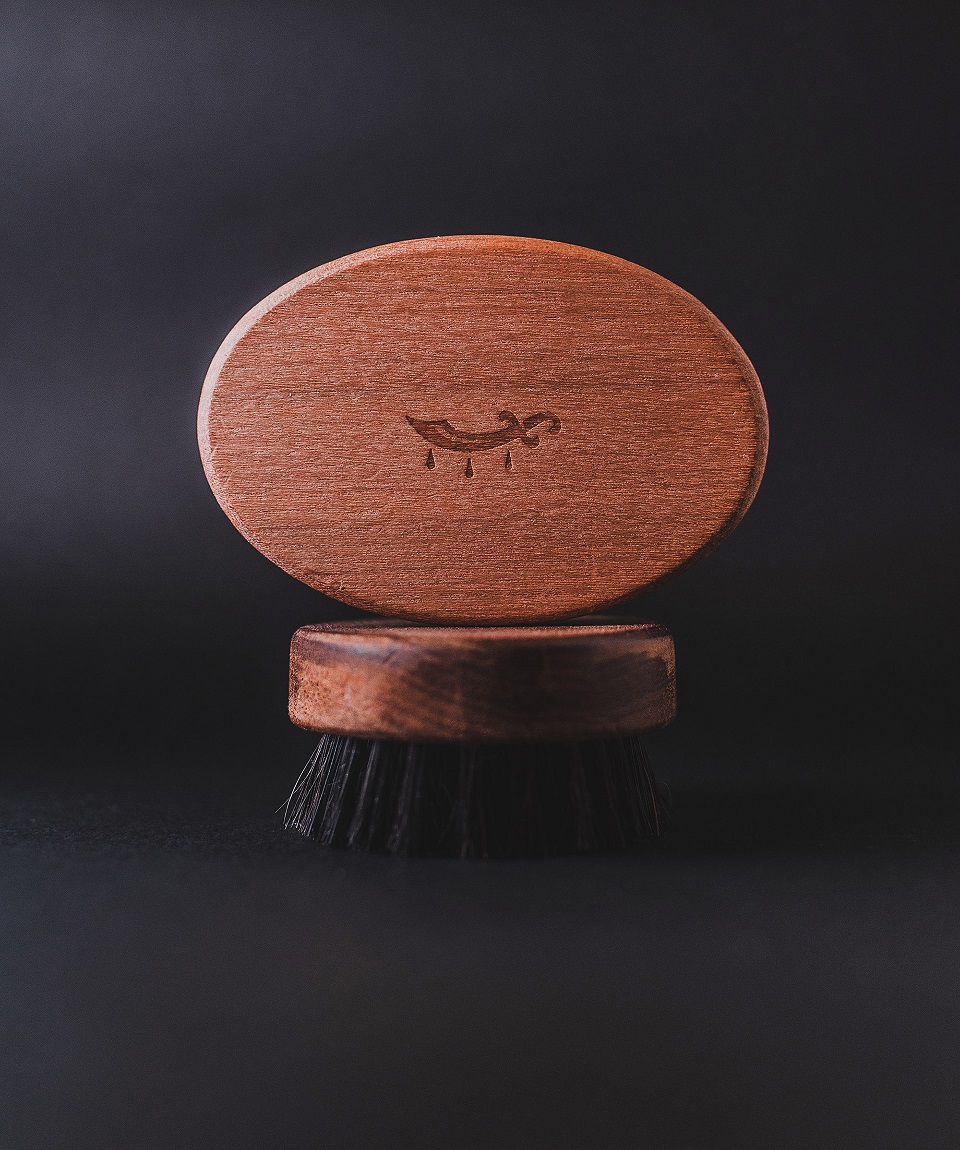
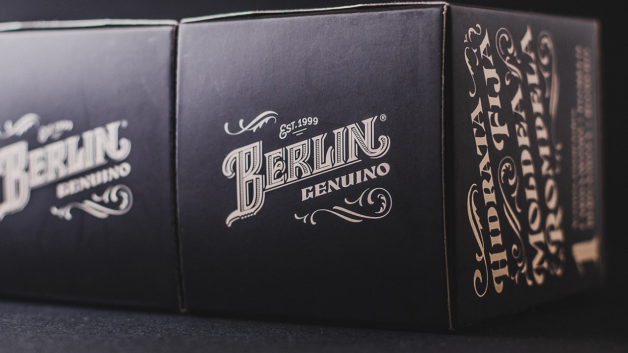
Moving on. The same image is wrapped around the bottle dedicated to the beard oil. As for the brush, the things are kept pretty simple. It is made out of wood and the creatives carved on the brush’s surface an image of a razor drawn in a minimalist manner to make it more appealing to the audience. All products are packed in cartons, which bear the items’ images on their facades as well as the masculine illustrations.
Ready to stop by Salon Berlin’s shop? In case you’re too far away to get through the salon’s doors, you don’t have to worry. We prepared a series of illustrations for you just to help you experience how this masculine adventure would feel on your own cheeks (or rather eyes).
