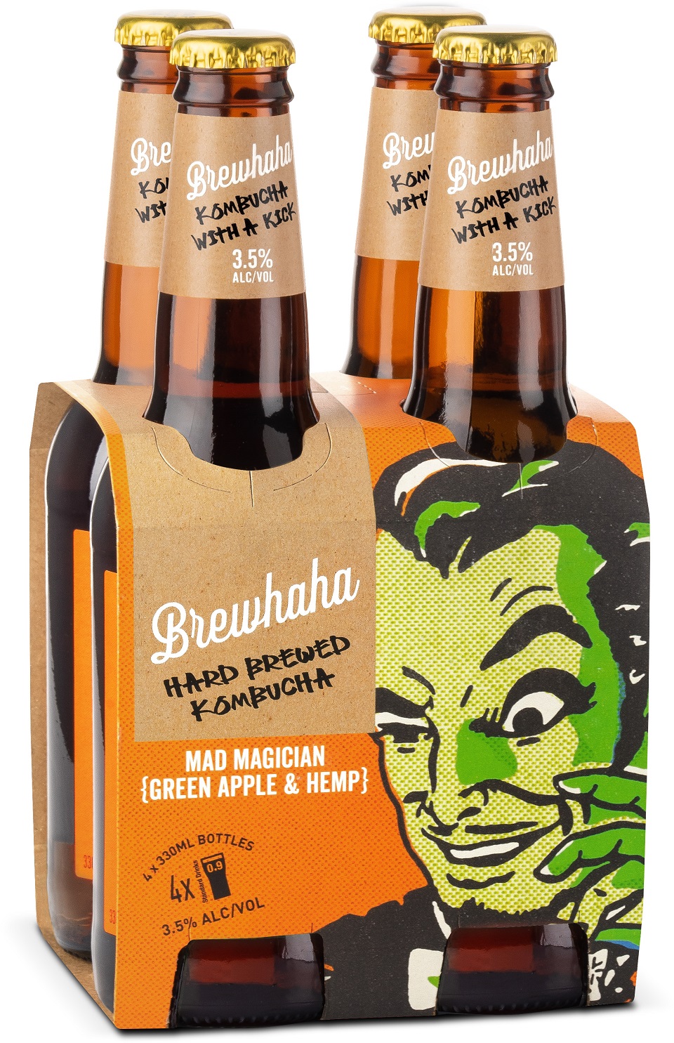
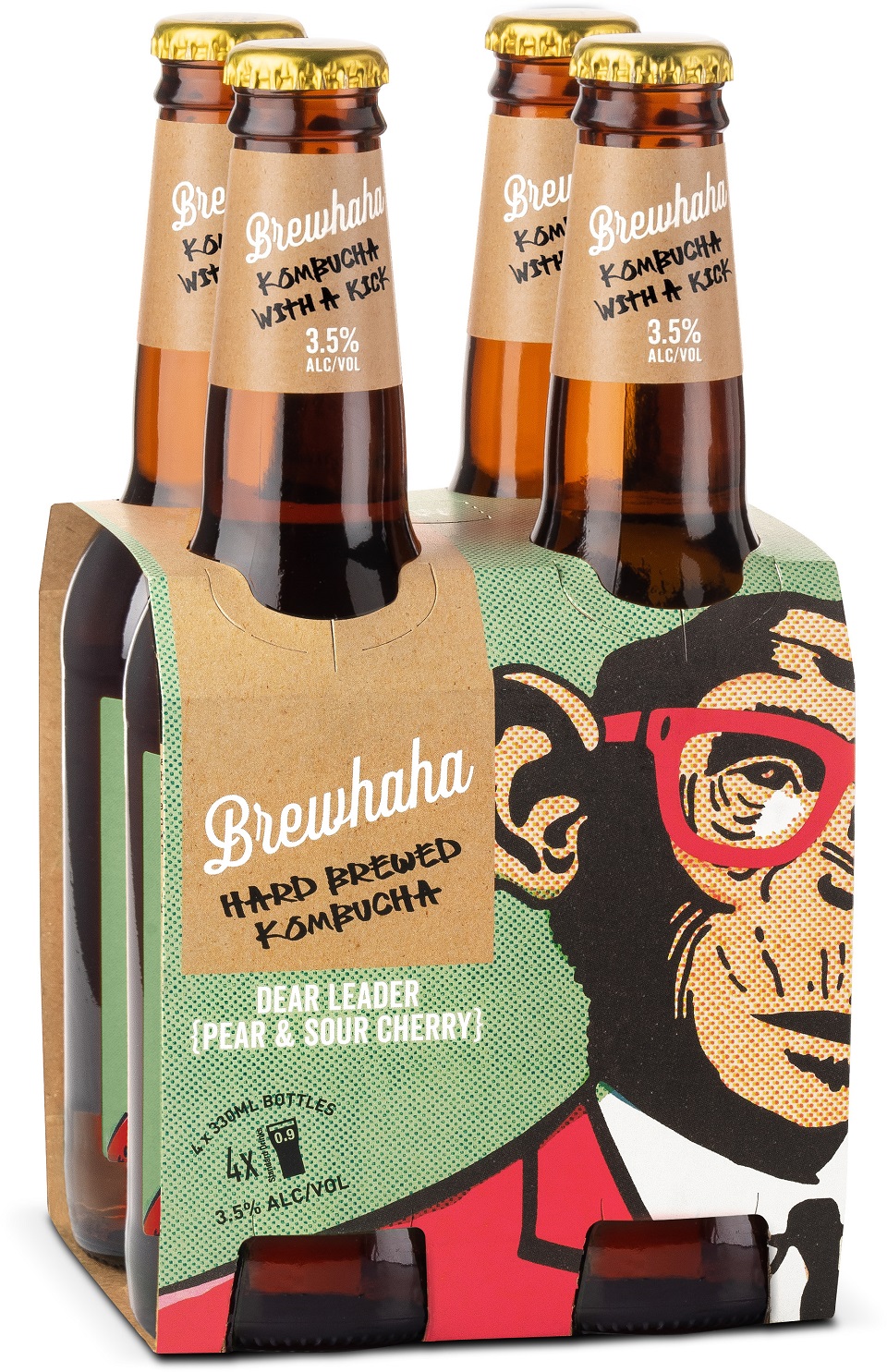
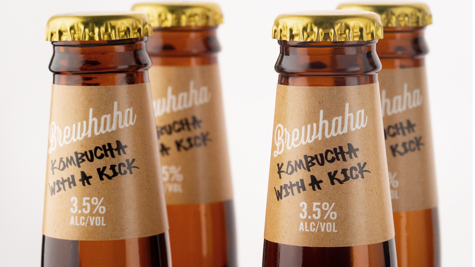
An interesting drink with health-giving qualities, mostly amongst millennials, has been launched just recently. Titled “Brewhaha,” the new drink is a hand-brewed alcoholic kombucha, which comes as a response to people’s ways to search for healthier brands for social occasions. Now, the new kid in town couldn’t come empty-handed. It landed with a refreshing brand and packaging identity by drinks design specialist Denomination.
Alcoholic kombucha is the latest trend in the world of probiotic-rich fermented tea and is kind of unknown outside the USA. Yet, this didn’t stop the design agency from shaping the brand’s personality that shall reach all consumers that love to party like rock stars. Denomination’s work for Brewhaha depicts — in a very clever way — how brand and packaging design can be used to define new drinks categories, whilst also designing a maverick, Instagram-worthy buzz.
Emma Day, PR Manager, Brewhaha, says: “We wanted to create upheaval in the sector, disrupting, changing the game and shaking up the world of alcoholic drinks that are better for you. We approached Denomination because it has a track record of creating stand-out brands that smash category boundaries and make a strong impact.”
The artists at Denomination knew that they had to do something to make a big noise in a world that is relatively new. So they played with the nature of kombucha, which is brewed with a live yeast culture known as ‘mother,’ and sketched the looks of the brand.
Rowena Curlewis, CEO, Denomination, continues: “Typically, kombucha focuses solely on the healthy and organic in terms of design cues, so we moved it into the craft beer space to signal its alcoholic content to consumers and set it apart from its softer sister.”
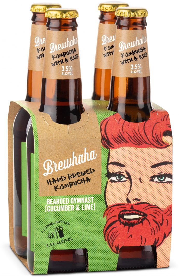
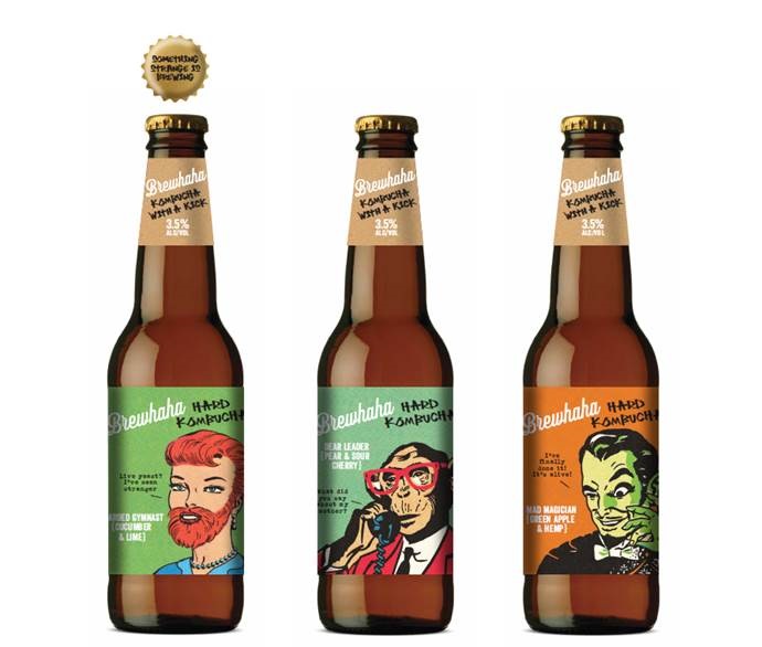
The creatives used a brown beer bottle with a crown enclosure. The cherry on top are the labels that combine craft beer-inspired packaging and imagery with copy that speaks to the alcohol sector whilst bringing an ode to the drink’s health benefits. The team’s imagination also helped with contouring strong personalities for each variant – Bearded Gymnast, Dear Leader, and Mad Magician. The color palette speaks about the bold identity of each drink, reflecting the ingredients that, basically, inspire epic social-media moments.
Rowena Curlewis adds: “As a drinks specialist, we have an innate understanding of design cues across beer, wine, cider and spirits and so have been able to apply this knowledge strategically and creatively. Bravery in design, variant naming and copywriting have also worked to create a category-defining brand.”
Emma Day concludes: “Denomination has cleverly leveraged the perceived benefits of kombucha while tailoring the product to compete with other refreshing alcoholic beverage choices. We wanted to come across as an adventurous new brand, and Denomination has more than delivered.”
