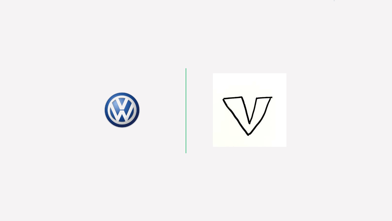
Ah, logos, the visual signature of any brand. The symbol that customers use to recognize a particular brand is created to grab attention and make a strong first impression. A logo is one of the most important branding investments a business can make. Yet, there are some logos which we recognize even at a glance: Those of cars (mostly because we are constantly exposed to them).
Even if we don’t own a car, it’s impossible not to recognize their logos since there are so many cars on the street. We see these symbols every day: Whether we go to work by taxi, bus, or personal car. But have you ever stopped and asked yourself if you can draw their logos by memory? You see them daily, so it shouldn’t be so hard…
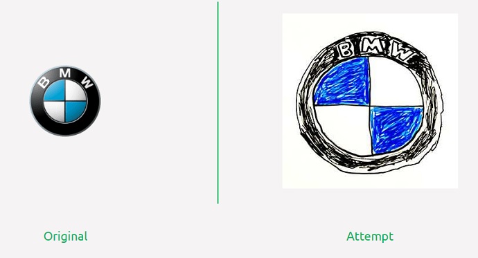
You can put yourself at test anytime you want but first, let’s have a look at Van Monster’s, the largest used van retailer in the United Kingdom, experiment. The brand wanted to find out how many people can recall the logo of a car brand by memory. So, they asked 100 people (54 women and 46 men of varying ages) to draw the logos of ten different brands, using only their memory.
The experiment bears the name “Motors by Memory” and within 60 hours, experts analyzed over 1,000 illustrations. They were sorted by color, shape, style, and font. This gave the team a clue on which brands stuck to our minds and which ones did not.
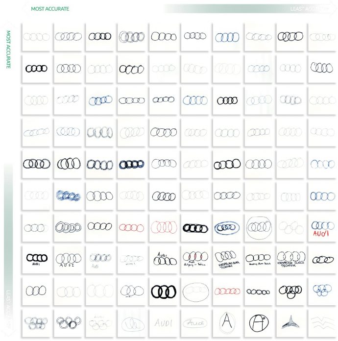
Let’s start with a simple logo: Audi. The brand’s badge features four intertwined circles, reflecting the four manufacturers of Auto Union. But as simple as the emblem is, as difficult it seems to be, creating so many problems to the participants: 5% of them confused it with the Olympic logo, while 14% of people drew the wrong number of rings.
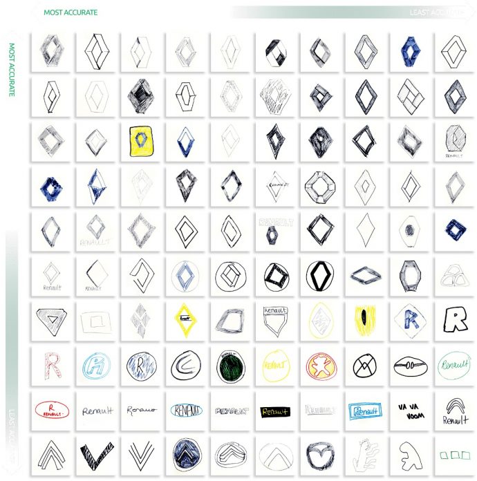
Now, here’s another simple example (or so we thought). Renault’s logo, which features a diamond shape colored in silver shades. The logo has a long history — but we won’t get into that — being remembered by 71% of the participants. You’d say that these are great numbers but wait until you find out more. Interestingly, of all the logos included, Renault was the brand most mistaken for something entirely different.
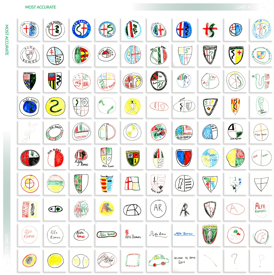
There’s something in Italians’ blood to overcomplicate things. Just look at some of their car logos: Alfa Romeo and Ferrari. Alfa features a complex symbol: While it sticks to the branding color psychology, the logo has some other distinguishing marks. A red cross on a white field, the symbol of Milan and a snake, the symbol of the Visconti family, one of Italy’s most important families. These details are what made things more difficult: Of the 100 drawings, only 26% of people remembered to draw the flag and 37% the snake, with just 17% remembering to draw both.
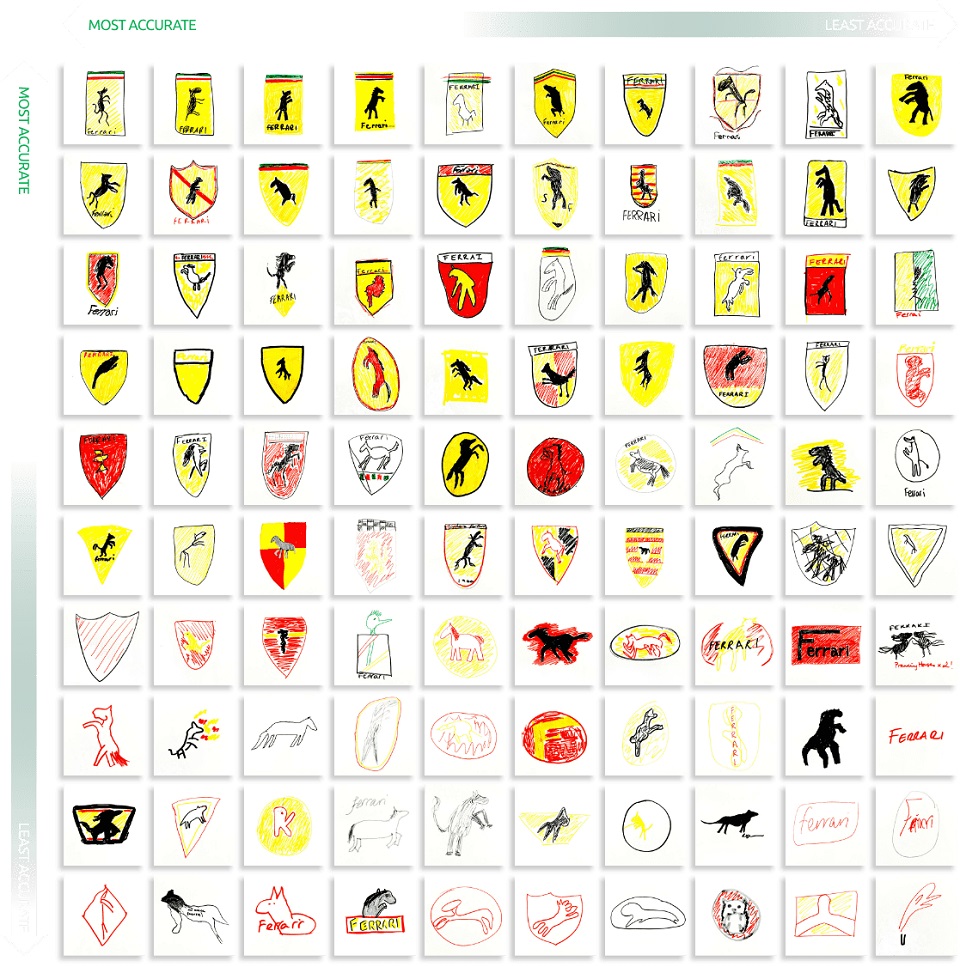
As for the Ferrari logo, things are quite simple: Most participants remembered the horse and the color, whilst the shape of it was mistaken with that of Lamborghini’s. Some of the details were lost: Less than half made drawings containing the Ferrari wordmark and only 15% remembered the colors of the Italian flag.
“Generally, as expected, the simpler the logo, the more accurately participants were able to recall and draw it,” concludes the team behind the project. Nearly 80% of drawings used the right colors, and 78% of the main badge shapes were drawn correctly. But how correct these facts are, given that the number of ladies participating in the project was higher? Women are known for paying more attention to details and are more likely to recognize a brand by its logo. Yet, men are obsessed with cars and could simply recognize a car brand by the sound the car engine makes. If the participants were evenly distributed by gender, maybe the results would have looked slightly different…
Speaking of which, here’s what you can use to get a different outcome: Sonic branding. Studies have already proved that sound is more effective than visual in terms of marketing. Sure, sound and visuals go hand-in-hand, but “it is definitely possible for people to have a stronger association with sound. When it comes to the branding world, the more frequently people are exposed to your sound, the stronger the connection with your brand. After all, sound and music are the shortcuts to emotion — try to turn off the sound of a horror movie or a joyous scene and you’ll lose all engagement,” says MassiveMusic’s Marijn Roozemond, Creative Strategist Music & Brands, in an interview with our sister site, Brandingmag.
So, here’s a new challenge for you, Van Monster: If you were to make the same experiment, but instead of using visuals you would use car jingles, how many participants would recognize the brands?
Credits:
