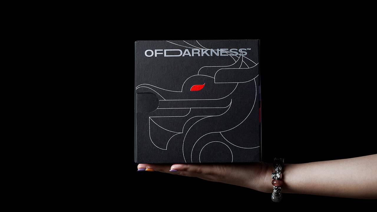
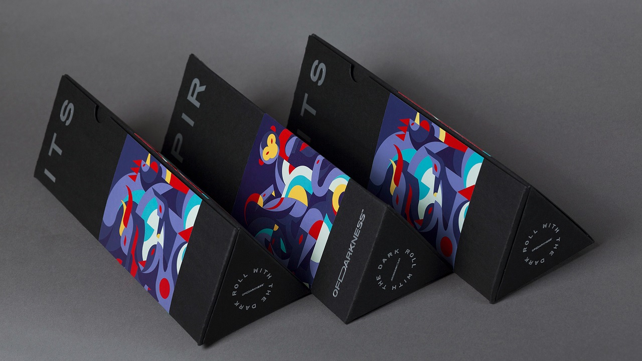
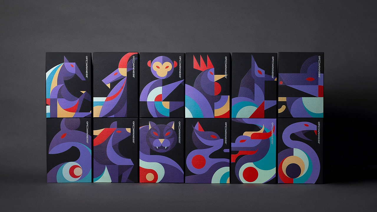
Humans are not nocturnal beings and so, we developed a behavior to be cautious or alert at night. Martin Antony, professor of psychology at Ryerson University in Toronto and author of “The Anti-Anxiety Workbook” said that “being scared of the dark is a prepared fear.” Our ancestors were at risk of being attacked at night and we evolved a tendency to be scared of the darkness.
As darkness is usually linked to evil and the unknown, we tend to forget that darkness and light are inherent. OfDarkness™, an art platform that expresses visual design studio InSpace Creative’s perspectives through graphic language applied to real products, from concept to visual identity, believes that “in the dark a light arises, out of darkness, all things form.”
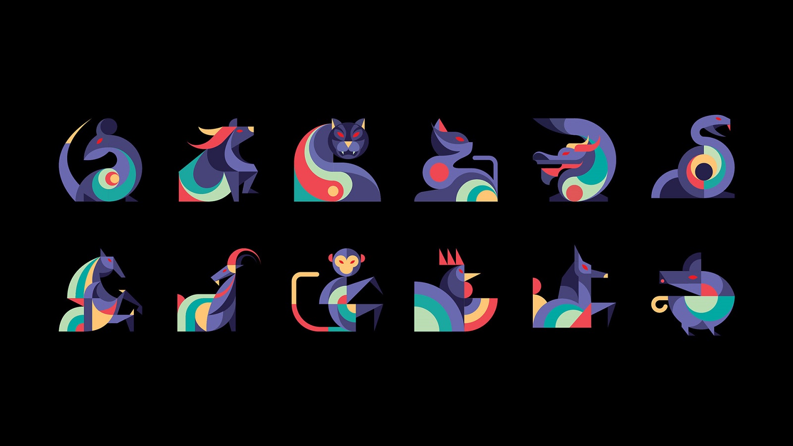
To show that darkness and light are equally wonderful, the Ho-Chi-Minh-based studio designed the 12 Spirits OfDarkness, the first concept in the Animals – OfDarkness™ series. When shaping the visual language, the creatives drew inspiration from the 12 Vietnamese zodiac animals and their personalities, but there’s a catch.
Instead of speaking about the strengths and goodness of each sign, they chose to express the dark side of the signs. The negative aspects and qualities are in the spotlight this time, highlighting that maybe, sometimes, we are being too harsh on ourselves.
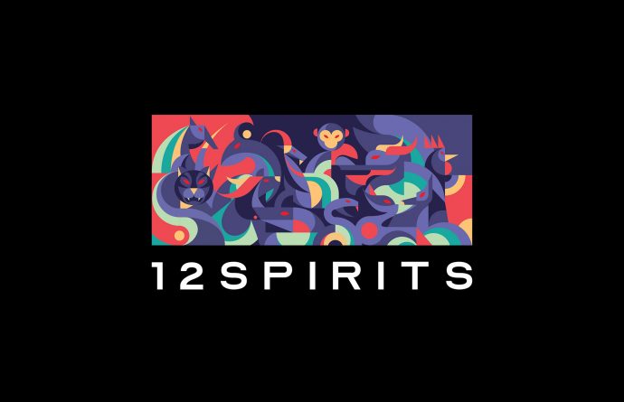
For example, the Rat is considered to be tricky, the Buffalo is stubborn, and the Tiger is impulsive. Being skeptical, reckless, or greedy are also on the list. So, it is OK to have such “qualities?” Are these that bad as we usually consider? According to the agency, “In an increasingly complex society, good or bad can only be judged from our own individual point of view,” advising us to be ourselves.
The faces of most of the animals are represented in profile, except for the tiger and the monkey. Maybe because one is impulsive and lives bravely and the other is aggressive, “competitive because those haters can’t defeat me.” For the rest, we can see only their side profile, but one thing is visible to all the characters: Red eyes, slightly sharp, which are a visual reminiscent of something evil.
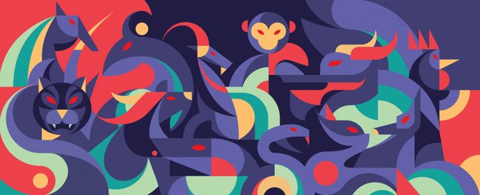
The color palette is based on shades of red and blue, both expressing strong values. Red symbolizes strength, power, determination, as well as passion, desire, and love, while blue is often associated with trust, loyalty, wisdom, confidence, intelligence, faith, and truth. One bursts in energy and is spontaneous and the other is peaceful, conveying a sense of calm. When used with other warm colors, such as red, blue is linked to consciousness and intellect. Placed side by side, the combination seems like being balanced, each element complimenting the other in the same way light and darkness do.
Associated with darkness is the color black, which the artists used as a background in their creative process. It is the canvas on which the design evolves. But, although black is linked to grief and mourning, it certainly emanates darkness in this context, but we think it is also used to speak about sophistication.
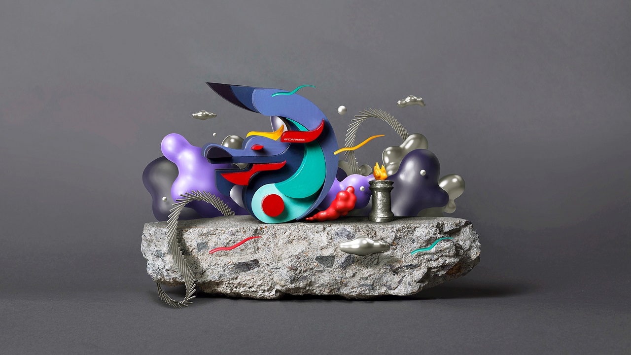
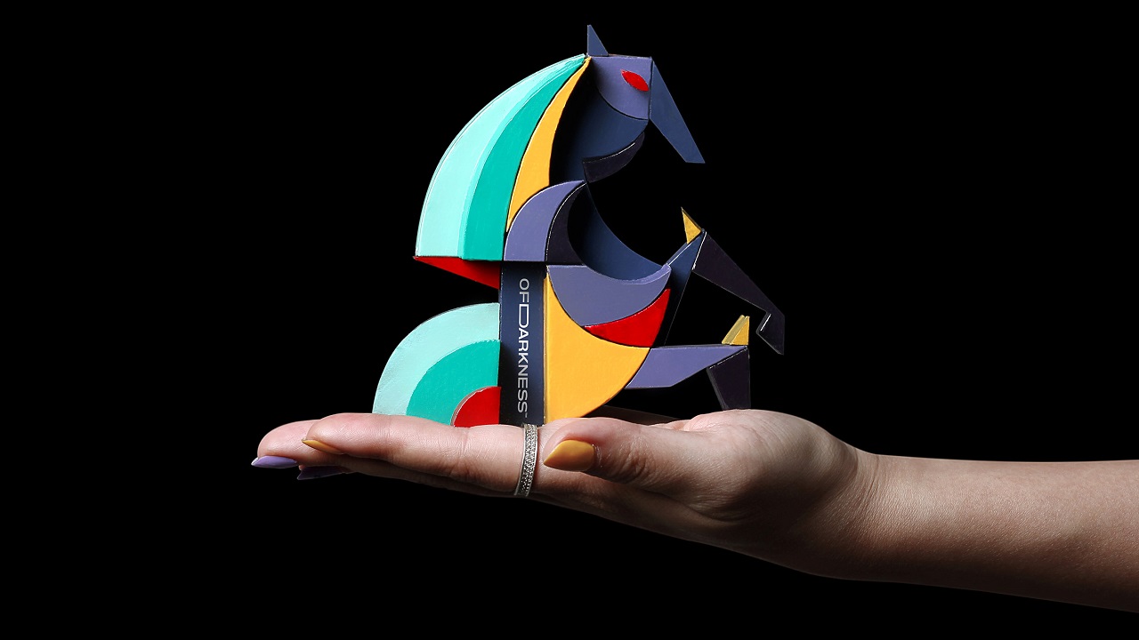
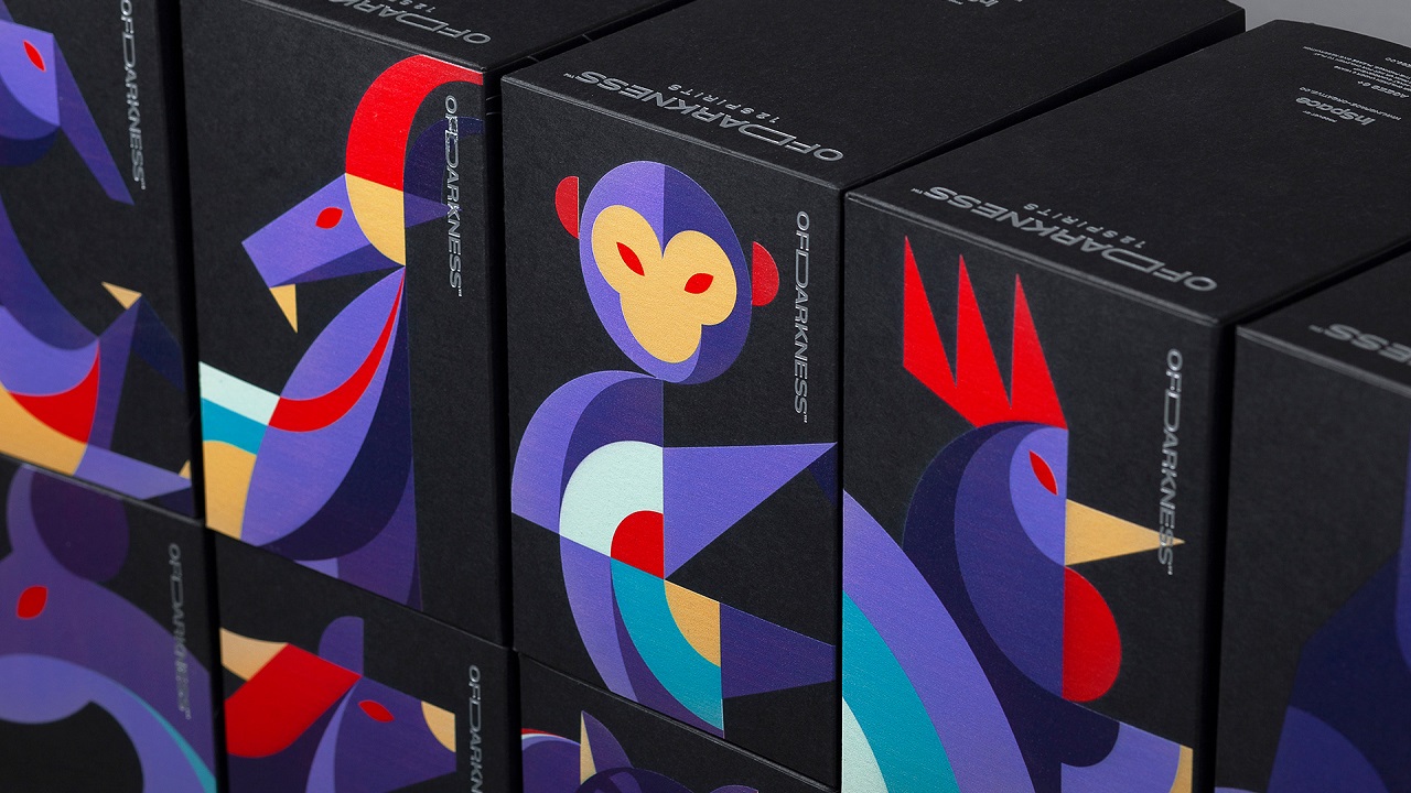
The design is used in manufacturing 12 art toys made of wood and recycled materials. Also, the concept can be seen across T-shirts, prints, posters, and packaging.
Credits:
Creative & Design: InSpace Creative
Scope of Work: Logo, Visual Identity, Creative Products, Packaging, Merchandise
.
Creative & Art Director: Sanh Nguyen
Creative Designer: Sanh Nguyen, Huy Pham, Duy Trinh, Huy Vo
Copy Writer: Thanh Hoa
Motion Graphic: Duy Trinh, Phung Dang
Products Manager: Bien Ngoc Anh
Project Manager: Trang Ho
Operation Supervisor: Vu Tran, Dinh Quoc
Cast: Hang Phan, Trang Nguyen, Hung Le
.
Photography: 1990 Studio
Printing: Cropmarks Studio
