Experimenting with new and bold ideas is part of Cockburn’s personality. Set up in Portugal by Scotsman Robert Cockburn in 1815, the brand has always expressed its rebellious side, doing things its own way. For more than two centuries, Cockburn’s has been producing port wines, enjoying its status as a favorite brand among port consumers. However, as Millennials have surpassed Baby Boomers as the largest adult generation, there is a decline in demand for wine, including fortified varieties.
Feeling that it is time to appeal to a new generation of port drinkers, Cockburn’s Port launched a fresh range of mixable ports. The drink is usually associated with a nice way to end your dinner, but the brand wants to redefine the way consumers enjoy port. So, with the “Tails of the Unexpected” range, Cockburn’s Port completely rethinks port and the image it carries as an after-dinner sipper for an old generation. Instead, it encourages people to enjoy it as a cocktail ingredient all year round.
Cockburn’s strategy to reinvent ports for cocktails is accompanied by a brave brand identity and packaging design for which its parent company, Symington Family Estates, headed to “the origin of great drinks design,” Denomination studio. The branding specialists helped the company “present these new ports in a more approachable way, showcasing their versatility in a way that’s relevant for a younger demographic, and one that can be part of their day-to-day life all year round, in a casual, modern way,” Charlotte Symington, Senior Marketing Manager and 5th generation family member at Symington explains.
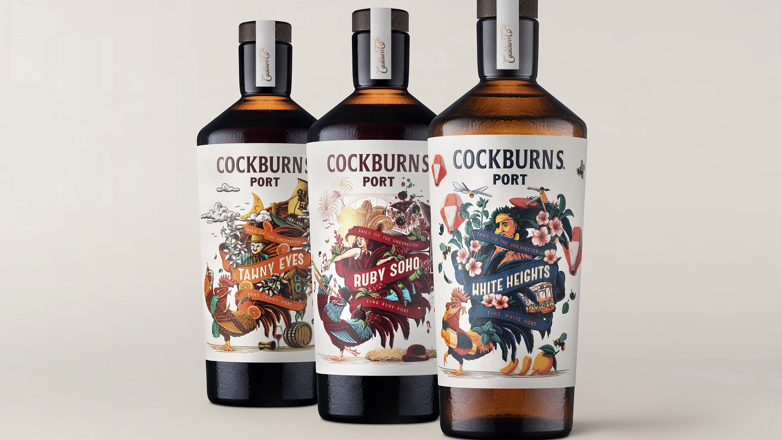
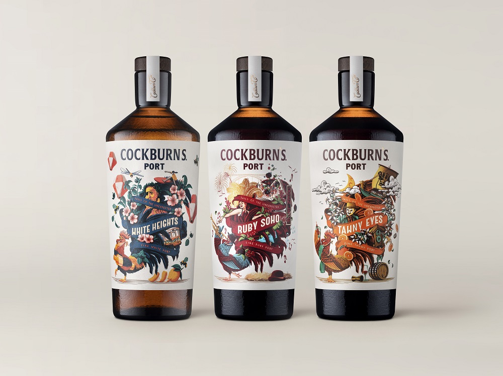
The range includes White Heights, Ruby Soho, and Tawny Eyes and there are no rules on how to serve them. Yet, in line with the London-based studio’s repositioning, the brand invites consumers to “replace formal rituals with a cacophony of ideas and creativity, and create their own new traditions.”
“Port is associated with tradition, and is especially linked with Christmas and older generations,” says Rowena Curlewis, CEO of Denomination. “A major part of our strategy involved turning all that on its head and transforming Cockburn’s into a drink that would appeal to younger demographics, with increased user occasions all year round.”
“Younger people are drinking less, but better quality, and are choosing lower-ABV options. Our strategy and design for Cockburn’s complement this innovative launch by positioning the three varieties of port as an alternative to spritzes, Prosecco, rosé, and gin,” she continues.
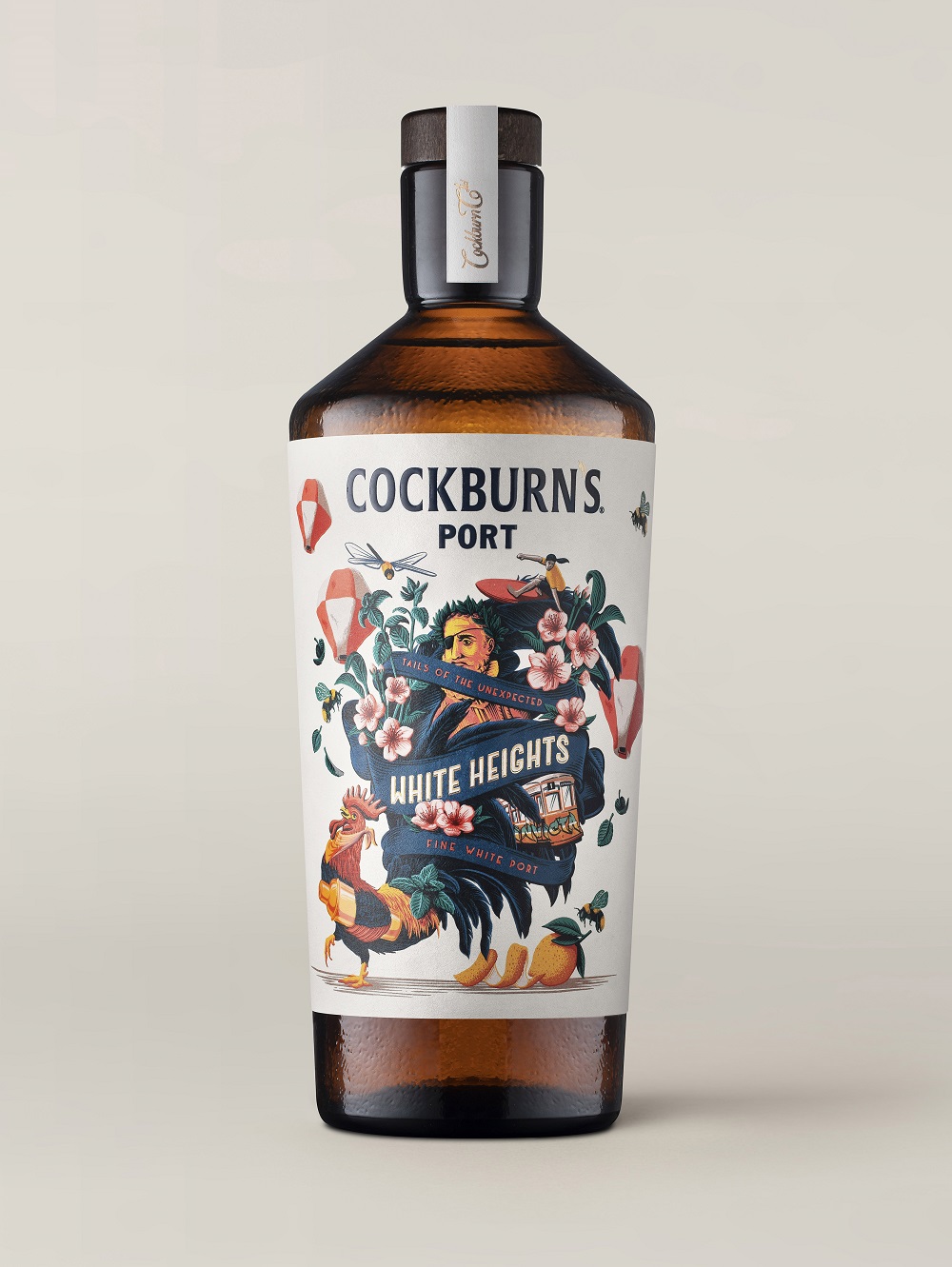
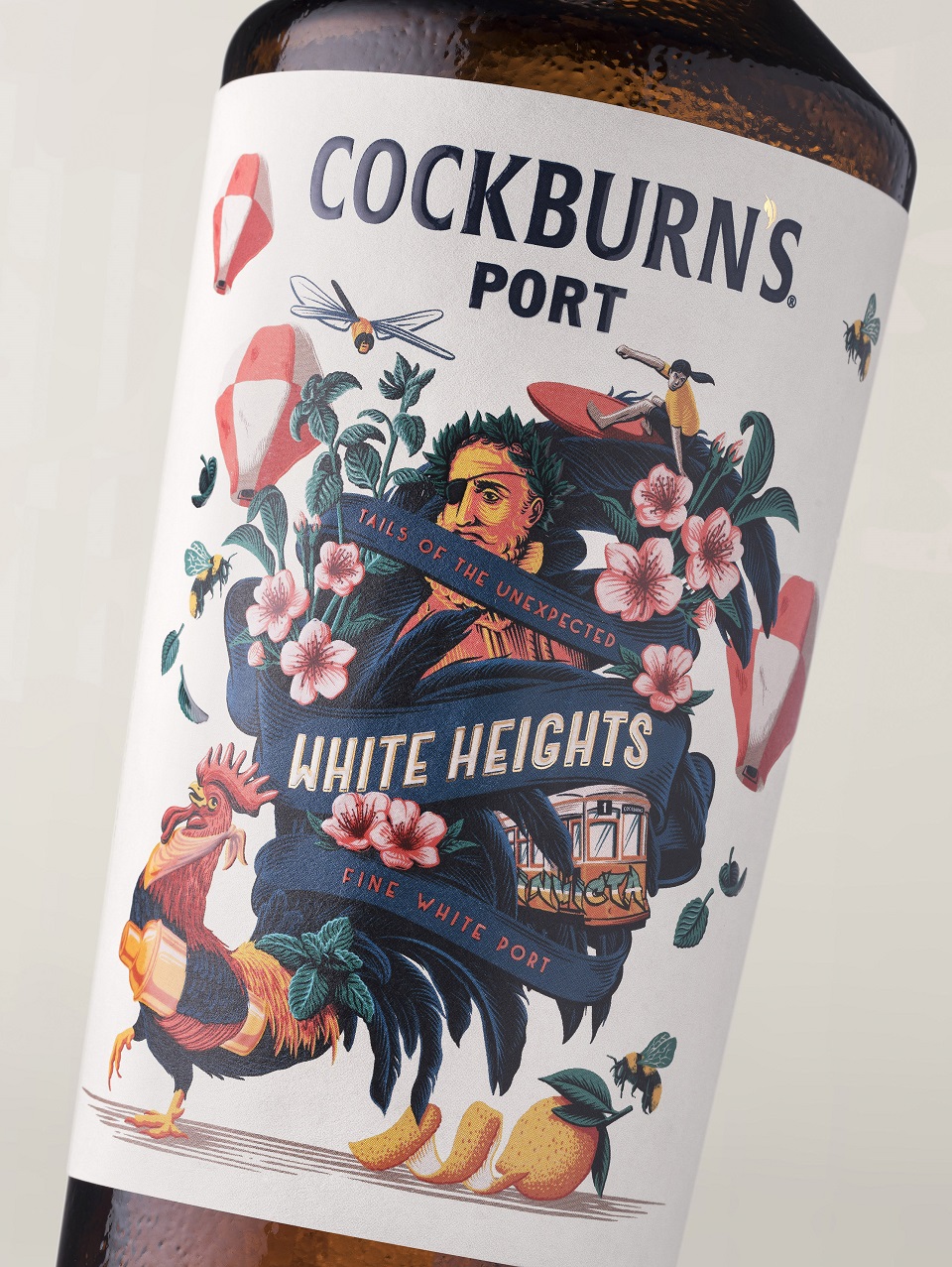
The new strategy and identity beautifully complement the brand’s playful and rebellious spirit, with each variant having its own captivating story. The White Heights bottle narrates Porto’s city-seaside life, showcasing iconic trams, statues, flora, and fauna. The Ruby Soho story carries consumers to London’s West End, where burlesque dancers greet them with a positive vibe.
Lastly, the Tawny Eyes story depicts winemaker John Smithies alongside a ship sailing from Porto to the London Docks. Written on white paper, each label features the silhouette of the famous cockerel, which is represented either as a mixologist, a jazz trumpeter, or a reveler.
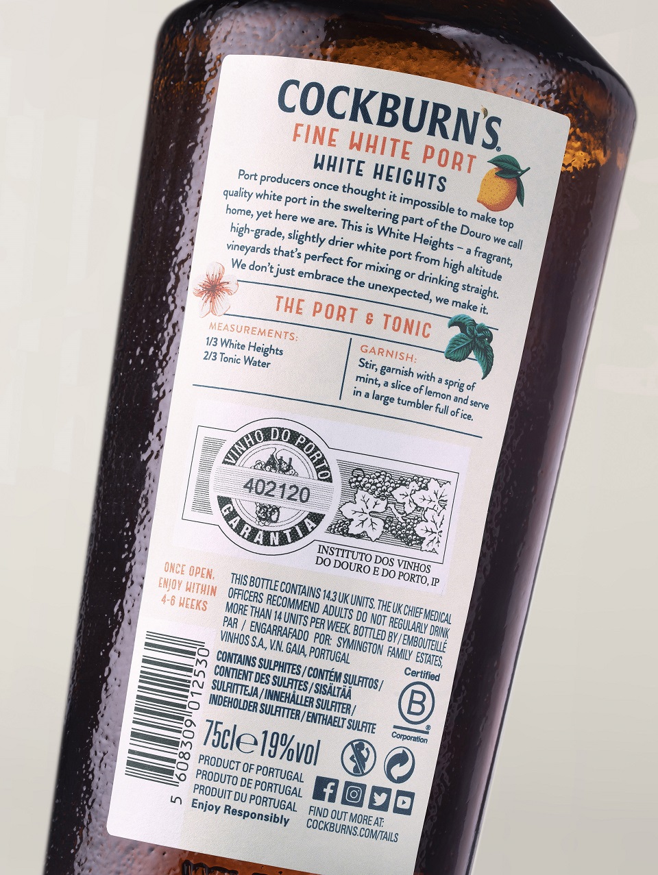
In line with Symington Family Estates’ sustainability principles, the bottles are made from 100% recycled glass, with the labels also made from recycled stock. The trio will launch in August with special pop-up events in Falmouth (20 – 21) and Brighton (28 – 29). Also, the range will be available direct to consumer on the brand’s website for £20 per bottle.
Credits:
Client: Symington Family Estates
Brand: Cockburn’s Port
Agency: Denomination