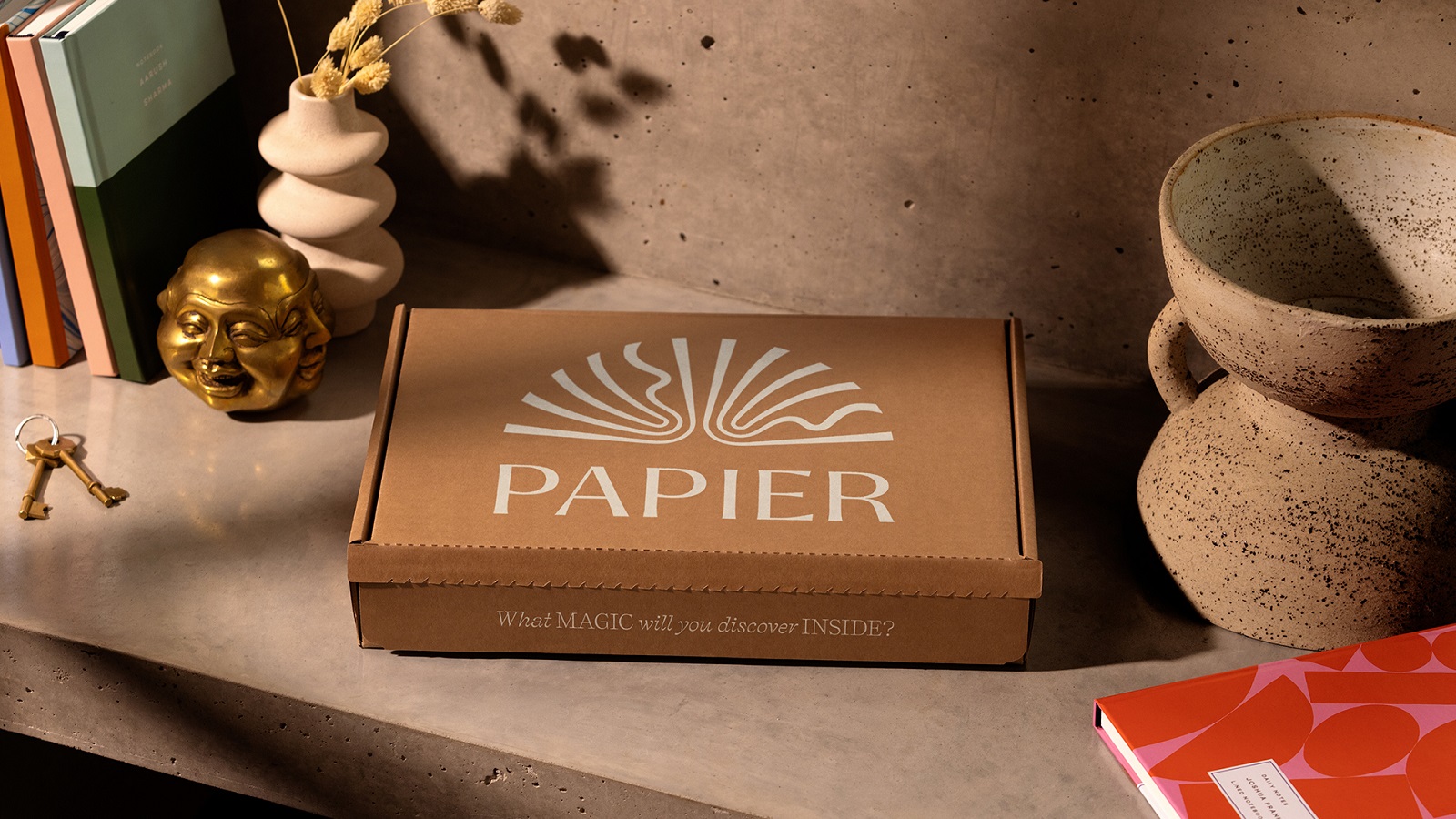
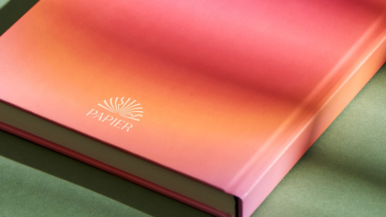
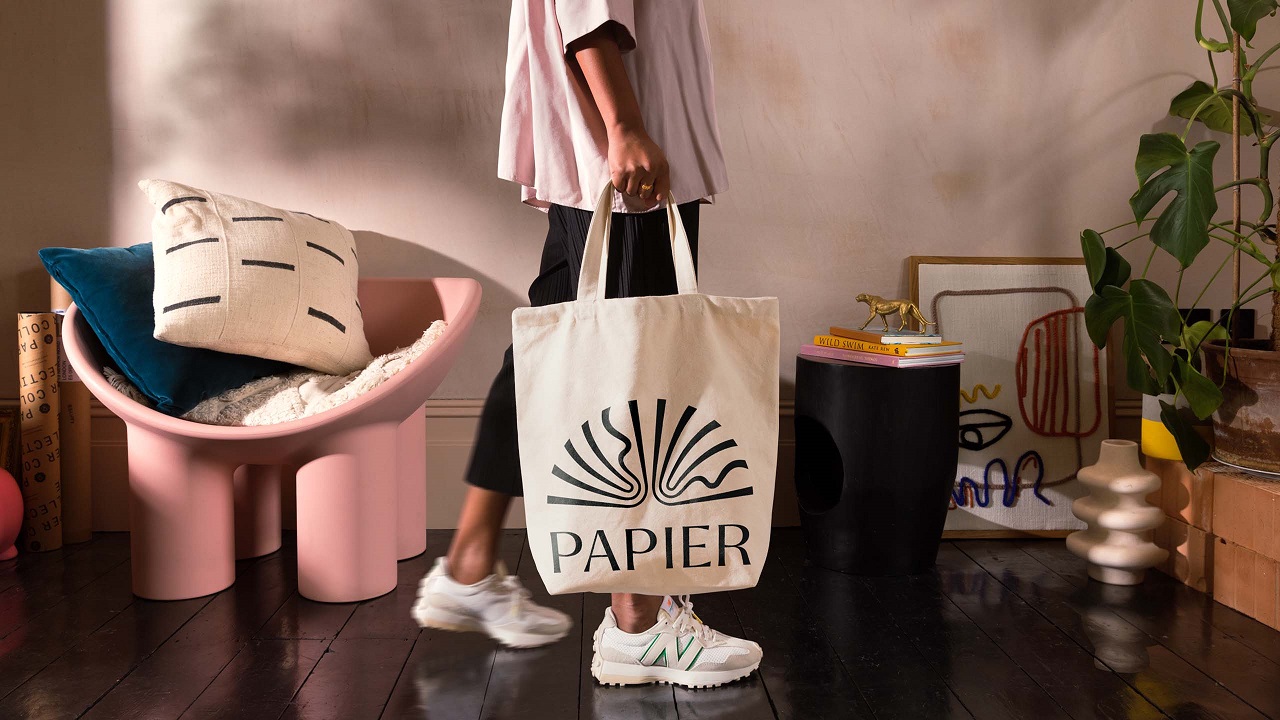
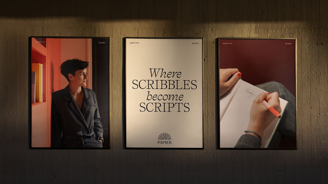
Established six years ago, British brand Papier has convinced more than a million people around the world to see the endless possibilities a blank page can unlock. But as the stationery brand looks to expand over the ocean and given that its original identity was built on intuition, Papier needed a design boost that would set it apart from its competitors. Guided by agency Ragged Edge, a new chapter is added to its story, a global rebrand that goes beyond aesthetics and that empowers people to discover the power a blank piece of paper can hide.
The rebrand sees Papier committed to making people think differently about stationery, a category of products that’s mostly focused on visual elements. But while shiny designs are used to host one’s ideas, they are likely to end up as decorative elements. Papier offers a playground for ideas to see the light of day and comes with products that not only help us in expressing our thoughts but which also keep us company in the process of discovering who we are.
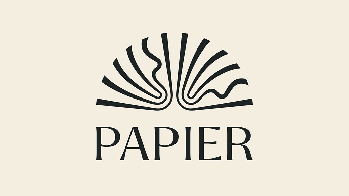
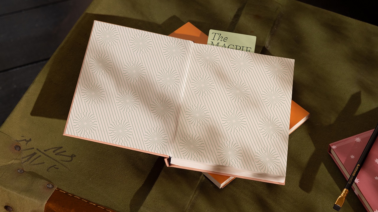
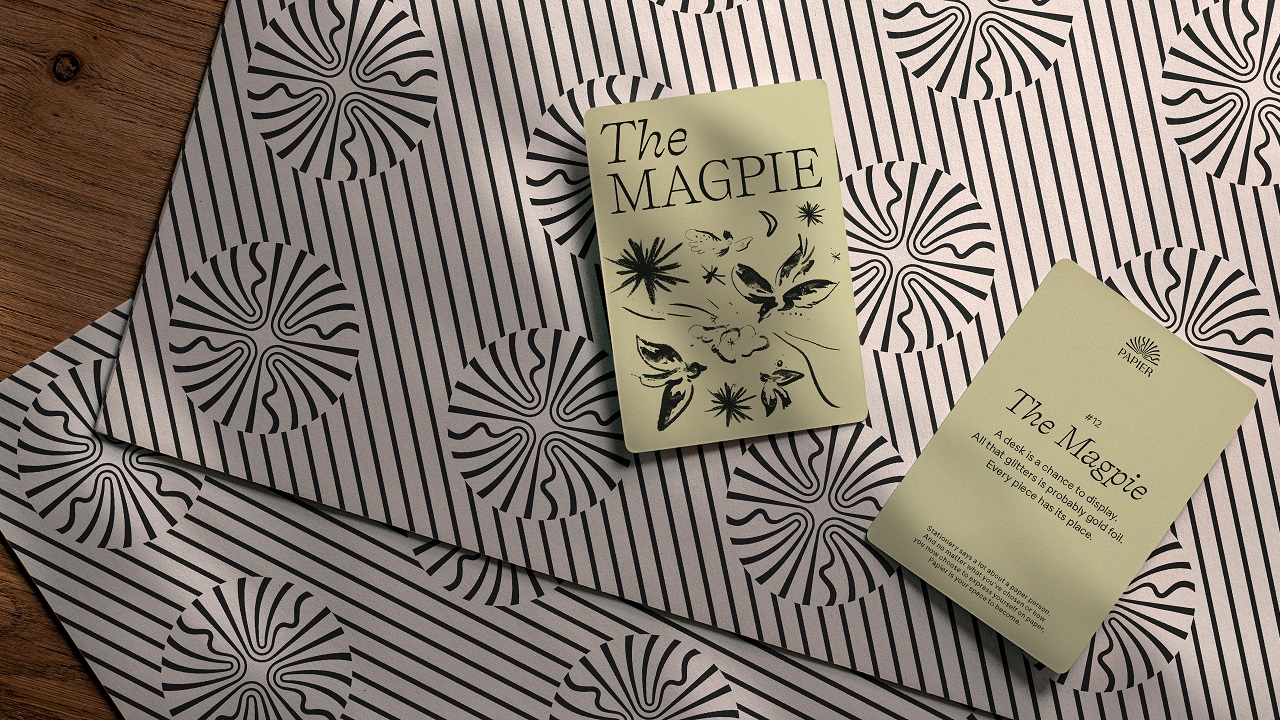
Thinking of Papier as an “emporium full of magic inside,” the London-based agency began to define the new identity, having a blank page as a starting point. Emerging out of paper and ink, the new look is outlined in such a way as to invite the audience into a world where they are free to express, realize, and transform who they are. Transcending the aesthetic part, the rebrand emphasizes the true power of stationery, helping customers discover the magic and the unlimited possibilities that lie beneath the covers of a notebook.
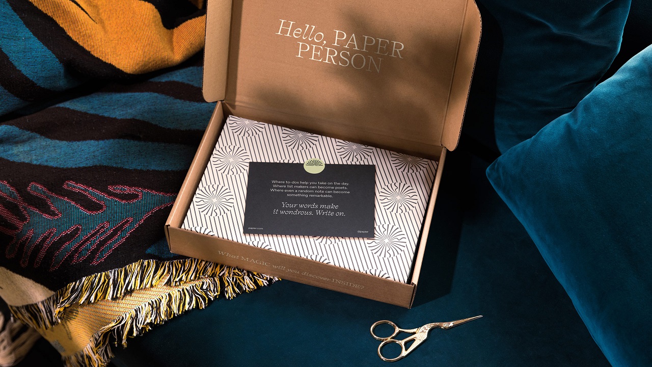
The details that reflect the stationery’s transformative power are sewn into other elements that pleasantly complement the project. Borrowing the silhouette of an open book, the logo “lifts the cover on the wonder within a notebook.” Meanwhile, the packaging is reinvented for paper people, the imagery addresses an atmosphere, and the tone of voice softly speaks about possibilities, not just about products.
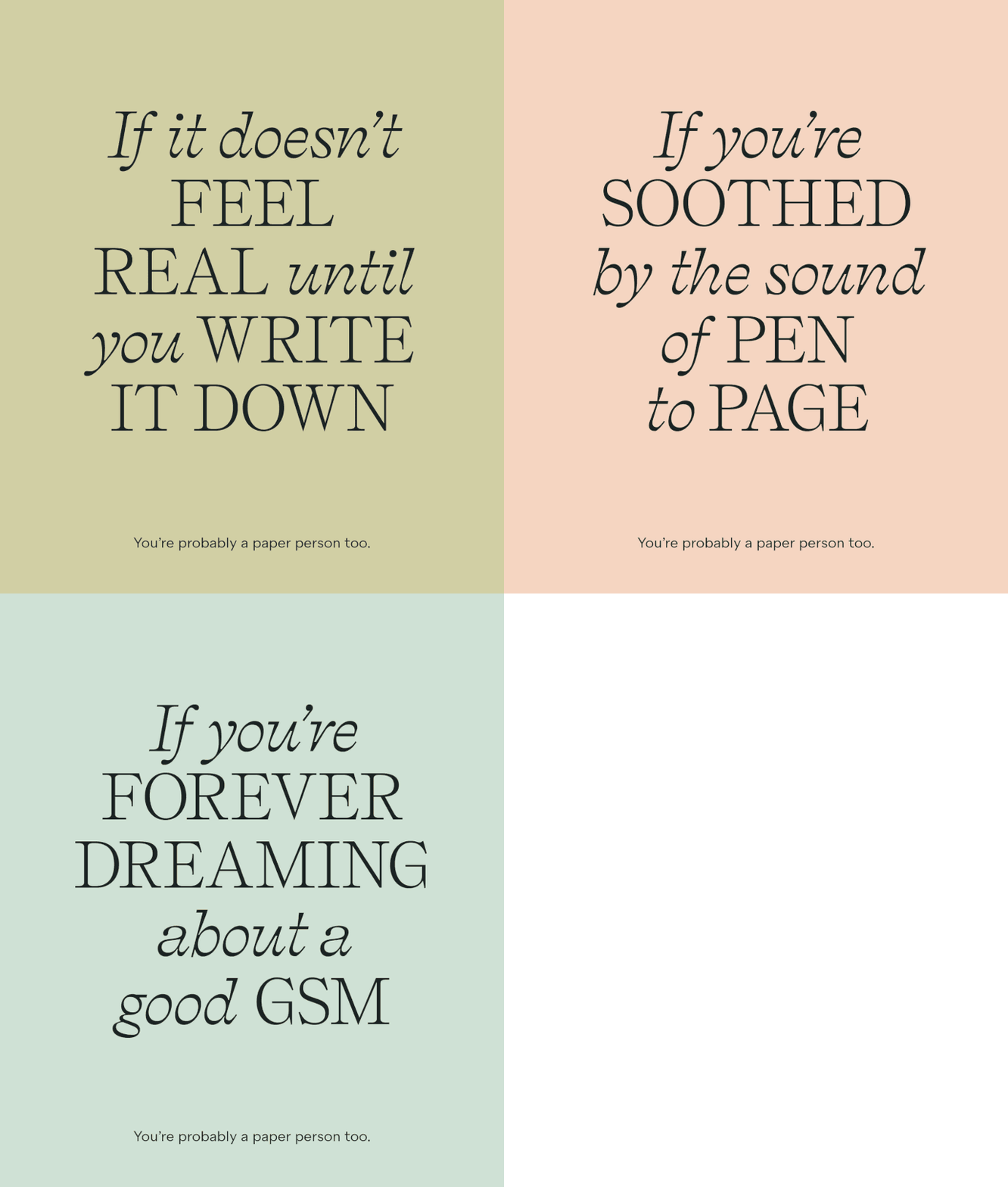
Max Ottignon, Co-founder of Ragged Edge, says: “In a category that’s all about design, we had to add a touch of magic. So, as we began with our own blank page, we saw the possibility of an emporium full of wonder. And just as an emporium does, this brand has to invite people in, to dig deeper, not knowing what you might discover. It appeals to and even provokes the senses, just like stationery itself. And, while it’s a brand born of paper and ink, it is just as magical as part of Papier’s digital experience.”
“Ragged Edge were a brilliant partner. They were sensitive to the brand we had built and our customers loved, yet unafraid to challenge and push us out of our comfort zones. The result is a brand that beautifully captures how the magic of stationery goes beyond the cover,” concludes Taymoor Atighetchi, CEO & Founder of Papier.
Sometimes, a blank page is all one needs to organize their thoughts in order to get a fresh start. So, why not start writing your ideas down on a blank piece of paper while also drawing some inspiration from the brand’s new identity?
