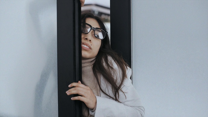
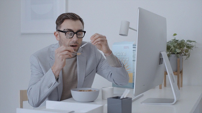
Real life would take a ridiculous turn if it were to run similar to web design — at least, this is how no-code platform for web design and development Webflow imagines it if web design issues were to appear in real life. Adapting to such conditions would be extremely difficult, if not impossible.
Can you imagine a life in which things around you would refuse to function normally, elements would disappear for no particular reason, or some components would simply break because of too much traffic? Before you give any answers, how about watching Webflow’s spot, “If Life Were Like Web Design,” first?

Developed in partnership with production company Where the Buffalo Roam (WTBR), the ad, which we’re going to focus on during this week’s #ThrowBrandThursday column, was directed by Brian L. Perkins who tapped into the brand’s weakness for comedy to show how complicated things would get if web design troubles were part of our real lives.
“It’s a spot for designers, but anyone who’s ever tried to make a website or use subpar software will get it,” Perkins said. “Bad software won’t let you do even the simplest things. It breaks your mind. If the real world operated like that, you’d go crazy. So, the message is, you don’t have to live like this. Webflow removes the senseless obstacles, so smart people can make awesome things.”
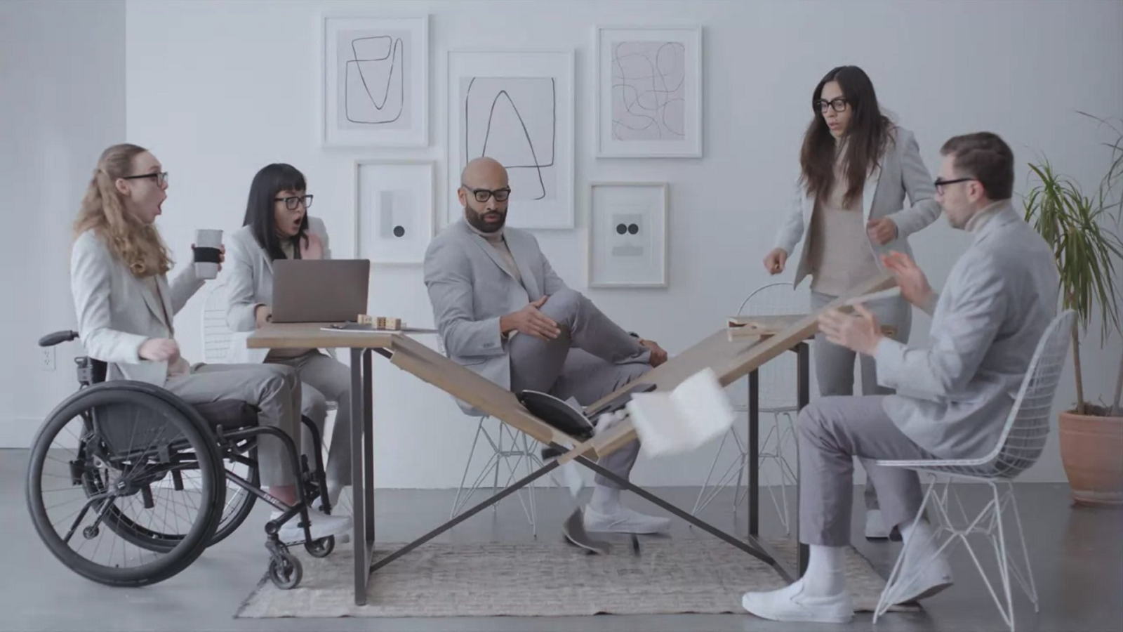
Both the brand and the director enjoy comedy, so it shouldn’t come as a surprise that they used a humorous approach to bring the frustrations associated with web design to life. The one-minute-long video’s action takes place in an office, where employees can’t normally do their tasks as things inexplicably break, disappear, or simply refuse to work properly. Listing a series of absurd scenarios — from a door that doesn’t work because of an update, broken jpeg icons, to coffee that refuses to be poured into a mug — the video highlights how Webflow can be a good partner designers can trust when building a website.

With character dialogue kept to a minimum and relying on the actors’ body language and facial expressions, the story is narrated in “the funniest manner possible.” “We weren’t going for full-on slapstick, but dialing in a restrained level of physicality in the performances was the key to making each moment so awkward and so relatable that you can’t help but laugh,” the director continued. “We had a lot of fun on set with the cast and crew, as we kept trying to dial-in the perfect dry reactions to an office that is no longer obeying the rules of physics and common sense.”
The chaotic moments that take place in the office are accompanied by a monotonous color palette, which is reflected in the employees’ outfits as well. Even the soundtrack was carefully chosen to highlight “the old-school stuffiness of outdated software, as well as to play against the visuals of the office going haywire.”

Both the visual and the audio change as the audience gets closer to the end of the video when Webflow finally marks its presence — a key moment that makes the office’s walls change into more vibrant and joyful colors while the music switches from opera to an orchestral piece.
“Webflow was a dream client who brought great ideas and feedback that only elevated the concept — and that’s because they have a clear vision of who they are as a brand and who their audience is,” concluded Perkins. “They ask all the right questions with a true appreciation for humor and storytelling. We had a blast working with them.”
If you are wondering what life would be like if it were web design, the video below has an answer, delivered in a way that is likely to make you have a good laugh.
Credits:
Client: Webflow
VP Marketing: Ashley Brucker-Stepien
Director of Content & Communications: Mischa Vaughn
Director of Growth Marketing: Tim Dalrymple
Director of Design: David Hoang
Design Manager: Ryan Miyoshi
Production Company: WTBR/Oakland, CA
Director/Writer: Brian L. Perkins
Executive Producer: Tim Pries
Producer: Emma Jubinski
Designer: Tuesday McGowan
Animator: Jake Pryor
Post Producer: Mike Schultz
Where shot: Half Moon Bay, CA
Post Production + Editorial Company: WTBR
Editor: Jonathan Flookes
VFX Company: WTBR
VFX Supervisor/Flame Artist: Simon Mowbray
Colorist: MFD
Music: APM
Sound Designer & Mixer: Blake Aaron Henderson
