After all the challenges the world has been going through lately, we can agree that we all need a break. As work increased excessively as a result of the pandemic, the idea of a break seemed like something that belonged to the past. Overwhelmed by the situation, a break was and continues to be essential to combat stressful times. While Pony Malta suggests actually adopting a break and relaxing in the company of an adopted dog, there are other ways people can choose from in search of a Zen-like state of mind.
So, have you ever considered “tearapy?” A tea break, to be more specific. For lots of people, this kind of drink is exactly what they need to get away, just for a few moments, from a busy day. On the one hand, we can say that tea is equipped with a sedative effect because it helps us calm down; on the other, the hot drink can be seen as a source of energy, giving us a boost with every sip of tea we take.
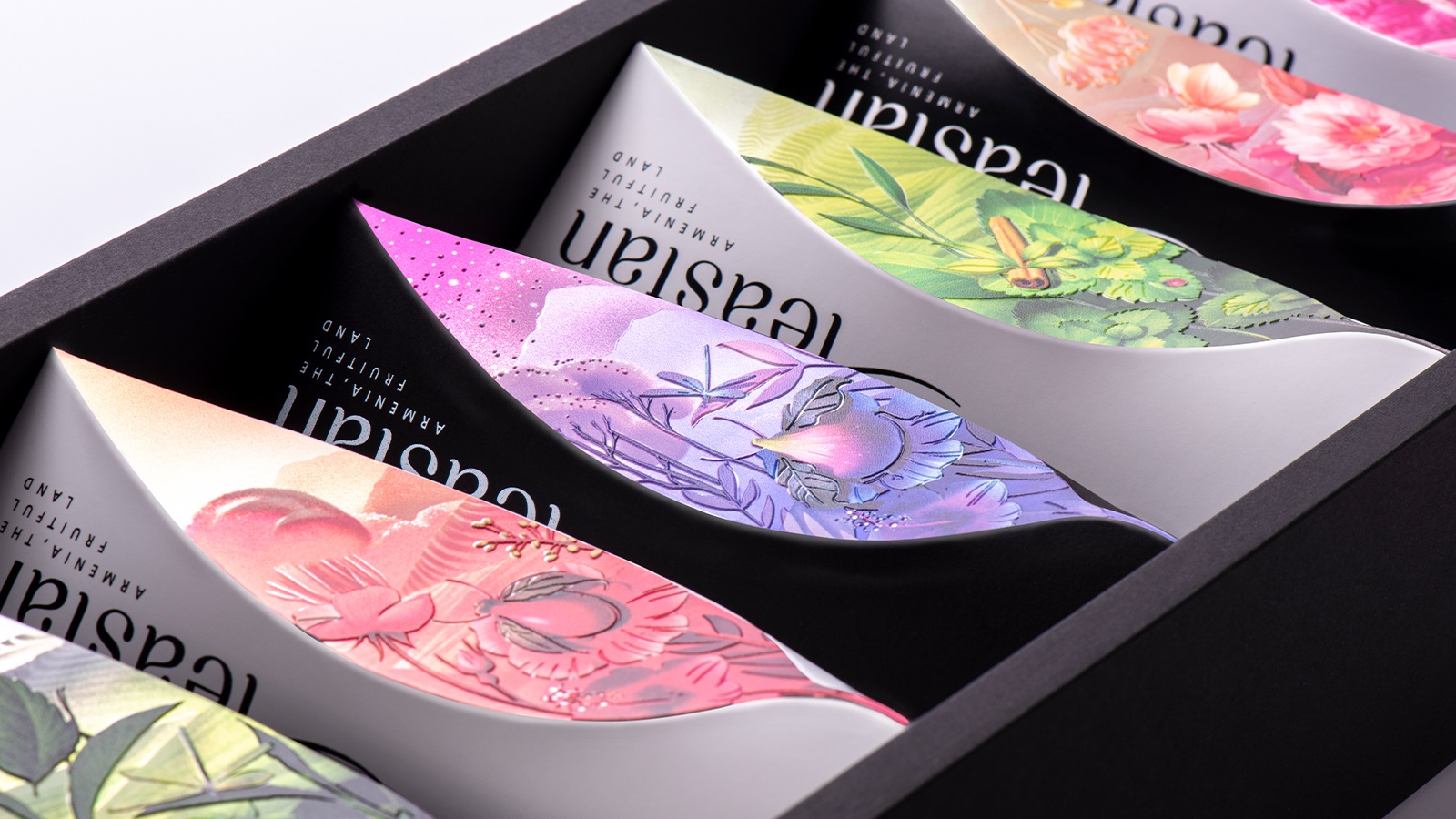
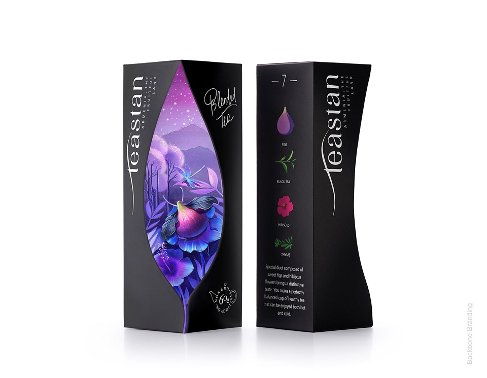
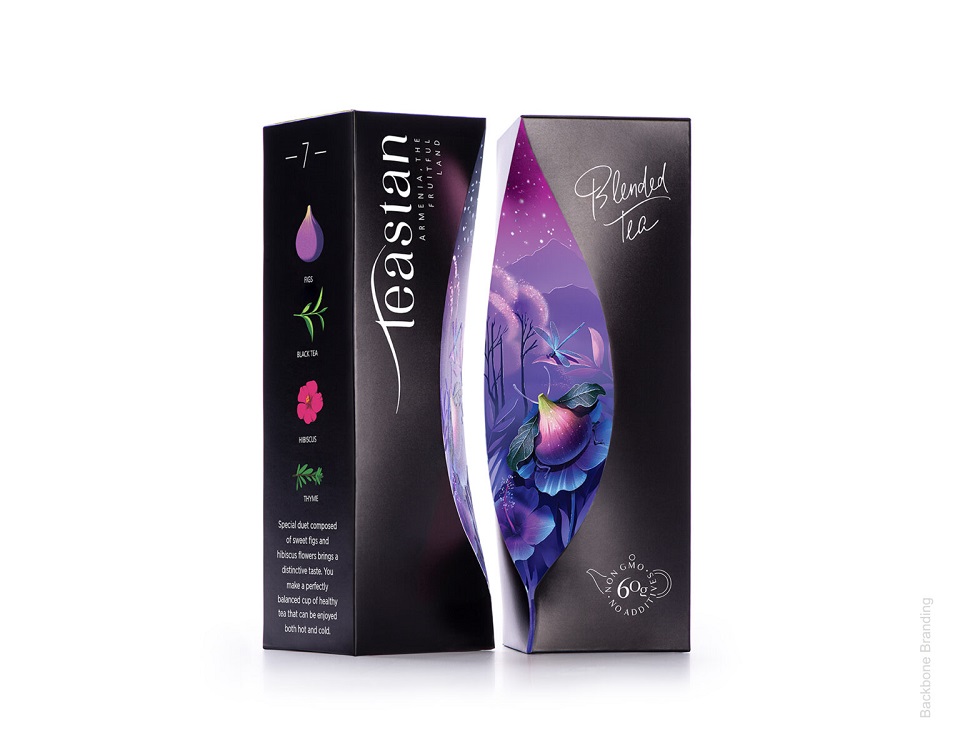
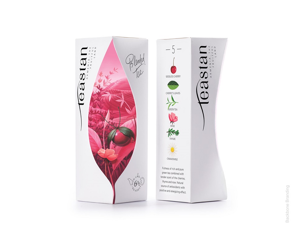
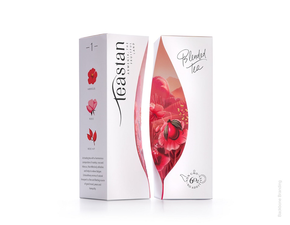
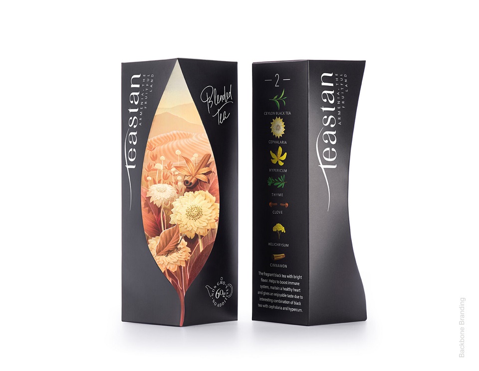
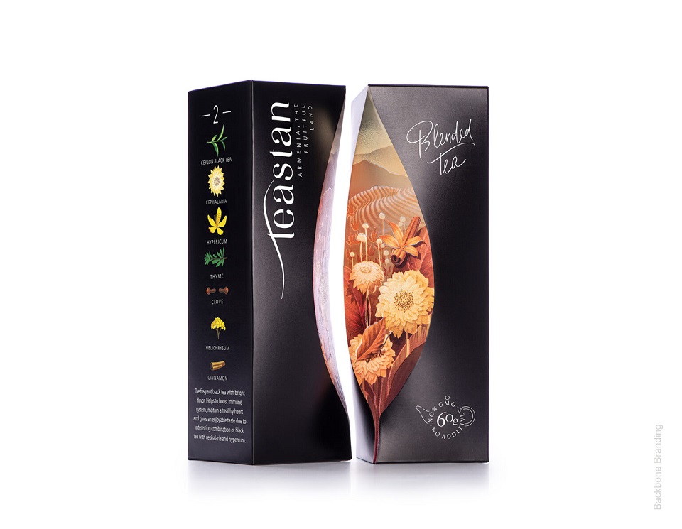
With two different types of tea, Teastan, an Armenian tea brand, invites consumers to a spiritual and aromatic journey, further enhanced by its captivating packaging design, courtesy of Backbone Branding. Challenged to create a design that visually captures the emotions that embrace people when drinking tea, the Yerevan-based branding agency developed a packaging that can easily be included in one’s tea ritual.
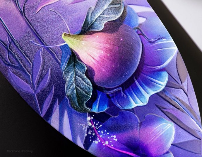
Pour yourself some hot tea and get ready to experience an Armenian tearapy (as we like to call it). As part of your first session, Backbone Branding prescribes different tea packaging designs to suit your every mood. Focus on the aesthetics and you’ll take a calming walk through the country’s fascinating nature. Look closer, and you’ll see that the effects tea passes to you while drinking are visually sewn on the boxes.
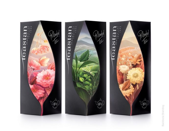
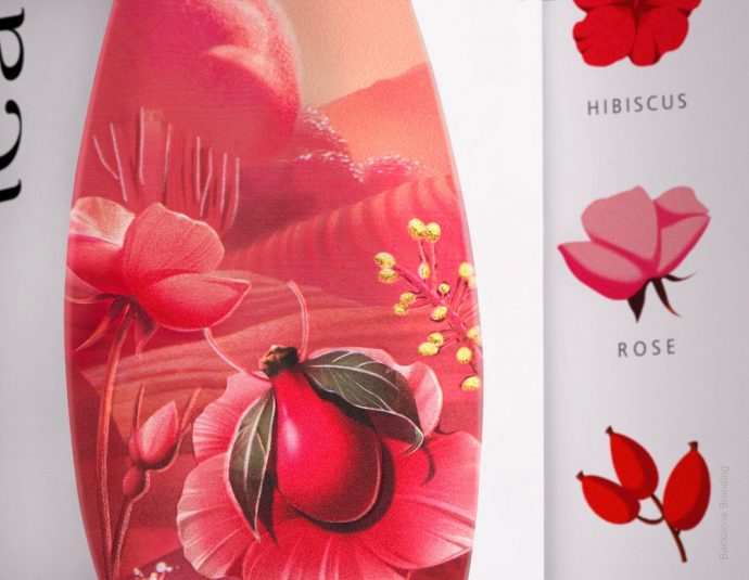
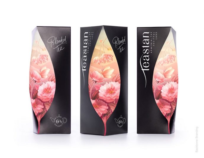
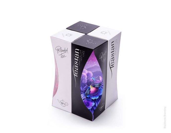
The artists “sculpted” a tea leaf shape on front of the box to symbolize a window that connects the drinkers’ world to the one that provides the much-appreciated drink. Once passing through that door, consumers discover a magical and relaxing tea world, where insects and plants live harmoniously with each other in the wild nature, “devouring the sun and fresh air of the beautiful mountains, where they rise,” describes the agency.
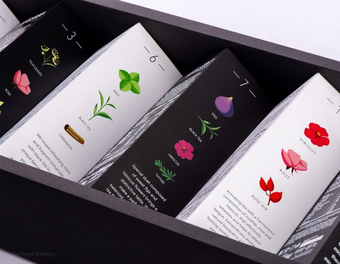
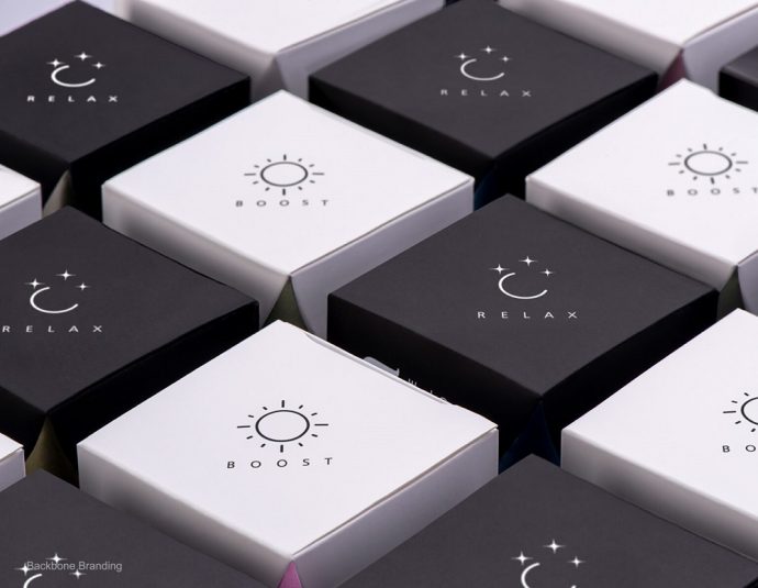
The two types of tea are assigned different colors. Those that give a boost of energy are represented by the white color and are complemented by the symbol of the Sun, visually describing the source of energy that shrouds consumers when sipping from a cup of tea.
The other category includes teas with soothing effects. Dressed in black “clothes,” the sign of the Moon guards over the relaxing journey consumers are about to embark on. “So you can get the feeling that the tea gives not solely by the color of the package and symbols, but also by the mood that it passes,” adds the agency behind the project.
Our multisensory tearapy comes to an end but before that, we would like to invite our readers to take a free tour around Armenia’s natural treasures, carefully embroidered in Teastan’s packaging. Check the images below, enjoy the ride, and discover the art of great tea!
Credits:
Client: Backbone Branding
Agency: Teastan
Brand Strategist: Lusie Grigoryan
Creative Director & Structure Designer: Stepan Azaryan
Illustrator: Mariam Stepanyan
Photos by: Backbone Branding & Suren Manvelyan
