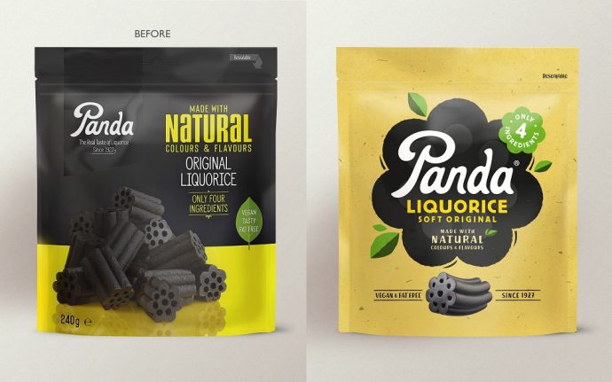
With products available across continental Europe, the UK, the US, and Canada, Panda Liquorice — which has been delivering the real taste of liquorice since 1927 — has reached out for This Way Up‘s help, asking the creative team to redefine its looks in order to reflect its position as a brand leader, while also look more appealing to the younger generation of consumers.
The London-based agency was welcomed by the company’s crew back in 2020, stepping inside this sweet world to work on Panda Liquorice’s visual identity, packaging, website, and wider brand world. Driven by the mission to improve lives by collaborating with health and natural food and drink brands, the award-winning creative agency’s rebrand centers around eye-pleasing designs that are in line with the company’s positive vibes. Simultaneously, the new visuals had to illustrate the brand as a healthier snack, thus attracting younger consumers to “be more Panda.”

“Panda’s competitors all look very much the same: a round, black logo and white type,” explains David Pearman, This Way Up Creative Director. “Panda is the original liquorice, and it needed to better communicate its role as a brand leader.”
In order to depict the brand as the category leader, the creative team focused on conveying the rich, almost one-century-old history of the company, outlining the visual story in a way that feels more modern. “We needed to find the sweet spot between the familiar cues of the category and some of the more emergent codes of healthier indulgence,” adds Amber Hart, the Account Director at This Way Up, who led on the Panda project. “Panda natural liquorice has a short ingredients list and there are no real nasties in there, so if you’re going to indulge in confectionery, Panda is a positive choice.”
As some of the consumers assume that liquorice is for older people, the new design — through which the brand wants to target younger people — seeks to change these perceptions of theirs, finding itself at the intersection between pleasure and wellbeing. “We wanted to really play on being natural on pack without using brown paper bag effect like everyone else,” says Pearman. “That can look very old-fashioned — a little bit ‘old school retro’ — and doesn’t play into capturing a younger audience.”

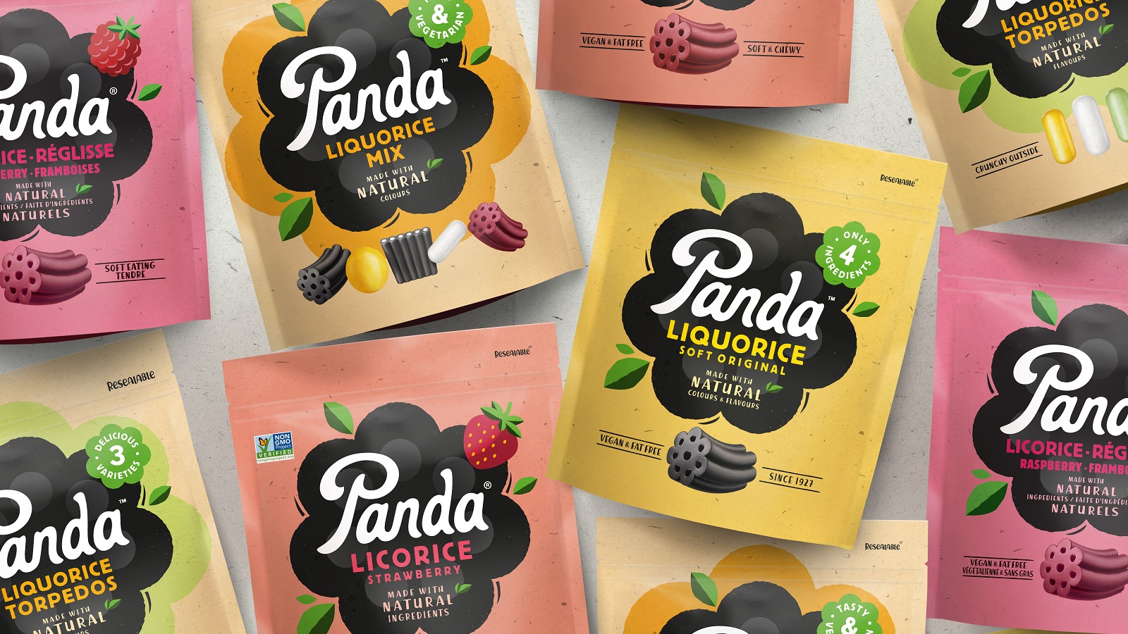
One other aspect the creative team had to keep in mind while working on the rebrand was to help Panda Liquorice secure new store listings and develop a design that would make the products stand out on the shelf. Given the small size of Panda’s SKUs (such as liquorice bars), the packaging had to be designed to make it easier for consumers to identify the products on the shelves.
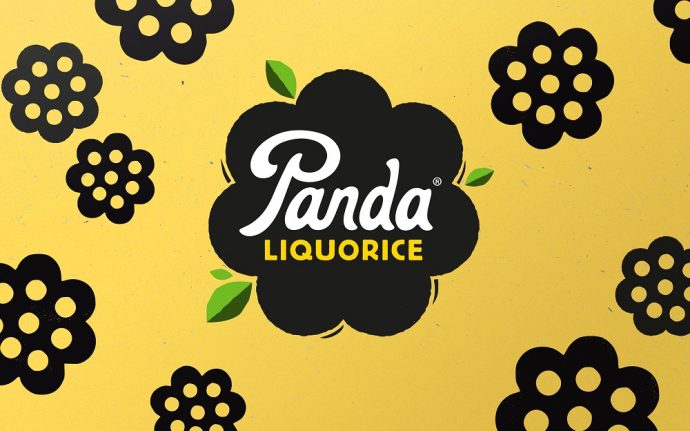
“Panda have a very distinctive product shape which actually makes it a better chew, so we wanted to really hero that,” says Pearman. Having a distinctive, flowery-like shape, the products’ silhouettes were printed on the packaging. Complemented by other visual elements, such as leaf details or minimalistic illustrations of fruits, the whole image highlights the brand’s short and natural ingredients list.
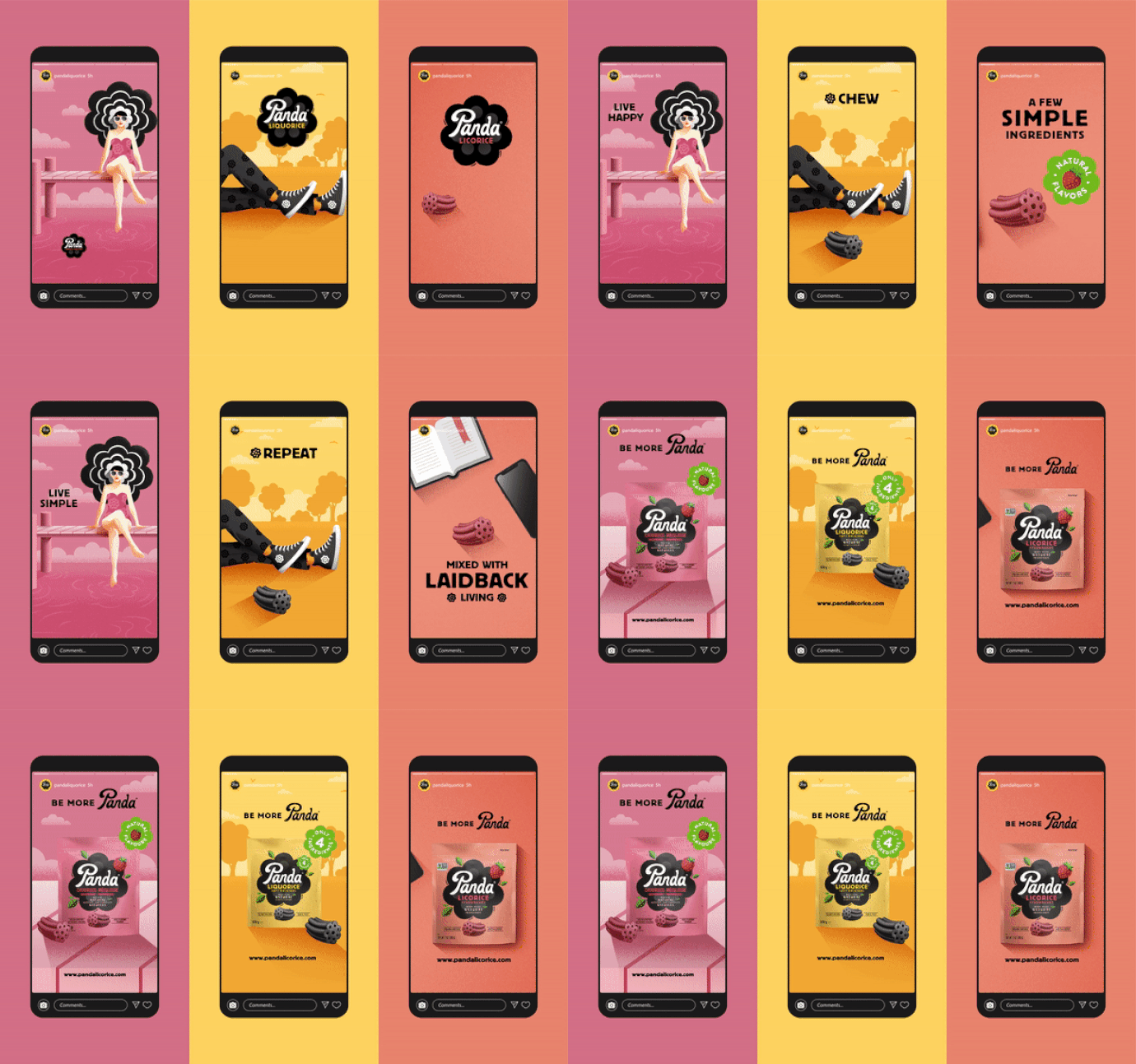
The resulting design, which feels “pandastic” thanks to the joyful, colorful, and vibrant aesthetics, is nicely complemented by a series of illustrations and animations developed for touchpoints such as social media assets. The refreshed look asks consumers to “be more Panda” around simple pleasures and focus on the “little moments of joy,” says the agency.

Credits:
Client: Panda Liquorice
Agency: This Way Up
