The official symbol of Pentawards — the first and most prestigious global competition dedicated to packaging design — is the pentagon, and for a good reason (well, five actually): The historic center in Brussels (where the competition was born) follows the shape of a pentagon; the pentagram is the ancient symbol of beauty; there are five fingers on the hand; five different awards levels in Pentawards; and, finally, humans rely on their five senses to satisfy their need for inspiration.
Pentawards has been celebrating design through its annual competition since 2007, recognizing excellence in the field via its Gala Ceremony. Each year, Pentawards organizes the event in a different city around the world, except for the last two years, during which the community met online to celebrate creativity. But with the world health crisis possibly coming to an end, some of the restrictions start to ease, allowing industry players to resume their activity.

For some, the two years of restrictions translated to an unexpected break from multisensory experiences — which only means that their appetite for new, exciting adventures that stimulate their senses has only increased as time passed. To help the audience quench their thirst for such adventures and to mark this year’s program, Pentawards partnered with global design agency Design Bridge for a campaign that, hopefully, will feed the audience’s minds with a good dose of creativity.
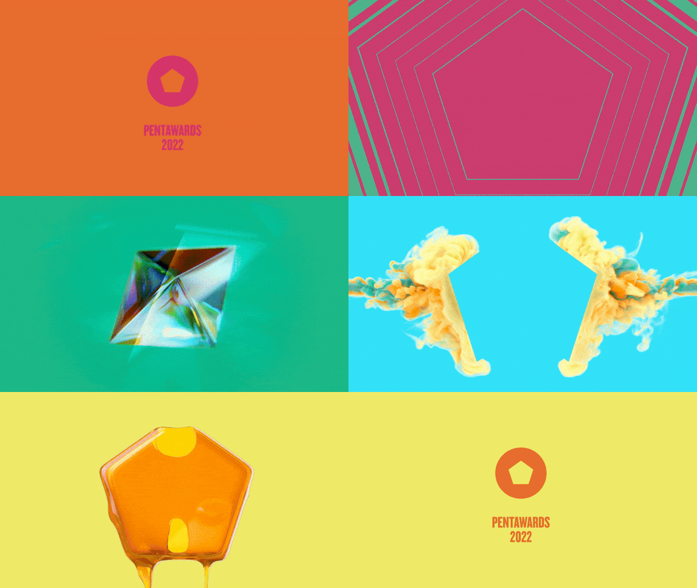
True to its “five-reasons attitude,” the campaign was specially conceived to tickle our senses, sating the public’s hunger for great design with a new look and feel brought to life in 3D and CGI animations (led by New Creative Director of Motion Alessandro Foschini), a brand film, a flexible design system for creating content and social media assets, and a vibrant color palette. At the heart of the campaign stands the five-angled-shaped symbol, Pentawards’ brand mark, which uses bold colors to manifest in a way that will surely grab viewers’ attention. Now that all eyeballs are on Pentawards, it’s time for a show the public won’t forget pretty soon: Ladies and gents, are you ready for “The 5 Senses of Design?”

Chloe Templeman, Creative Director at Design Bridge, commented: “After years of restrictions, distance and solitude, we are all eager to indulge in a long-overdue sensory overload. Design is reflecting this, with branding now pushing way beyond just the visual. Building on Pentawards’ ownable pentagon brand mark and inspired by our desire for sensory stimulation, the “Five Senses of Design” campaign brings to life what the Pentawards’ annual competition is all about: Recognizing and celebrating the very best that global design has to offer in all its guises.”
Jennifer Clements, Marketing Manager at Pentawards, continued: “As Pentawards winners over the last 15yrs and being part of our Jury for multiple years, Design Bridge was the perfect partner to take on the challenge of developing this year’s brand campaign. Thanks to the team’s global perspective and their use of the Pentawards logo, the visual identity reflects the true essence of who we are. It showcases the creativity that we celebrate each year in our competition, the excitement of taking part and winning, as well as reflecting the new-found desire to live and experience packaging design with all five senses.”
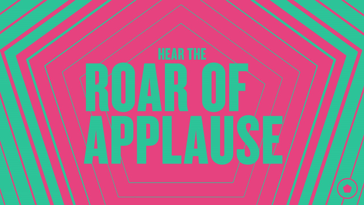
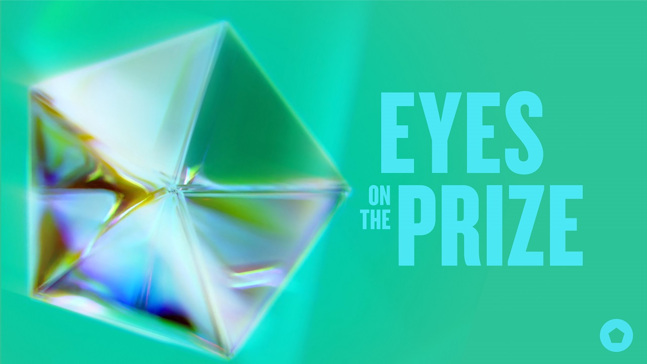
“Hear the roar of applause,” “pinch yourself,” and “eyes on the prize” are some of the campaign’s taglines which, coupled with tactile visual elements, enable one to feel as if they are among the lucky ones to win an esteemed Pentaward. This approach also encourages creatives around the globe to submit their work and impress the International Jury.
Credits:
Client: Pentawards
Agency: Design Bridge


