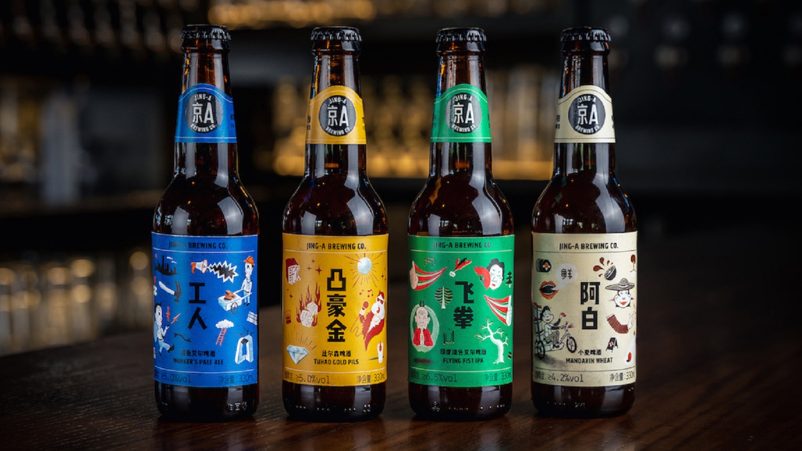
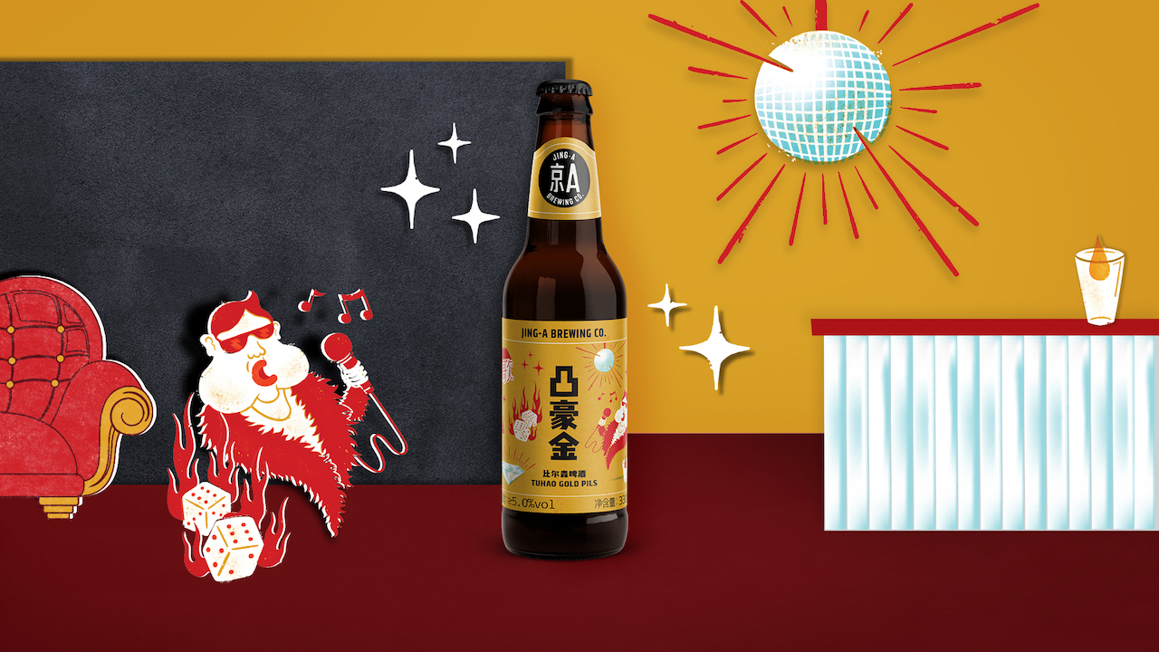
Inspired by Beijing’s both modern and traditional spirit, Kris Li and Alex Acker embarked on a journey to build a brand that captures the contrasting life unfolding within the city. It was 2012 when the long-time friends agreed on launching Jing-A Brewing Co., the duo seeking to brew a beer they are proud of, pushes the envelope, celebrates its roots, and, lastly, changes the way people think of Chinese brewing.
“Obsessed with hunting down rare ingredients and unexpected flavors,” the partners decided to spice up the looks of the company with some Beijing-inspired visual “ingredients.” With the design “recipe” carefully developed by MetaDesign Beijing, Jing-A — a brand that is “in constant motion” — paints its branding to reflect that the company is always evolving — much like Beijing itself.
The update comes as the brand looks to expand distribution across the country. Supported by a new design language, called “Future Meets History,” the beer brand’s labels, patterns, and texture are infused with Beijing’s roguish spirit, playfully highlighting the aspirations of those who pave their own path but never forget about their roots.
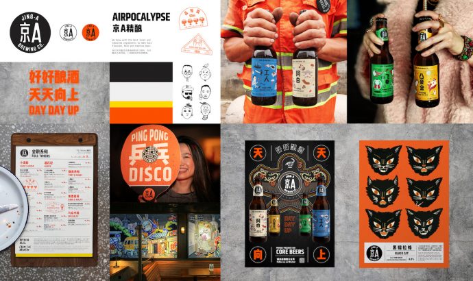
“Beijing’s life and local culture are Jing-A’s biggest source of inspiration. It really all comes down to our core brand philosophy, ‘Day Day Up’ — this drive towards dreaming bigger and striving for better seeps into everything we do,” explains Becky Lane, Art Director at Jing-A. “We challenged MetaDesign to create a refreshed identity system that is scalable and consistent, inspired by Beijing, yet never stifles our trademark creative spirit. Our new branding encapsulates Beijing, a city of contrasts, where history and a youthful spirit coexist in a melting pot.”
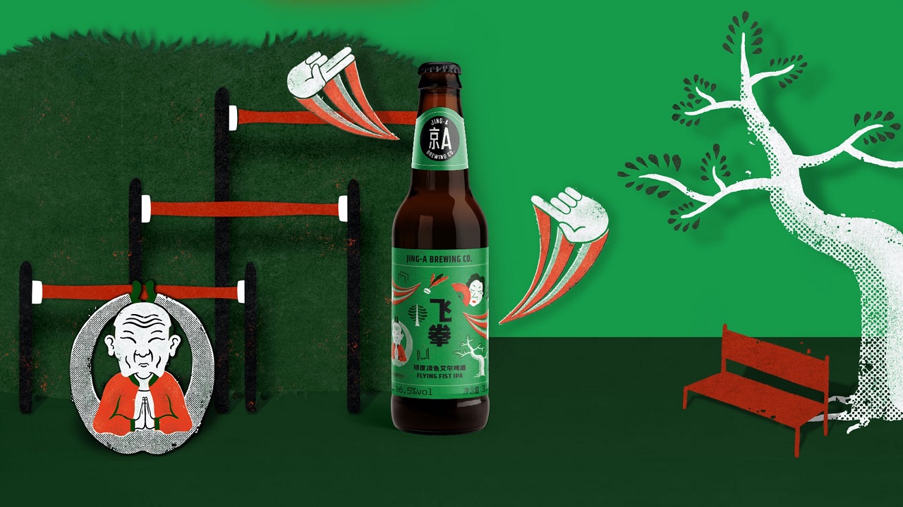
China’s capital city has a lot to offer in terms of cultural elements; both the historic and contemporary ones were combined with new expressions so that a flexible and eye-pleasing design language can be achieved. While the core packaging labels were first unveiled last year, the complementary posters and illustrations that tell the stories behind each of the brand’s four core beers have been introduced just recently.
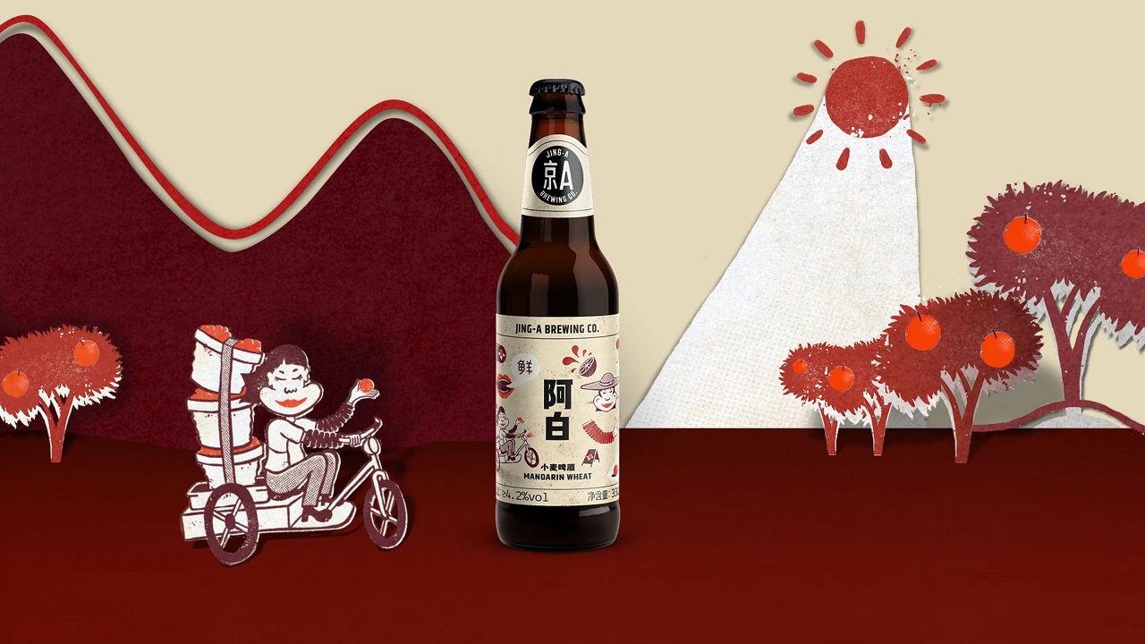
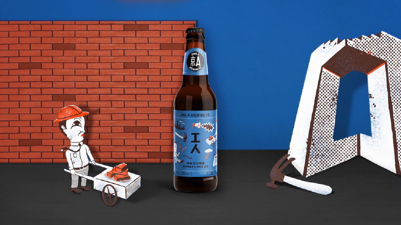
The “Worker’s Pale Ale” showcases a young, ambitious man — a nod to the tenacious attitude of the country’s working class. A farm lady carrying the family’s chenpi (dried orange peels) to the market is the illustration that accompanies the “Mandarin Wheat” flavor, visually suggesting the dedication and pride it takes to “bring your product to market.”
“Jing-A is a brewery that pushes the envelope, and it is changing perceptions of Chinese brewing worldwide. When we were given the opportunity to partner with Jing-A on their new branding, we wanted to combine old and new, east and west, because it’s these contrasts and layers that fuel the brand’s passion and creativity,” adds Sally Anderson, Group Creative Director at MetaDesign in Beijing.
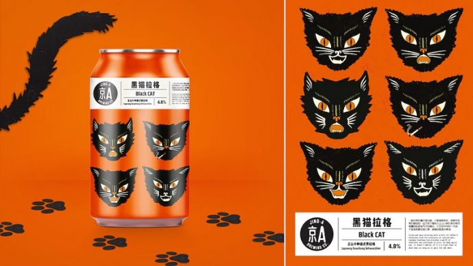
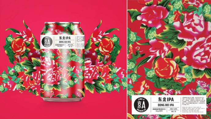
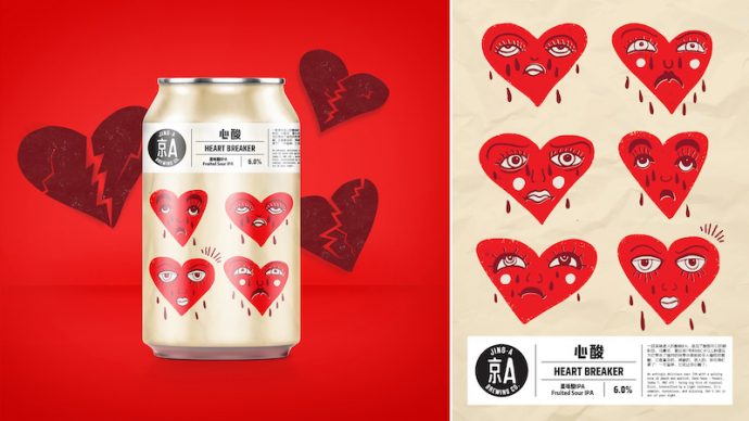
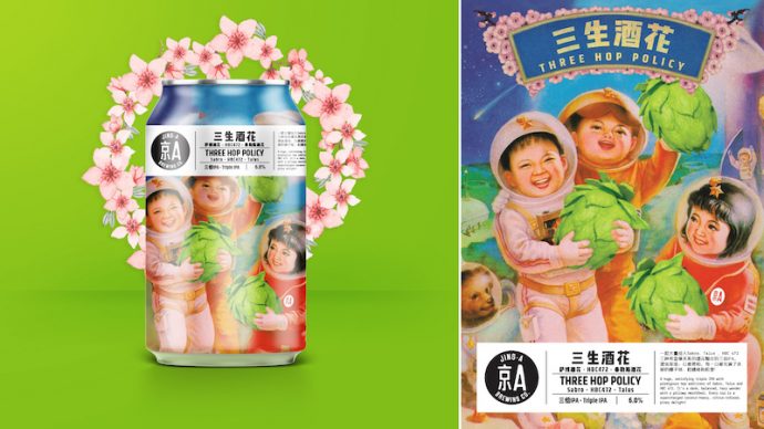
As a proud producer of around 50 experimental brews per year, Jing-A honors its seasonal line of cans with vibrant illustrations. There’s a collectible poster for each beer, with the founders referring to these as being the “fifth ingredient in [their] beer.” Each poster visually narrates a story about Beijing, its history, culture, flavors, and characters. Are you ready to explore them up close and have a quick trip to Beijing?
Credits:
Client: Jing-A Brewing Co.
Founders: Alex Acker & Kris Li
Art Director: Becky Lane
Agency: MetaDesign Beijing
Group Creative Director: Sally Anderson
