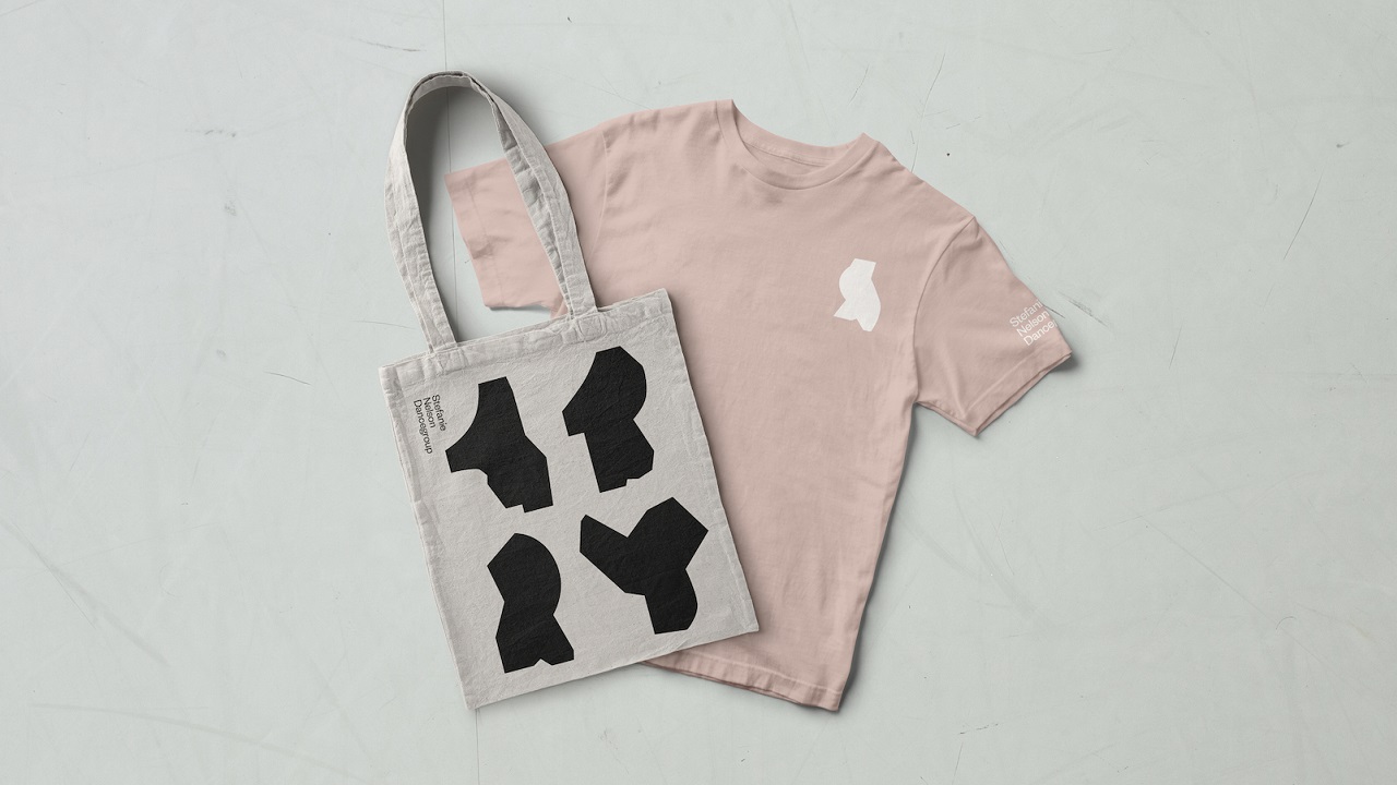
This year marks the 20th anniversary for the Stefanie Nelson Dancegroup (SND). To mark this milestone, the brand decided to throw a poetic and highly-visual art party, in which the main guest was its own visual identity. The party was made possible thanks to ‘event planner’ Gretel, which, in the middle of the night, unveiled its rebrand for the Stefanie Nelson Dancegroup in NYC.
Driven by a distinctly conceptual impetus and characterized by a visceral and strikingly visual approach, the company needed an even stronger identity that shall boost its looks amongst consumers. Known worldwide for its impeccable choreography, contorted, and ambiguous movement, SND’s work cannot be confused with other companies. Yet, to make itself sure about this, the brand decided that it is now time to boost its looks.

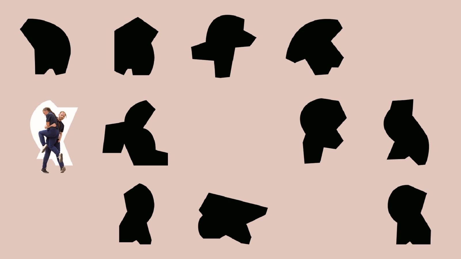
To capture the vivid spirit of the brand, the New-York-based design agency meticulously explored and analyzed the graphic shapes that allow for bold assertions of movement and physical form. The resulted geometric language was then molded in such a manner so as to suggest gentle moves that feel spontaneous. These gestures serve now as a visual language for the brand.
Gretel founder Greg Hahn says: “Whether designing for a cultural institution or a global tech brand, we’re always looking for work that’s unique, beautiful, and above all, true to whoever we’re designing for. Even for a smaller client like SND we provide valuable insights into the way their business is operating, the way they present themselves to the world, the way they speak, on top of providing a unique identity.”
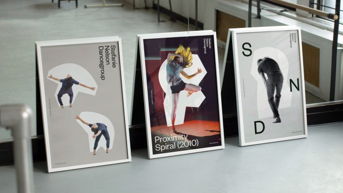
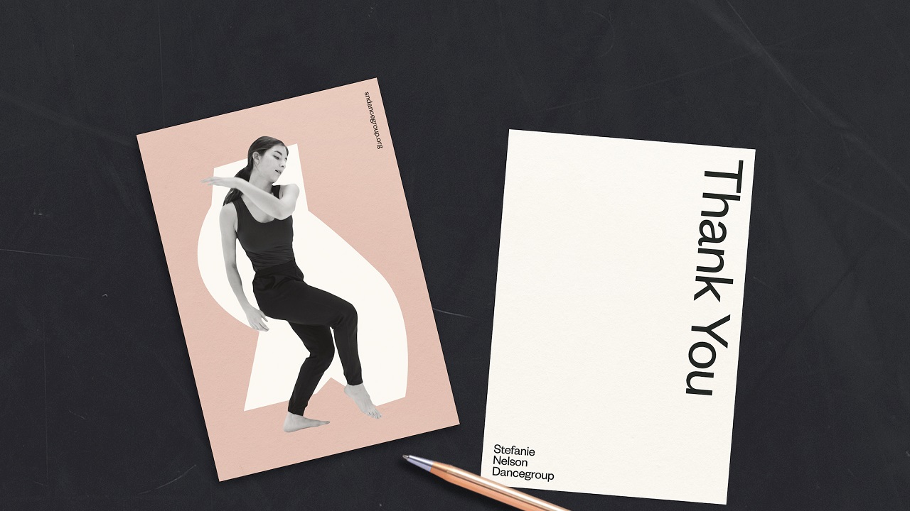
By getting inspiration from the dancers’ soft moves, Gretel developed a new language, that mirrors the shapes these people contour when practicing dance. “The shapes can work to supplement or enhance a photo,” says Hahn, “and on their own, they become a language of glyphs, unique because they’re based on SND performers.”
“The goal for this project was to mimic movement and dance through the design in a way that is personal and specific to SND,” says Elaan Bourn, Gretel’s design lead on the SND project. “By creating a graphic library of forms that represent and abstract the edgy, contemporary and energetic nature of Stefanie’s pieces, we were able to visualize the spirit of the rebrand.”
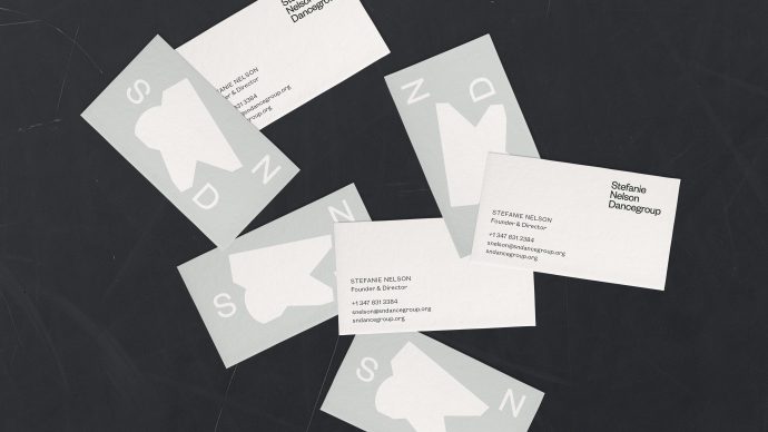
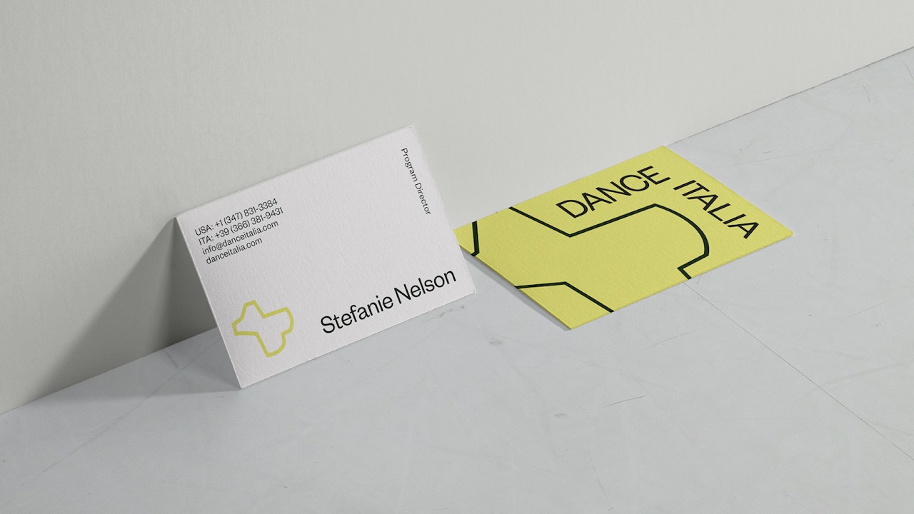
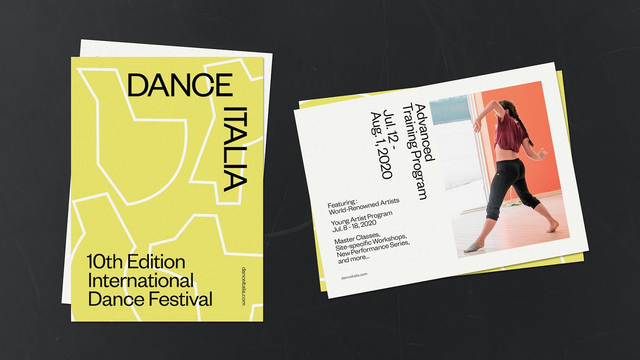
Besides refreshing the visual ID for SND, Gretel is also responsible for the looks of Dance Italia (DI), a summer program founded by Nelson in 2011 and a sub-brand of the mother company. Whilst they both use the same visual language to express their personality, DI was shaped to bring to the frontline the disjointed segments that add to the kinetic feel. This allows DI to have a more adventurous look than its parent has.
Stefanie Nelson, founder of SND comments: “We paired with Gretel to investigate core values of our company and have those reflected artistically to the highest design standards in our publicity materials. The resulting work is a wonderful visual reflection of our past and a strategic springboard for our future.”
With this project, Gretel managed to show how a strategy can pave the path for a brand’s cultural aesthetics, which connects with the audience clearly, effectively, and authentically. The rebrand of the Stefanie Nelson Dancegroup and Dance Italia will be rolled out in the coming months across digital touchpoints and all publicity materials.
