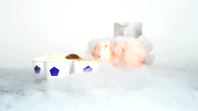
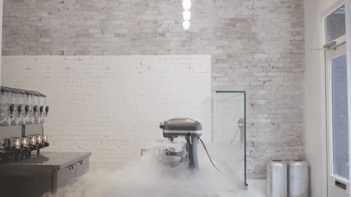
Vancouver’s Mister Artisan Ice Cream shop looks more like a laboratory than a restaurant. That’s because it uses liquid nitrogen to cool its ice cream, thus covering the shop in a delicious mist. The values of Mister are simple: pure ingredients, good ice cream, and—most of all—using small businesses as the nuclei for connection in our disjointed communities. The brand design was created by an interdisciplinary design studio, Brief.
Open late, this ice cream is marketed towards adults. It is an updated twist to the classic coveted childhood treat that provides us with a connection to our roots, where we come from, and the basic pleasures in life—both dessert and valuable social interaction. Mister is more than just updated ice cream; it is an updated neighborhood center.
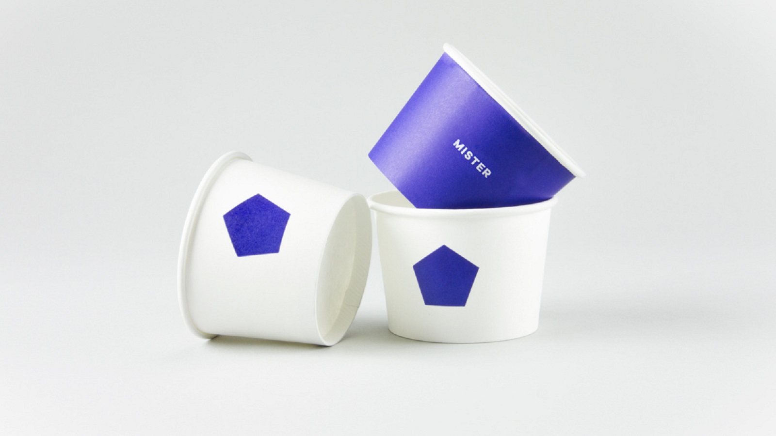
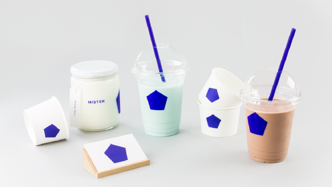
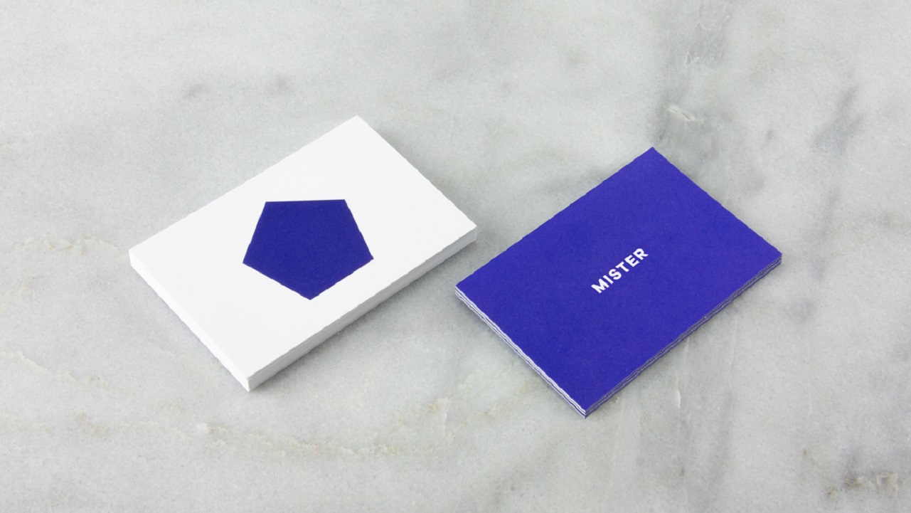
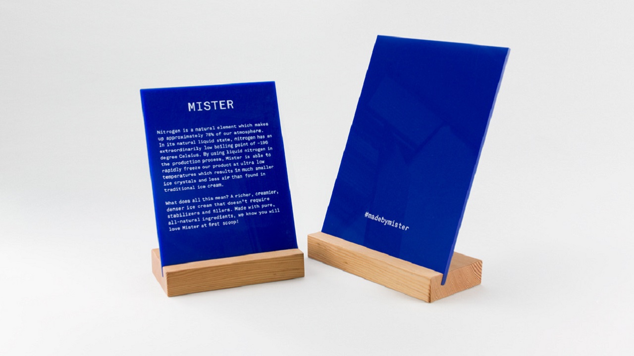
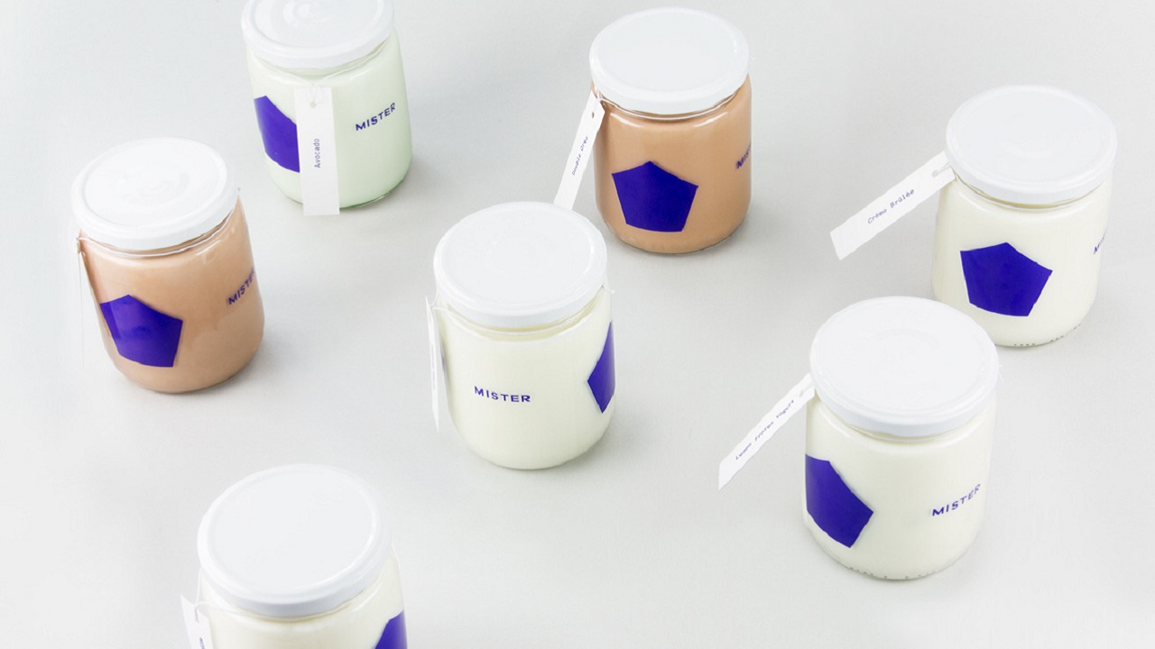
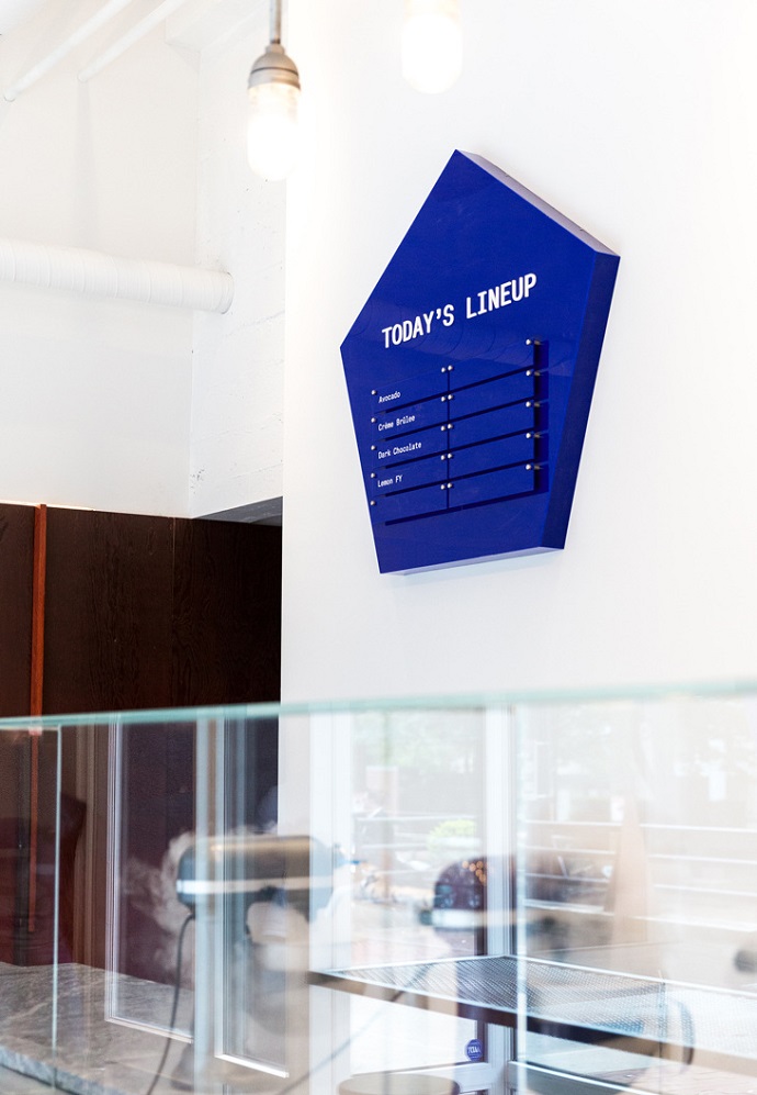
This futuristic ice cream parlor that was designed by a Vancouver-based architecture practice, Scott and Scott architects, needed an equally sleek symbol to represent it. Mister’s call sign in a basic blue pentagon. Focusing on simple geometry and a beautiful primary blue, the design takes us back to basics present in the parlor’s values. The same single shade of blue is used exclusively, contrasted on a stark white background or natural looking plywood. The ice cream cups take no words, and when words do appear on signage, they are in legible block print. Minimalistic and thoughtful, Mister reminds us that symbols represent more than a name ever could.

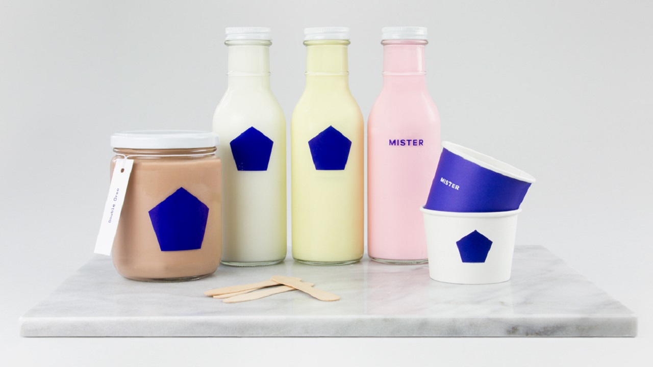
Basic shapes, colors, ingredients, and fonts preach the beauty of simplicity. Simplicity is mingled with the nostalgia that lives on in the taste of ice creams of summer’s past. Mister reminds us that childhood pleasures still exist in adult life by making its shop about the process of getting ice cream: from its creation to its consumption, Mister wants to make eating ice cream a community affair.

Credits: