Almost ten years ago, the four founders of independent creative studio Coffee & TV left industry institutions, venturing into a new quest of wanting more. The London-based studio has come to be a place where the amazingly talented team of artists solves the exciting clients’ creative problems — such as Sky Sports, Deliveroo, and Mercedes. Whether delivering the projects they work on in a traditional way or by converting its clients’ messages using modern approaches of storytelling, the studio’s expertise enables the crew to design world-class work.
Throughout all of this time, Coffee & TV has developed harmoniously, proudly wearing the title of being the UK’s first Certified B Corp creative studio and even winning Gold in Best Places to Work in TV 2022. To communicate its achievements, the company specialized in visual effects, design, color, and direction partnered with branding agency Ragged Edge for a new mission: Design a brand that captures not only the studio’s culture and what the team stands for but also the artistic journey they have embarked on nearly a decade ago.
“We needed a brand that would reflect who we’ve become,” says Steve Waugh, Creative Director. “It had to represent not only the love and care we put into our work but also the joy of the creative journey that we share with our collaborators. Ragged Edge are the changemakers, and the only people we’d trust with this job — we love what they’ve done here.”
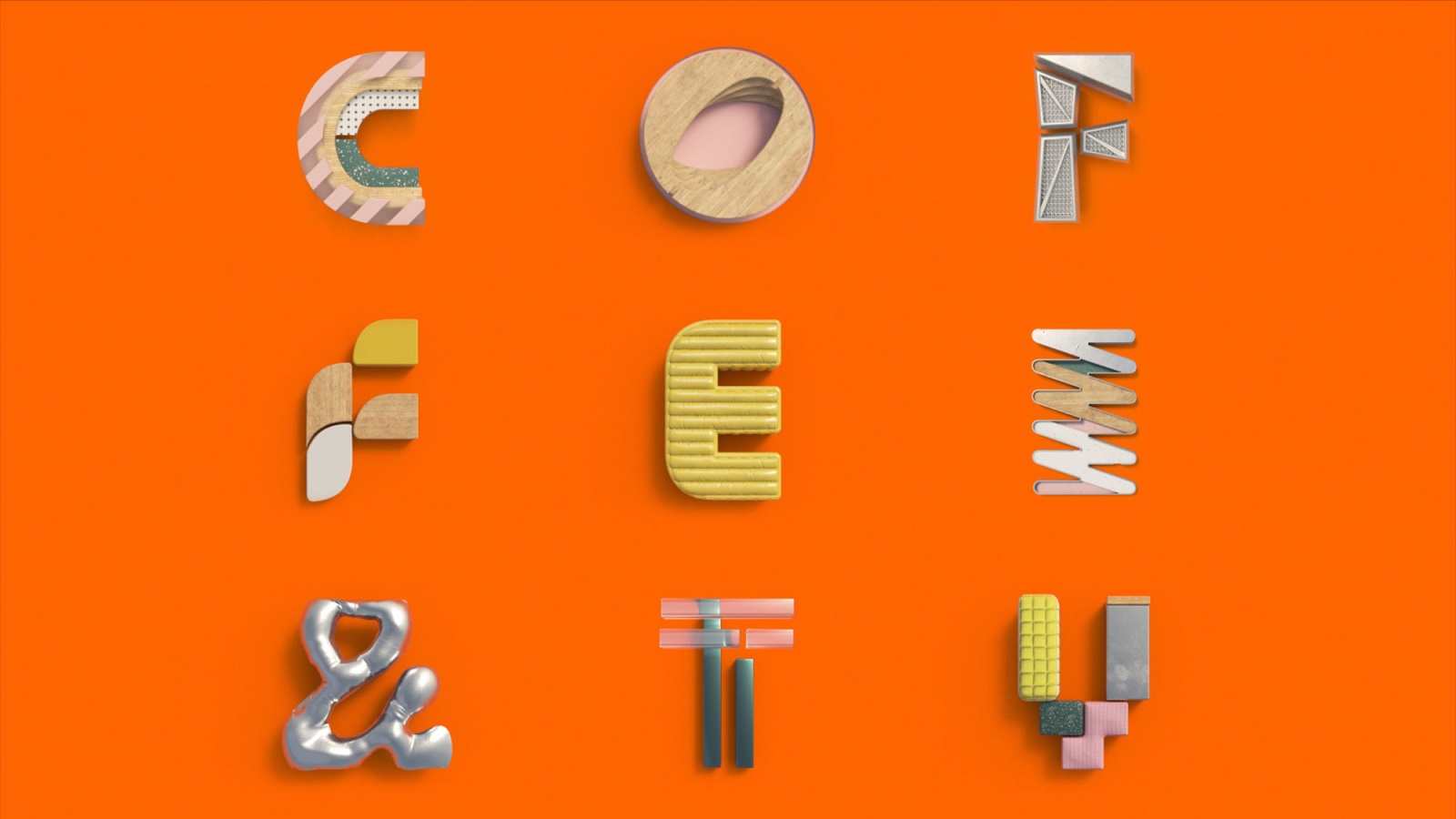
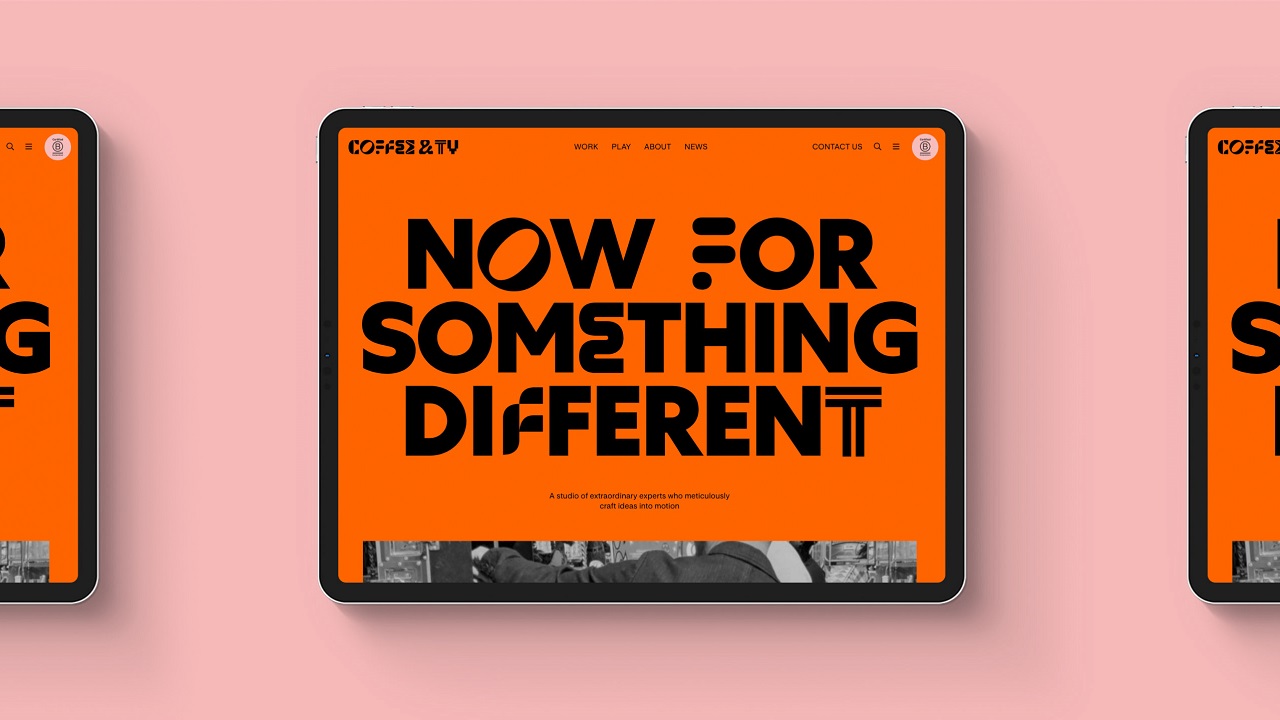
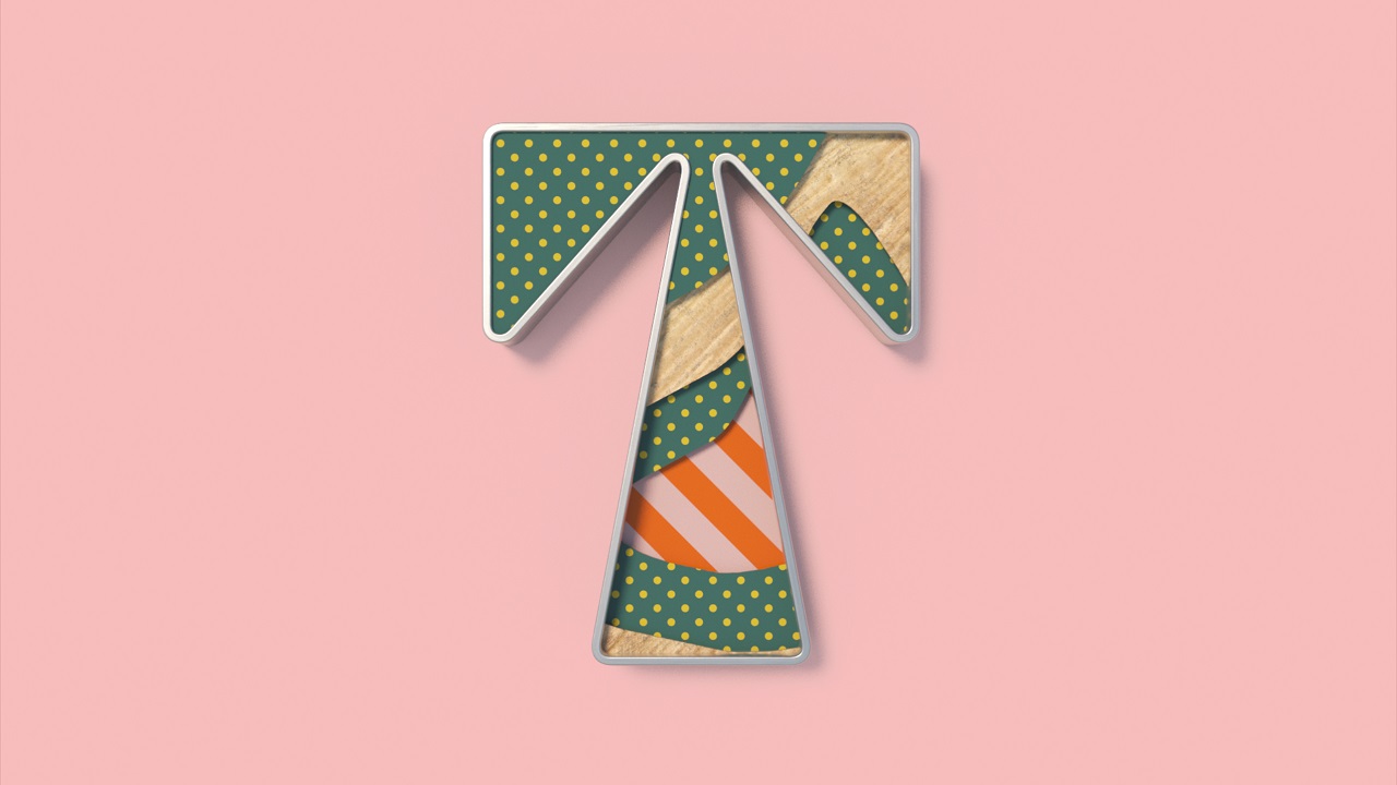
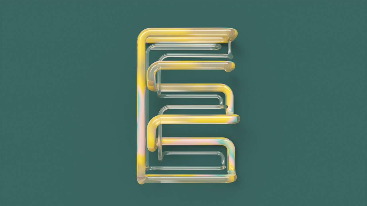
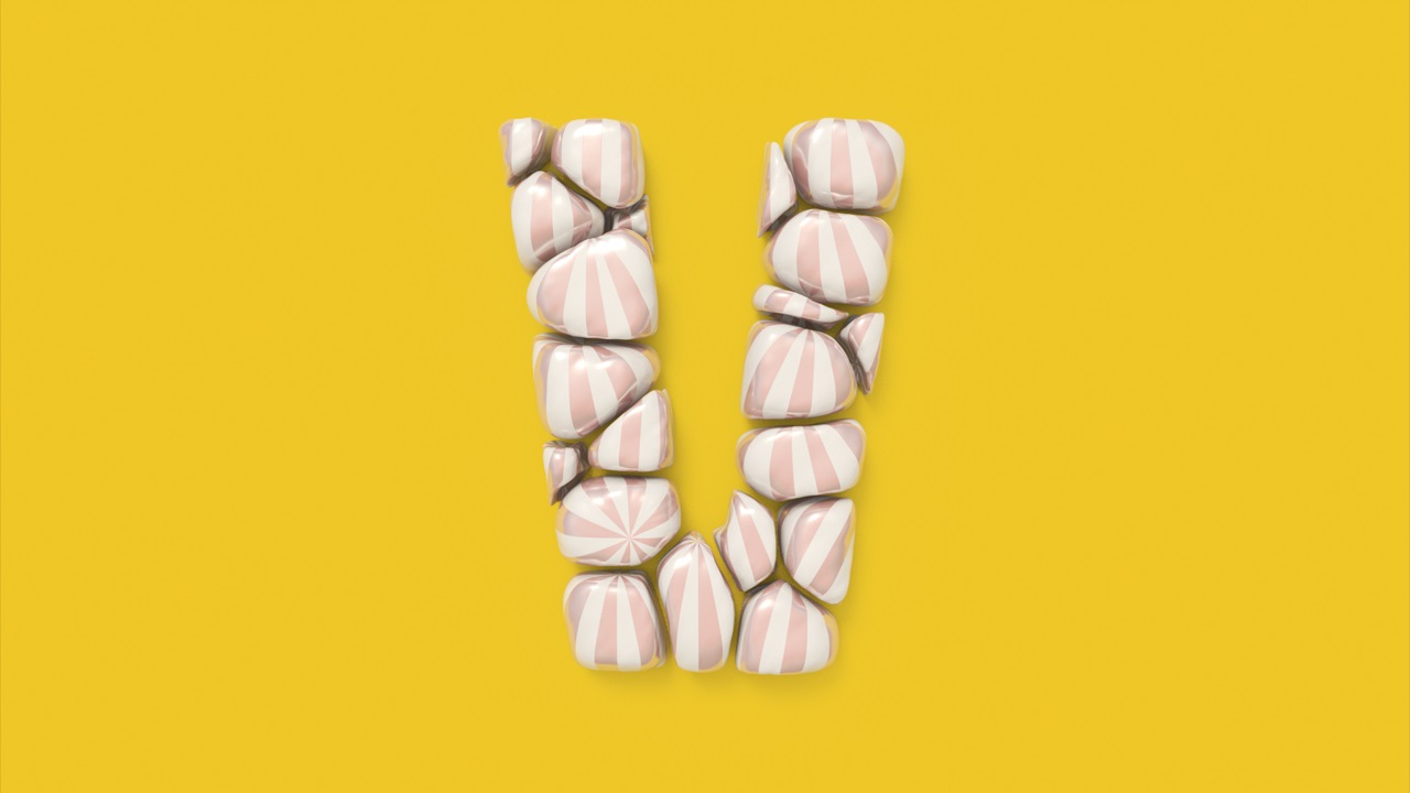
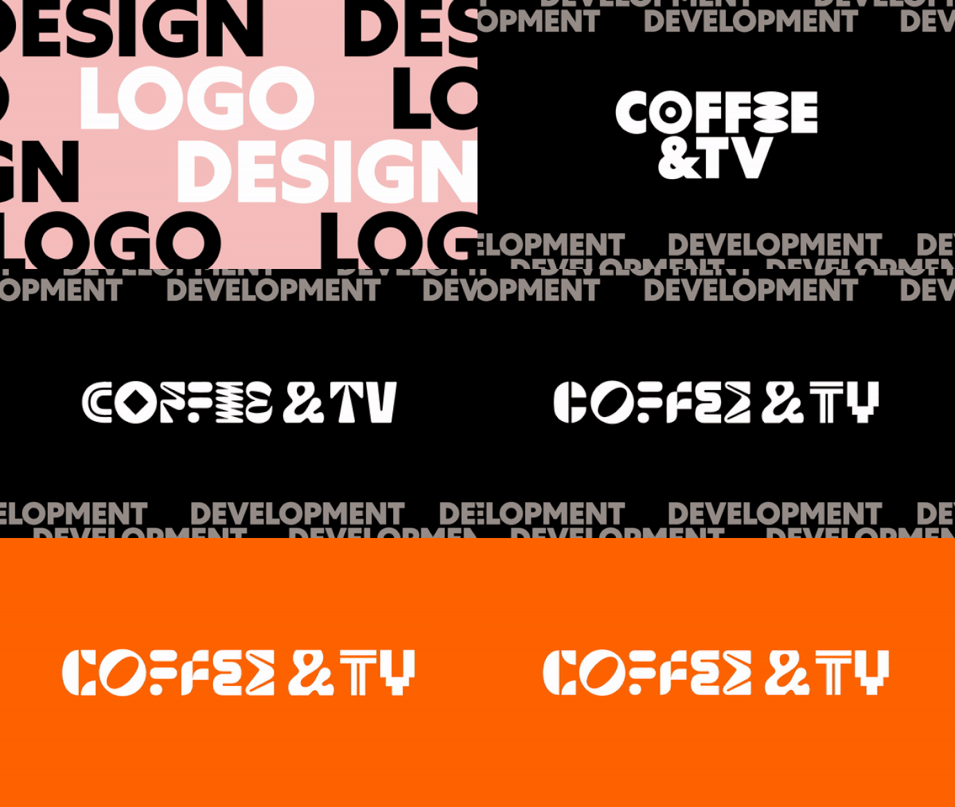
The refreshed look feels like a perfect place for creativity to thrive, providing it with all the vibrant elements it needs to manifest freely. A new logo, typography, color palette, glyphs, and a tone of voice but also a new website built and designed by Alchemy Digital were meticulously crafted to reflect the rigorous work behind each project the team strives to bring to life.
“Coffee & TV’s rebrand marks a step-change in their business, moving from the industry’s safe pair of hands to leaders in creative culture,” adds Max Ottignon, Co-Founder, Ragged Edge. “So, in stark contrast to the slick, monochrome identities of their competitors, we created a vibrant production playground where creativity is allowed to flourish. A celebration of creative practice.”
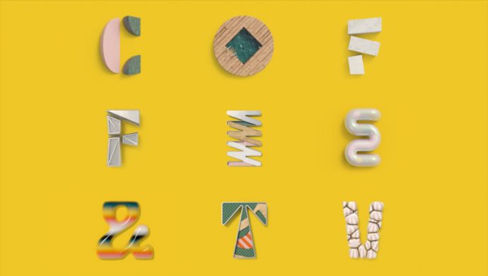
The logo’s different characters stand for the diverse range of the artists’ amazing skills. It feels energic and progressive yet approachable, thanks to the typography, which adds a dose of warmth to the messaging.
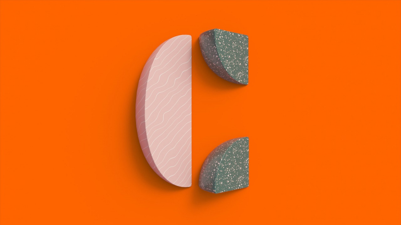
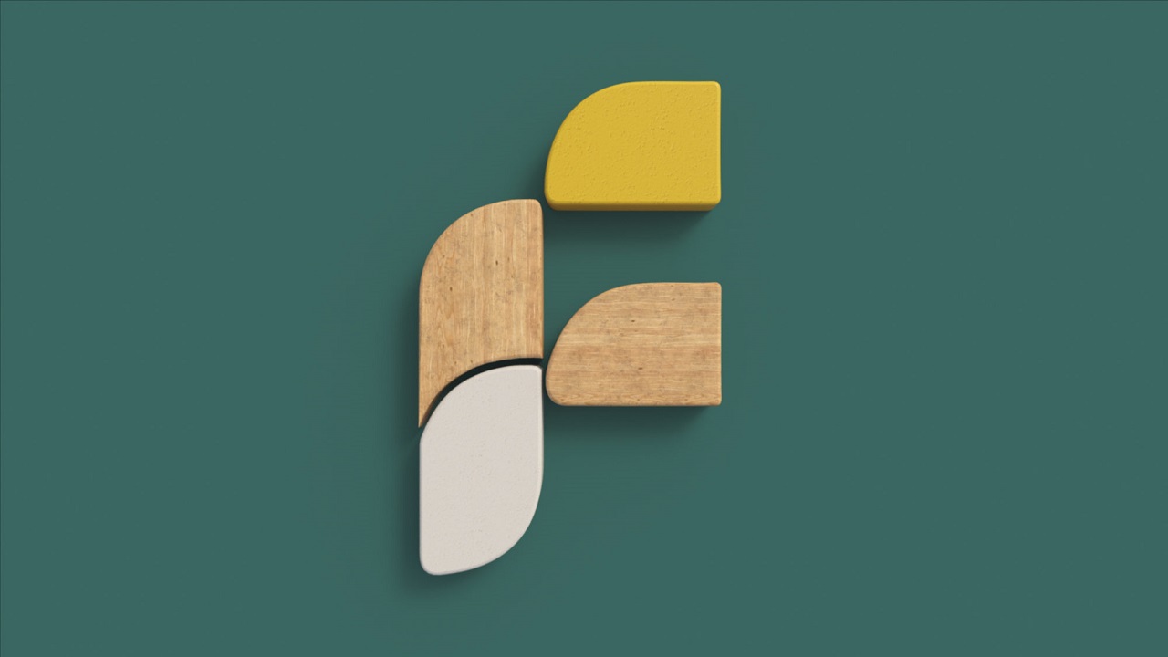
The primary color is orange, a hue that’s also strongly visible across the website, complemented by a palette of baby pink, emerald green, and mustard yellow. As extra support to the overall brand, Ragged Edged developed a series of glyphs that can be used within the logo when in motion or as independent graphic elements.
The tone of voice enables Coffee & TV to feel like a destination for creativity — whether you think about it in a metaphorical or literal way, the studio is a place where brands meet with the team to discuss creativity.
Credits:
Client: Coffee & TV
Agency: Ragged Edge
Website by: Alchemy Digital
