Following its vocation of building payments infrastructure that connects the African continent to the global economy, financial brand Flutterwave — which is the brainchild of a team of African finance and technology veterans — has grown to be one of the fastest-growing payment companies in the world since its inception in 2016. Just one year after it was born, the brand was named the continent’s best FinTech company at the Apps Africa Innovation Awards. The company — valued at over $3 billion — is currently the highest valued African startup on the continent.
Flutterwave’s ambition is to provide Africans with an easier way to fulfill their financial dreams. The brand needed to speak fluently to its audience, so it reached out for the award-winning digital design agency Verve‘s help to guide it in developing a brand identity that captures the distinctiveness of Flutterware.
Commenting on the rebrand, Roman Stikkelorum, Verve’s Co-Founder and Managing Director, wanted to point out how important the collaboration with the brand’s in-house team was to assure that the new brand strategy and identity is coherently communicated across all assets.
“Flutterwave is such a powerful and dynamic brand that exudes the spirit of African entrepreneurship and so our collaborative approach was critical to this, ensuring the brand remained authentically African while standing out in its category,” says Stikkelorum.
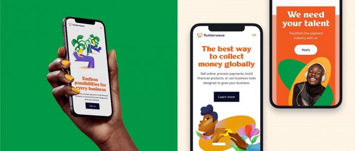
The FinTech industry is usually dominated by green and blue, “colors that are far too cold and corporate for a brand that prides itself on enabling and empowering African businesses and entrepreneurs,” adds Stikkelorum. Simply put, these hues don’t reflect the aspirations of the African entrepreneur, who dreams big, bold, in bright and vivid colors. This color palette may be predominant for this sector but not for Flutterware, which challenges the category’s aesthetics with an explosion of vibrant colors. In turn, this approach allows the brand to be easily spotted in a category that’s traditionally monotonous in chromatic terms.
Throughout the world health crisis, the brand’s butterfly logomark has become a symbol of trust. Inspired by this, the creative team developed the modular identity system around this motif, dressing it in rich colors as well as creating a motion system that’s based on the insects’ way of moving their wings.
“Thanks to Flutterwave’s growth over the last 12 months, its butterfly logo is now a symbol of reliability and trust,” continues Stikkelorum. “So, we created a modular identity system and motion principle elements around LabaLaba, meaning “butterfly” in Yoruba, one of the principal languages spoken in Nigeria and throughout the African west coast.”
Flutterwave’s Head of Design, Ted Oladele, continues: “We saw that Verve would be able to deliver on what we really wanted; a team that cares deeply about showcasing culture and personality through branding. We enjoyed re-discovering ourselves and workshopping the different ways we could retell our origin story. Identity is a window to interacting with the world and Verve has given us visual language and tools to do just that.”

“In this day and age, in order to survive you need to stand out and adapt as a living brand,” concludes Stikkelorum. “So, we are ecstatic that this project not only met the brief but combined the best of our skills and Flutterwave’s to create a brand that is bold and distinctively African and built from the core of classic digital Dutch design and future-proofed, as the company grows from strength-to-strength.”
In addition to developing the new brand identity, Verve collaborated with illustrator Milena Bucholz, who crafted a series of illustrations that guide users through different stages of entrepreneurship. The images are in line with Flutterwave’s new look, following not only its aesthetics but also capturing the brand’s commitment to supporting Africans take the global stage.
Credits:
Client: Flutterwave
Agency: Verve
Illustrator: Milena Bucholz
Strategy: Anne Miltenburg
Motion: Coen Rens
